
A critical mistake small business owners make frequently is to overlook the importance of typography to their business. The art of typography is more than just knowing which types of fonts styles to use, but that is definitely a good place to start.
According to Wikipedia…
Typography is the art and technique of arranging type to make written language legible, readable and appealing when displayed.
https://en.wikipedia.org/wiki/Typography
Understanding the basics of typography and fonts is the key to creating professional-looking marketing materials, so next time you are on the hunt for the perfect font, make sure you think twice about your font choice.
(The following post may contain some affiliate links. Please read the Terms of Service and Privacy Policy for more info.)
Professional Typography Tips
Before we dive in to the different types of font styles, there are some key concepts that you should know when it comes to designing with text.
The difference between fonts and typefaces
The term typeface and font are similar and often used interchangeably by the general public, many designers (and for the purpose of this article), but there is one distinct difference. A typeface is typically made up of a family or series of fonts that have multiple weights and styles of characters. Whereas, you can think of a font, like a child, or a subset of the parent typeface that contains only one weight or style of characters.
An example of a typeface is Helvetica. An example of a font is Helvetica Bold.
Other important considerations when designing with text
Neglecting to pay attention to typography and your font choices within your business’ communication is one of the top design offenses that can make your business and brand appear unprofessional and sloppy. Here are some great tips to help your business to keep its cool.
- Less is always more. Focus your message. Readers are more likely to read a headline and brief description or a bulleted list than a huge paragraph. Don’t try to say everything in one pass. Break up your body of text or link to a page with more information
- Use color as emphasis. Color can be powerfully communicative, but if its overused on type it can hinder readers from engaging or reading further. Balance your use of tones and shades to avoid creating a rainbow effect or pairing colors that clash. When choosing color for your type, you also want to consider readability and web accessibility.
- Use varied font sizes and weights to create hierarchy and interest. Decide which elements are the most important on the page and give them appropriate treatments. Don’t go overboard! The final arrangement should look cohesive
Types of Font Styles
There are several different types of fonts styles (or typefaces) that exist that can help you communicate the right personality for your brand, but consistency is key. Once you have decided on an appropriate set of fonts to use for your communications, stick with them. Here are the font styles you can consider:

Serif Fonts – A serif font has small strokes or “feet” on the ends of its letters as seen on fonts such as Times New Roman and Georgia. Serif fonts are typically used in more traditional and formal situations such as in legal documents and wedding invitations. There are also different subsets of serif fonts that all come with their own distinct personalities:
- Old-Style Serif
- Transitional Serif
- Modern Serif
Favorite Serif Fonts: Mrs. Eaves, Didot, Bembo, Adobe Garamond, Cormorant, Lora

Slab Serif Fonts – Slab serif fonts are considered a sub-set of serif fonts but have no variation in the widths of the strokes that make up the characters so in my opinion, they deserve their own category of recognition. Slab serif fonts add quirkiness and friendliness to your designs and can be a great choice for headlines, especially when you choose bolder weights and styles.
Favorite Slab Serif Fonts: Archer, Clarendon, Museo Slab, ChunkFive, Adelle
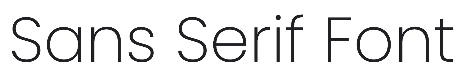
Sans-Serif Fonts – Sans serif fonts do not have small strokes on the end of the letterforms like in fonts such as Arial and Myriad Pro. They can be used in a variety of ways and are often used in web design apps and user interfaces for software. There are a sub-categories of sans-serif fonts including:
- Grotesque
- Geometric
- Humanist
Favorite Sans-Serif Fonts: Gotham, Futura, Bebas Neue, Din, Poppins
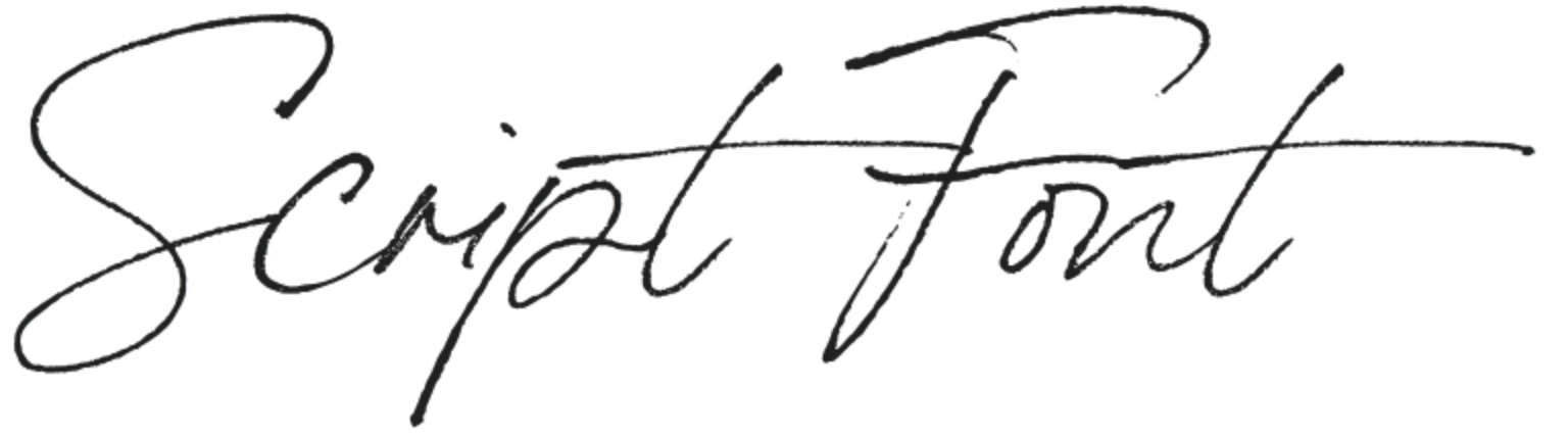
Script Fonts – Script fonts are designed to mimic the flowing characters of cursive handwriting or calligraphy. Script fonts come in a wide range from casual, to formal, to calligraphic, and can add the feel of elegance or personalization to your designs and brand.
Favorite Script Fonts: Bon Vivant, Juniper & Sage, Balayage Script, Ed’s Market
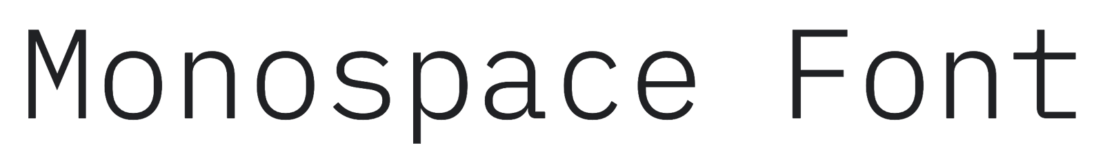
Monospace Fonts – Monospace fonts have equal horizontal width for all the characters. Originating from the early days of computers and inspired by typewriters, these fonts have a rigid personality, since the letterforms are more standardized than all other types of fonts.
Favorite Monospace Fonts: Courier, Droid Sans Mono, Letter Gothic, IBM Plex Mono
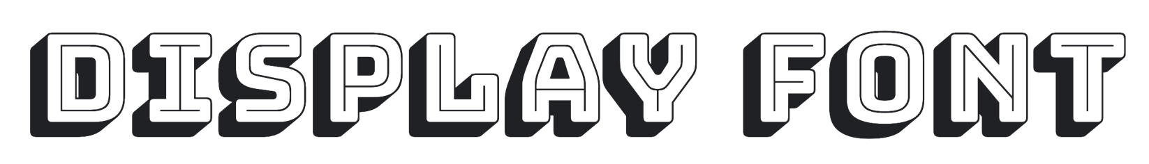
Display Fonts – Display fonts, also called decorative fonts, is a specialty type of font style that doesn’t really fit into one specific category. Often times they are a hybrid of a few different styles of fonts with added artistic details such as swashes, shadows, distortion, outlines or inlines. Display fonts have unique forms that make them great to use for logos or titles but poor choices for body text or text that needs to be read at small sizes.
Favorite Display Fonts: Homestead, Lavanderia
How (& Where) to Find Different Font Styles for Your Brand
Of course there are many websites you can purchase premium fonts on like Creative Market, however, there a perfectly good free font options as well. Just be aware that all free fonts are not created equal. Try Font Squirrel or Google Fonts for finding quality free fonts. Google fonts is a huge free library of fonts that anyone can access and download fonts from. To narrow your search on Google Fonts, use the font Categories dropdown menu to check which types of font you are looking for.

You can also adjust the language settings or font properties to narrow your search even more. Under Font Properties you can identify if you are looking for a font that is more narrow or wide, italic (slant), thin or thick, or even a font that has many different styles.

Once you have have identified the right search parameters for your font, you can test drive any option that you see. Just click on the font and you can preview all of the different weights and styles of the font using whatever text you want.
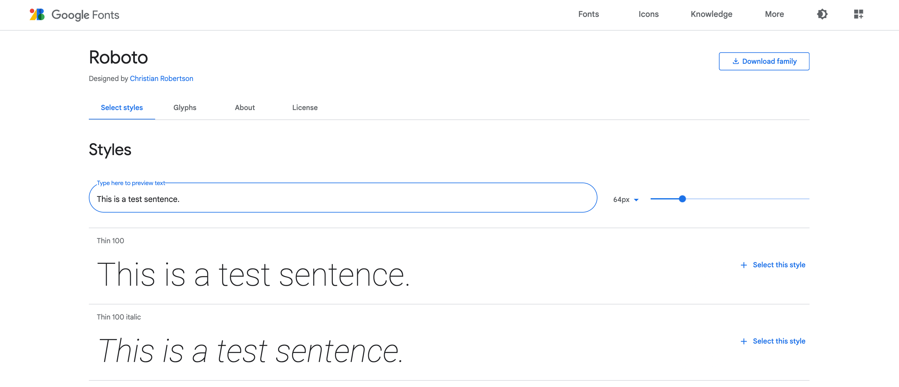
If you decide you want to use a particular font that you find, just click the “Download family” button in the top right corner. Then install it on your computer and your font will be ready to use in any desktop publishing application you use such as Microsoft Word or Pages or Adobe Photoshop.
Google fonts are also pre-embedded into many online applications such as Canva and popular website builders so that you can easily use them to create a cohesive visual aesthetic from your social media graphics to your website. Canva also has many of their own free font options and font pairings you can use in your designs as well!
Text Formatting & Other Type-Setting Techniques
Besides choosing a font style, there are a few additional things to consider when putting together any design that has typography as a focal point, such a logo, or uses a lot of text, such as your website. Adjusting the settings of your fonts and utilizing all of its features can have a huge impact on the personality and readability of your designs.
Choosing between a lighter weight font or bolder font is one way to give your text design a different dimension. You can also choose a font that has an oblique or italic version to set a different mood. Here are some additional typographic properties and settings you can explore to give your text added personality and refinement.

Kerning
Kerning is the amount of horizontal space in-between any two letters in a given word. Certain typefaces, and fonts used at a large size, require special attention to kerning in order to make sure that all the letters appear evenly spaced from each other. Bad kerning can make a word look misspelled, cause embarrassing errors or just look plain sloppy.
Tracking
Tracking, also called letter spacing, refers to the amount of negative or positive horizontal space between a series of letters or words. The default value for tracking is 0, but you can adjust it to be negative to appear condensed or positive to appear loose. A value between -10 and 10 is usually the sweet spot for most lines of text unless you are doing a special treatment. Too much of an increase or decrease in the tracking of your text in paragraphs can make it difficult to read.
Increasing the tracking between letters, especially on uppercase titles can add a feeling of elegance to your designs. Decreasing the tracking between letters is often done on text when used in logos to give it a stronger, more solid appearance.

Leading
Leading in the world of typography, also called line-height, refers to the amount of horizontal space between two or more stacked lines of text. Increasing leading between lines of text in paragraphs makes easier to read. However, logos with stacked lines of text or multi-line titles, often require less leading between their lines to make a bigger impact.

X-Height
X-height is the vertical distance of the lowercase ‘x’ character in any given font. This unit of measure can be taller, like in the font Acumin, or shorter, like in the font Brandon Grotesque, depending upon the font’s design. A font with a taller x-height is typically easier to read while a font with a shorter x-height can be harder to read. If you are using Adobe Creative Cloud program like Photoshop or Indesign, you can search for fonts by low, average, or high x-height.
Ligatures
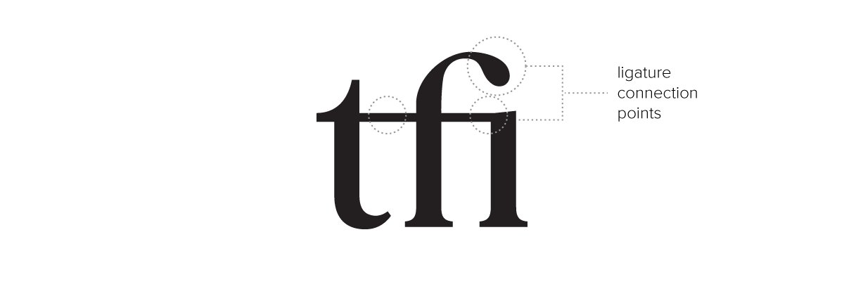
Ligatures are special configurations of letters that connects two or more characters to create a single glyph. Ligatures are often created to enhance readability or add style. For example, the letters f + i often make a great ligature because of how the f overhangs the i. A ligature for this combination typically merges the tip of the f with the dot of the i.
Other common ligatures a font might come with are ae, th, fl, fi, ffi and ffl. To see if your font has ligatures built-in, you can open the glyph panel inside of a publishing application such as Adobe Indesign or Microsoft Word. Or using a program like Adobe Illustrator, you can make your own custom ligatures by manipulating the font’s letterforms.
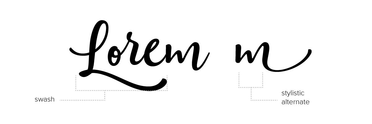
Swashes & Alternates
Many script fonts and also some types of display fonts come with additional glyphs that are variations of letters (or alternates) with added personality such as flourishes or swooping lines. Some font flourishes aren’t actually letters at all but swashes, icons or illustrations that help add even distinction to your text.
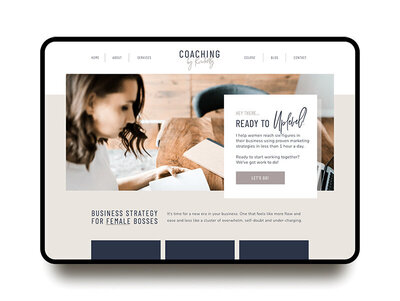
Need help choosing the right types of font styles for your brand or creating professional looking typography for your business? Contact K Design Co. for help.
This post was originally published December 18, 2014 and was recently updated with more helpful, accurate and timely information. Cheers!

I help female entrepreneurs and business owners create brands that command the spotlight. I love working with women to help them create beautiful, one-of-a-kind brands that give them the confidence to take their business to the next level and get them seriously noticed. I’ve worked with coaches, authors, influencers… you name it, and I bet I can help you too.