There are virtually an unlimited number of ways to mix and match colors for your brand. You can choose dark and moody, or light and airy, or anywhere in between. But if you want to go for a soft and whimsical vibe, you should definitely consider a pastel color palette.
What are pastel colors?
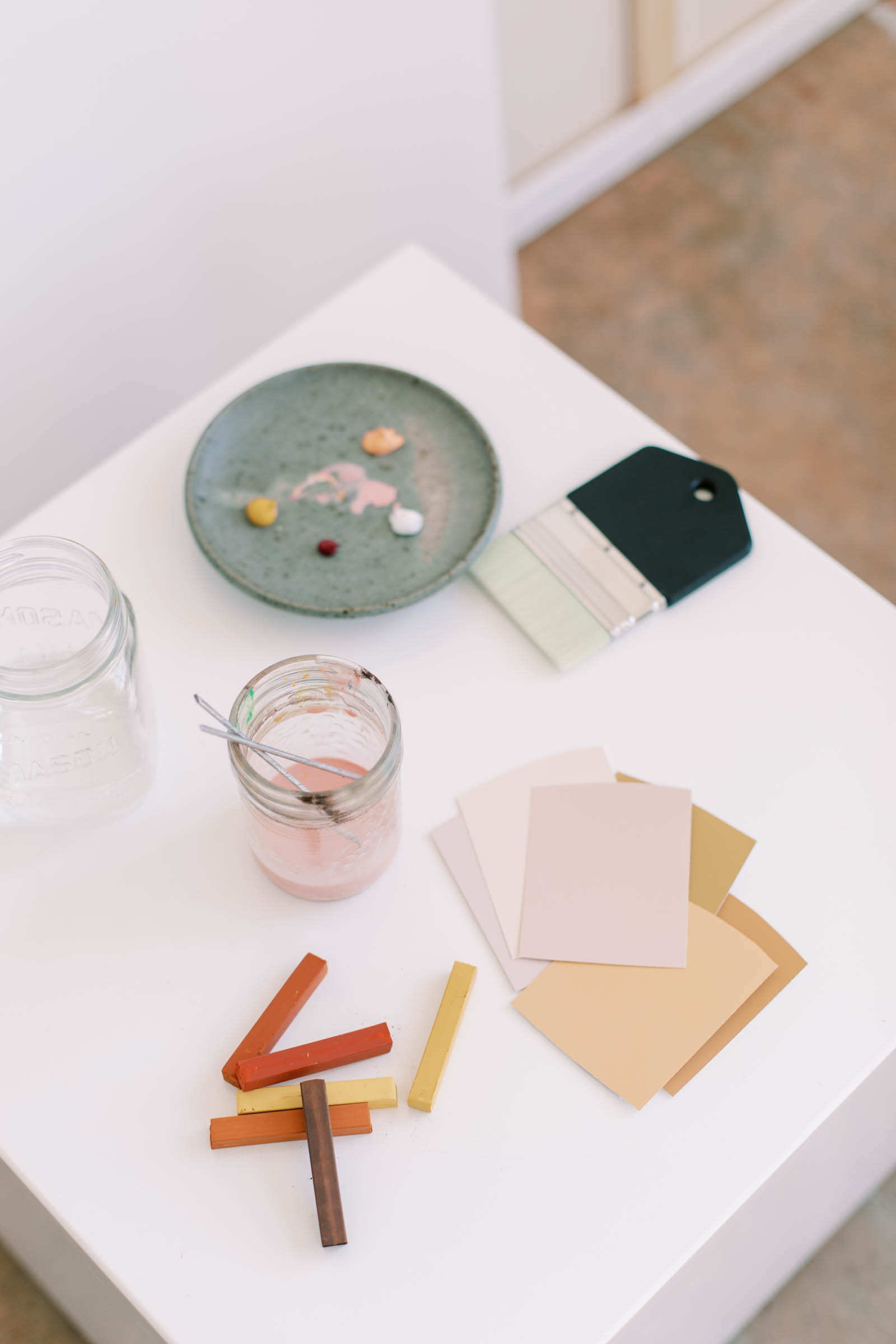
They are exactly what you think… A pastel color is a low-saturated, lighter version of another color. If you’re mixing paint, you can create a pastel version of any color by adding white to the original color or mixing in complementary colors that will make the original color appear more muted. When you add white and/or neutralizing colors, the more ‘pastel’ the color will become.
For example, think of pink like a pastel version of red. And if you add white to pink, you’ll get an even lighter pink, or pastel pink.
On the web, where we use a light-based color system (R-Red, G-Green, B-Blue) instead of actual paint, the closer your color values are to 255 (the max value of light possible), the lighter and more pastel it will appear. And did you know that pastel colors can be referred to as ‘tints’?
What are some common uses for pastel color palettes?
Pastel color palettes can be used in tons of different applications such as branding, web design, fashion, interior design, and art. It is also really common to use pastels in projects related to weddings, baby products, wellness, or really, any design needing a soft, approachable feel.
If you want to create feelings of calmness, relaxation, and positivity, a pastel color palette is the perfect option. Pastel colors can make a space or design feel welcoming, gentle, and soothing.
To make pastel colors stand out, pair them with contrasting darker tones or use them in large, bold shapes. Adding texture or gradients can also enhance their impact.
Pastel color palettes you’ll love
The color combinations you can make with pastel colors are endless, but here are some that we came up with that we think you’ll be inspired by!

Cotton Candy Cloud – Pink, Blue & Purple Color Palette
A dreamy blend of pastel pinks, blues, and purples that evoke the sweet, whimsical feel of cotton candy. Ideal for playful and imaginative designs.
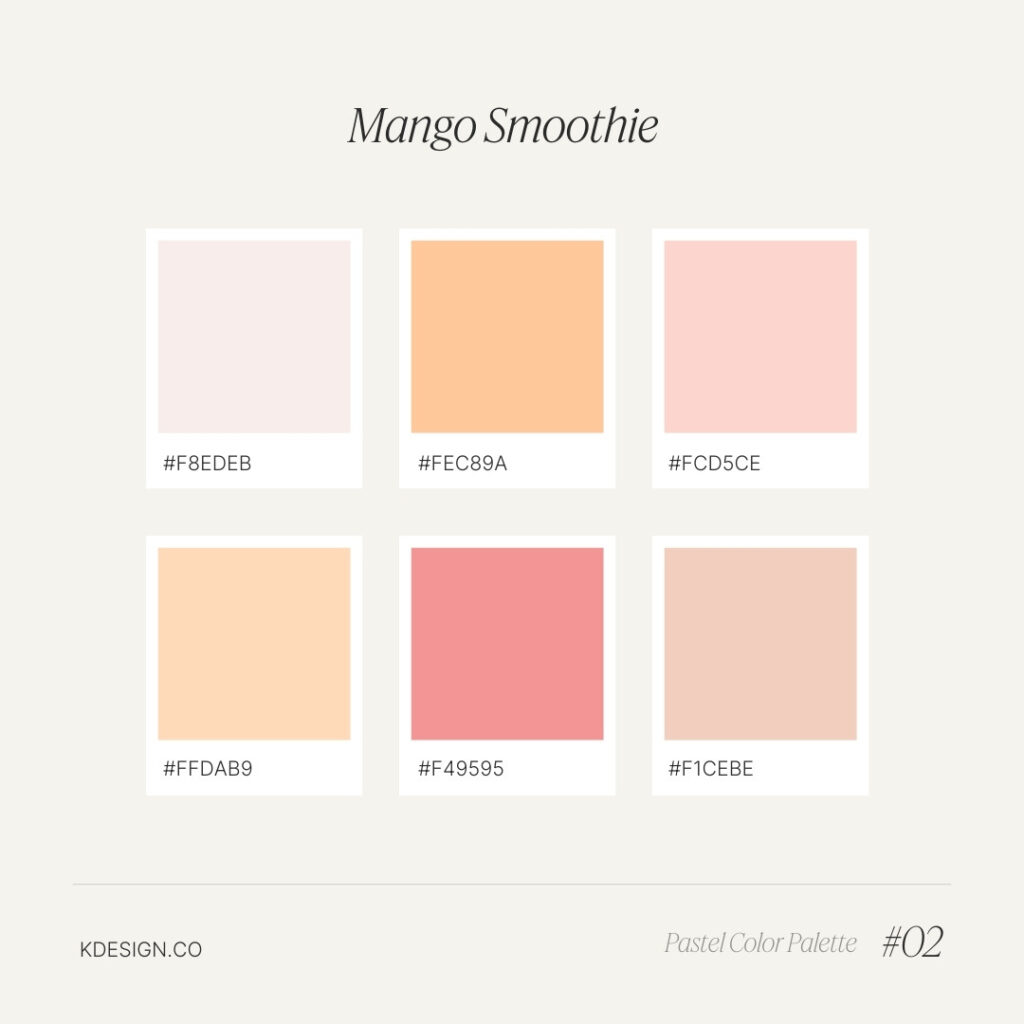
Mango Smoothie – Warm Pastel Color Palette
A tropical blend of warm pastels inspired by the soft hues of a refreshing mango smoothie. Perfect for summer-themed or food-related designs.
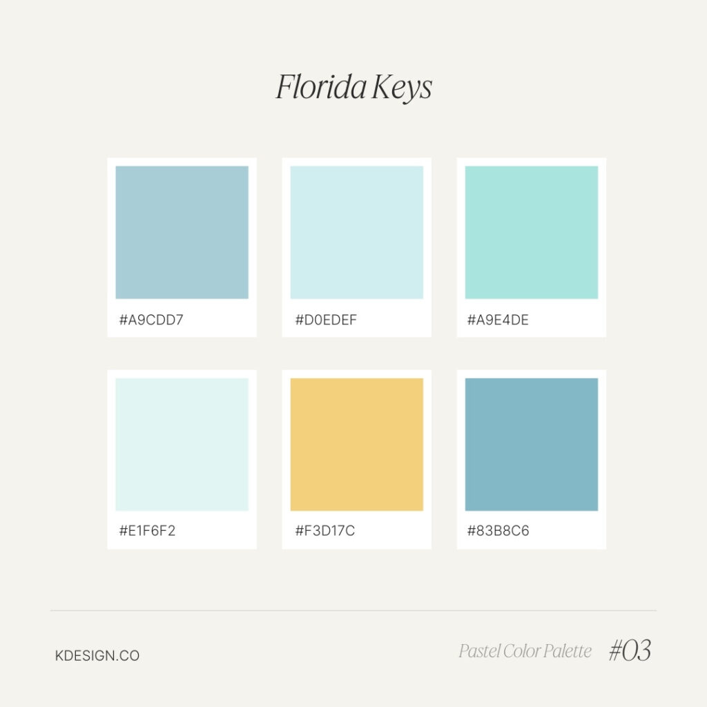
Florida Keys – Tropical Pastel Color Palette
Inspired by the vibrant hues of the Florida Keys, this palette features soft tropical pastels that bring a sunny, beachy vibe to any project or design.
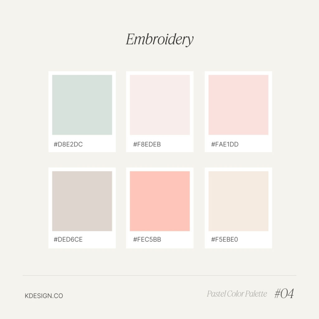
Embroidery – Soft Earth Tone Color Palette
Warm, muted earth tones come together in this palette, reminiscent of hand-stitched embroidery. Perfect for rustic, handcrafted, and cozy design projects.
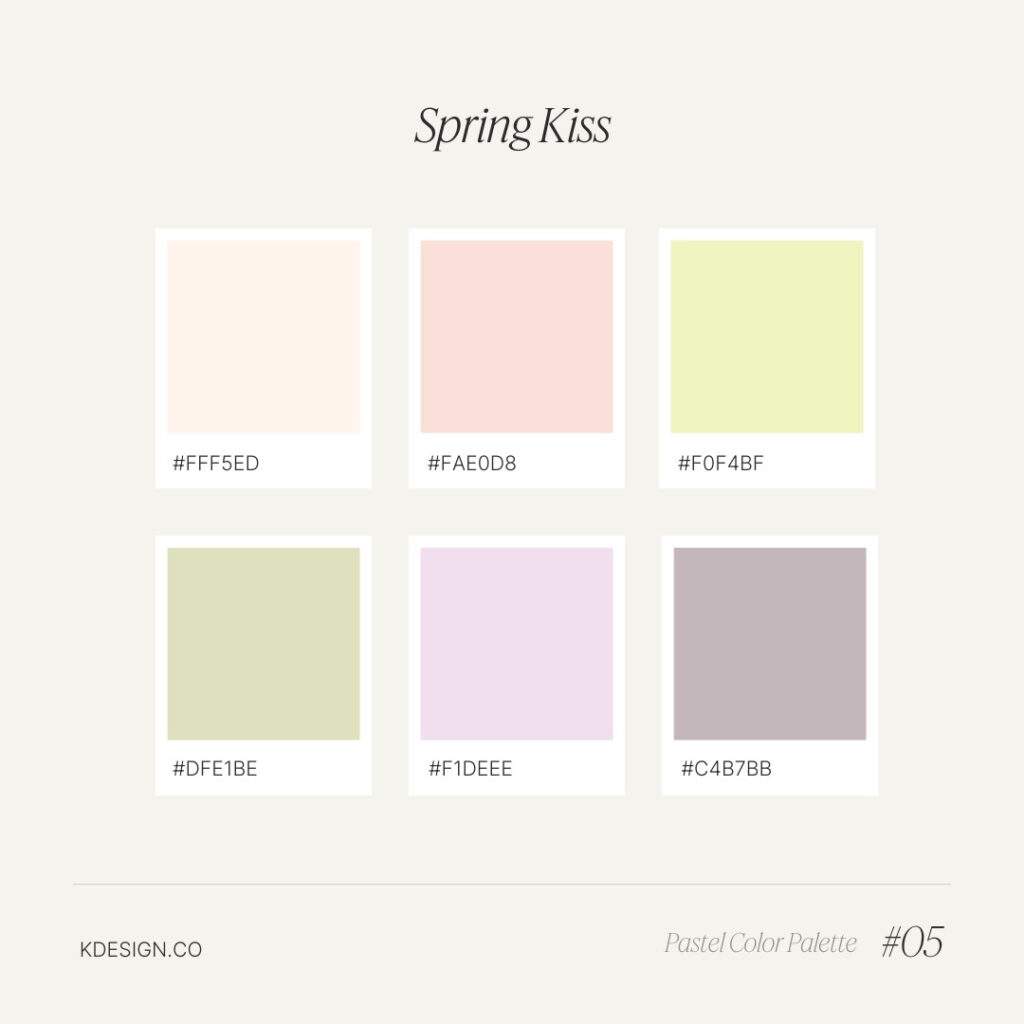
Spring Kiss – Fresh Pastel Color Palette
A lively mix of fresh pastels inspired by the first blooms of spring, perfect for designs that need a bright, uplifting touch.
Can’t get enough of these pink palettes? Check these Girly color palettes out too!
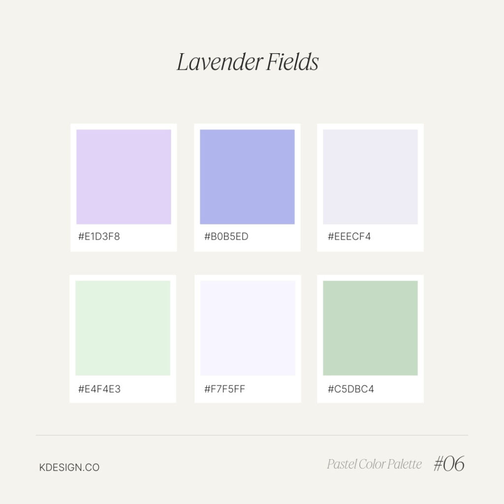
Lavender Fields – Purple Pastel Color Palette
A soothing palette of various lavender and green shades, perfect for creating a tranquil, calming atmosphere reminiscent of blooming lavender fields.
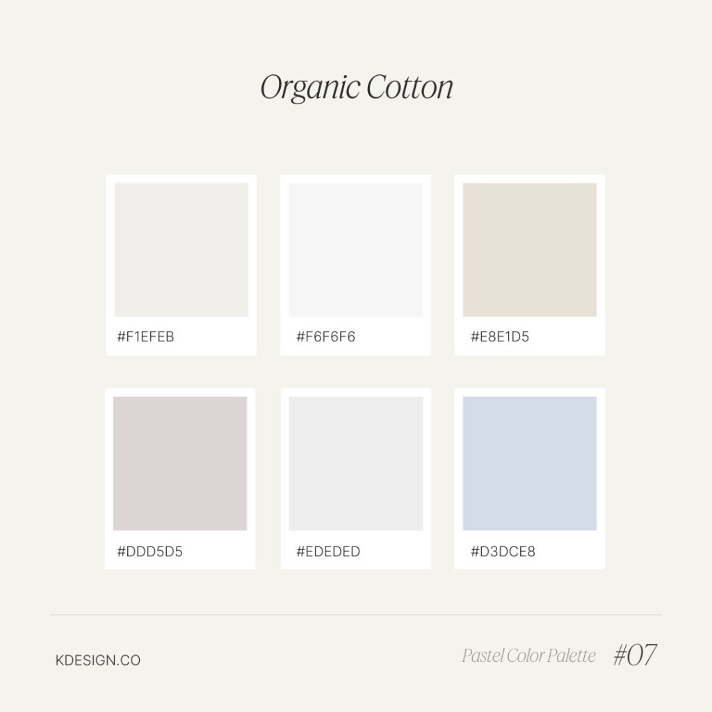
Organic Cotton – Neutral Earth Tone Pastel Color Palette
A soothing blend of earthy neutrals, this palette is perfect for designs that focus on sustainability and natural beauty, ideal for organic or eco-friendly projects.
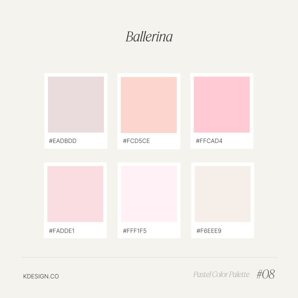
Ballerina – Pink & Peach Pastel Color Palette
Delicate pinks and peach tones create an elegant, feminine palette reminiscent of ballet slippers and tutus. Perfect for designs that need a graceful, airy touch.
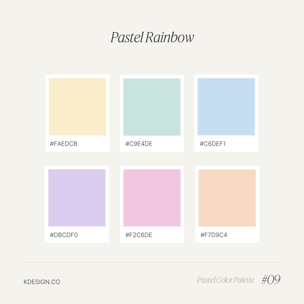
Rainbow – Multicolor Pastel Palette
A cheerful array of pastel colors, this palette captures the full spectrum of a soft rainbow, ideal for playful, inclusive, and joyful design projects.
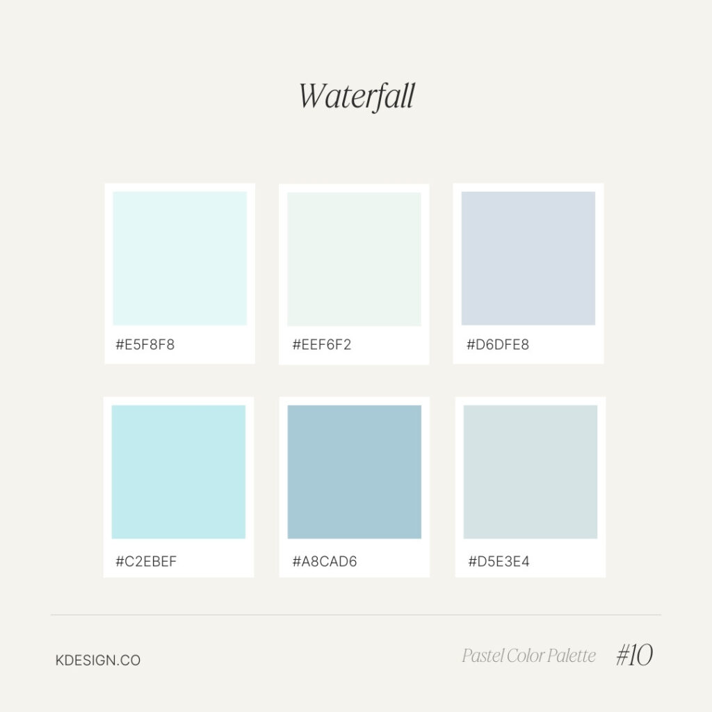
Waterfall – Blue & Aqua Pastel Color Palette
A serene mix of soft blues and aquas, this palette evokes the calming essence of cascading waterfalls. Perfect for designs that need a fresh, tranquil feel.
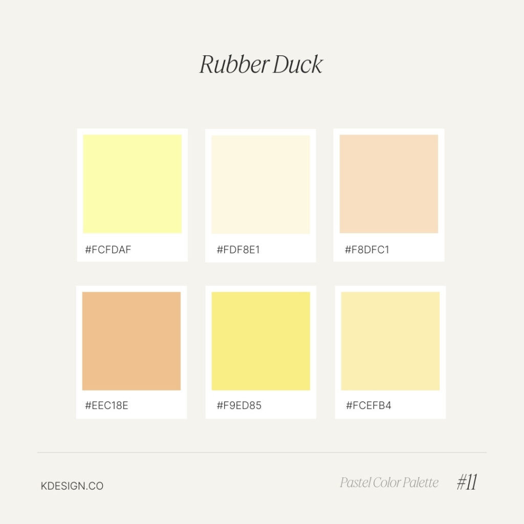
Rubber Duck – Yellow & Orange Pastel Color Palette
Inspired by the classic rubber duck, this palette features soft yellows and orange, perfect for playful, child-friendly designs.
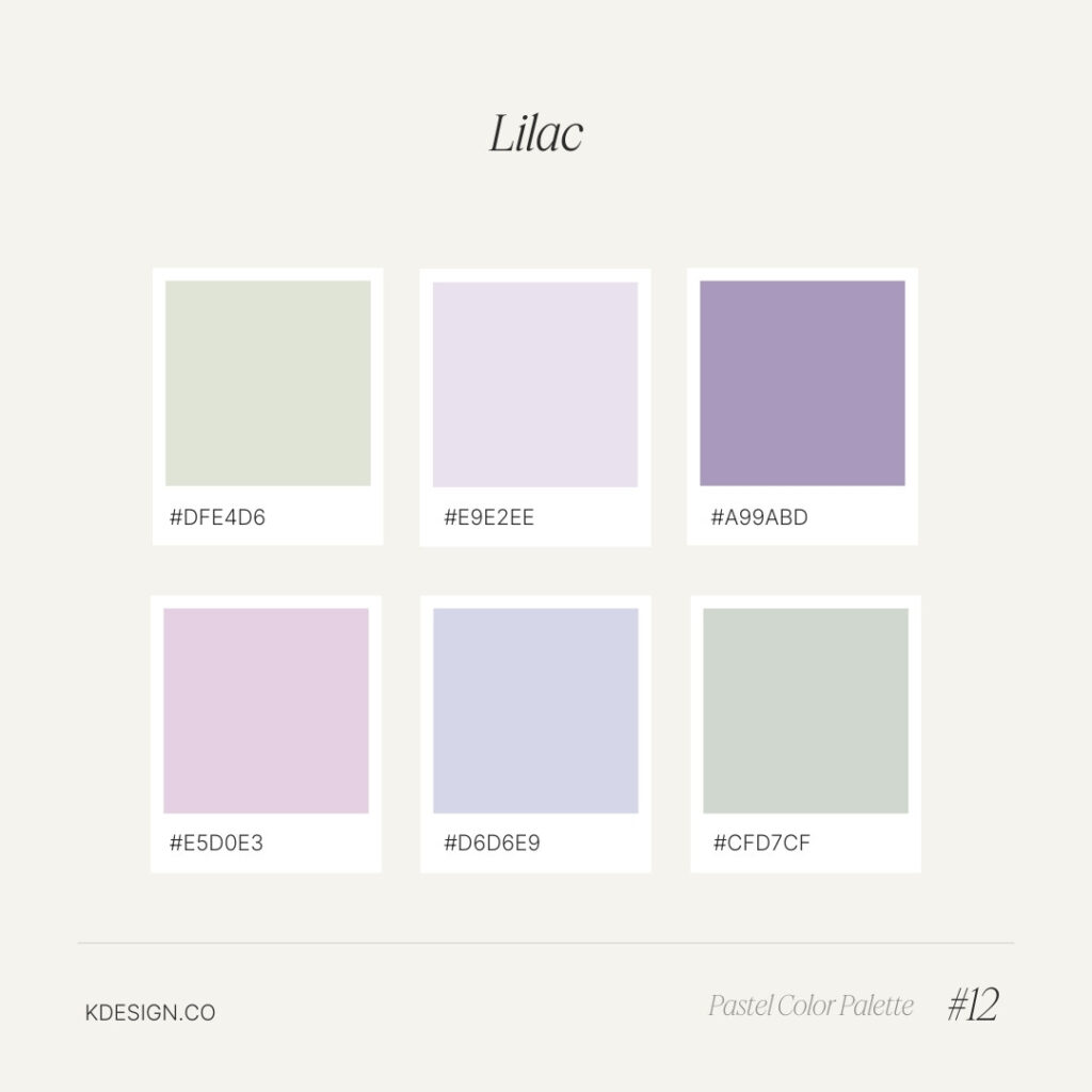
Lilac – Light Purple Pastel Color Palette
This palette features a range of soft lilac tones, perfect for adding a gentle, romantic feel to any design. Ideal for spring-themed projects.
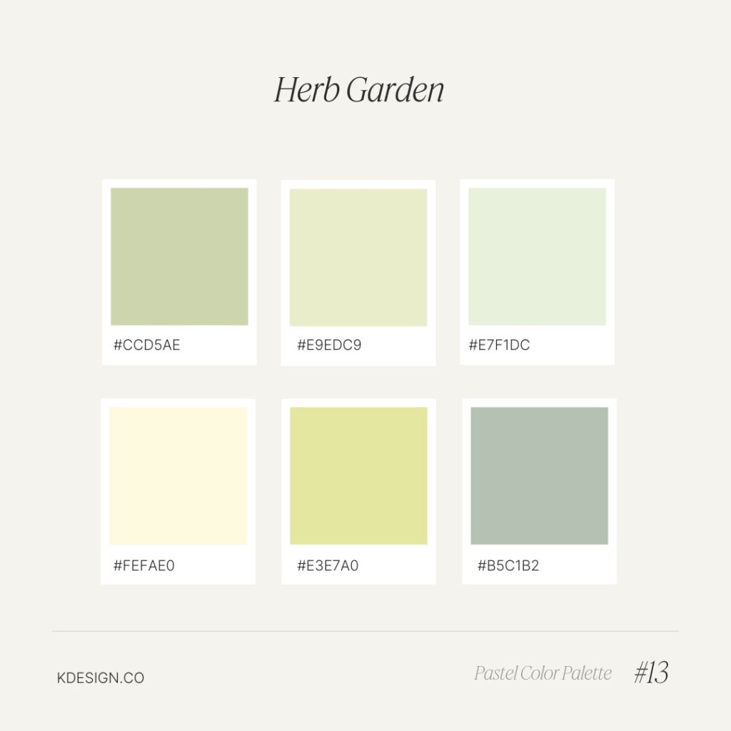
Herb Garden – Green Pastel Color Palette
Soft greens dominate this palette, inspired by the lush, calming tones of an herb garden. Perfect for botanical and nature-inspired designs.
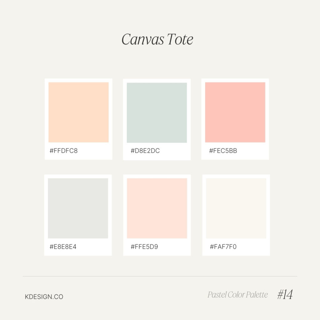
Canvas Tote – Neutral Pastel Color Palette
This palette combines soft neutrals and pinks, perfect for minimalist designs or projects that seek a clean, natural aesthetic. Think soft linen and organic textures.
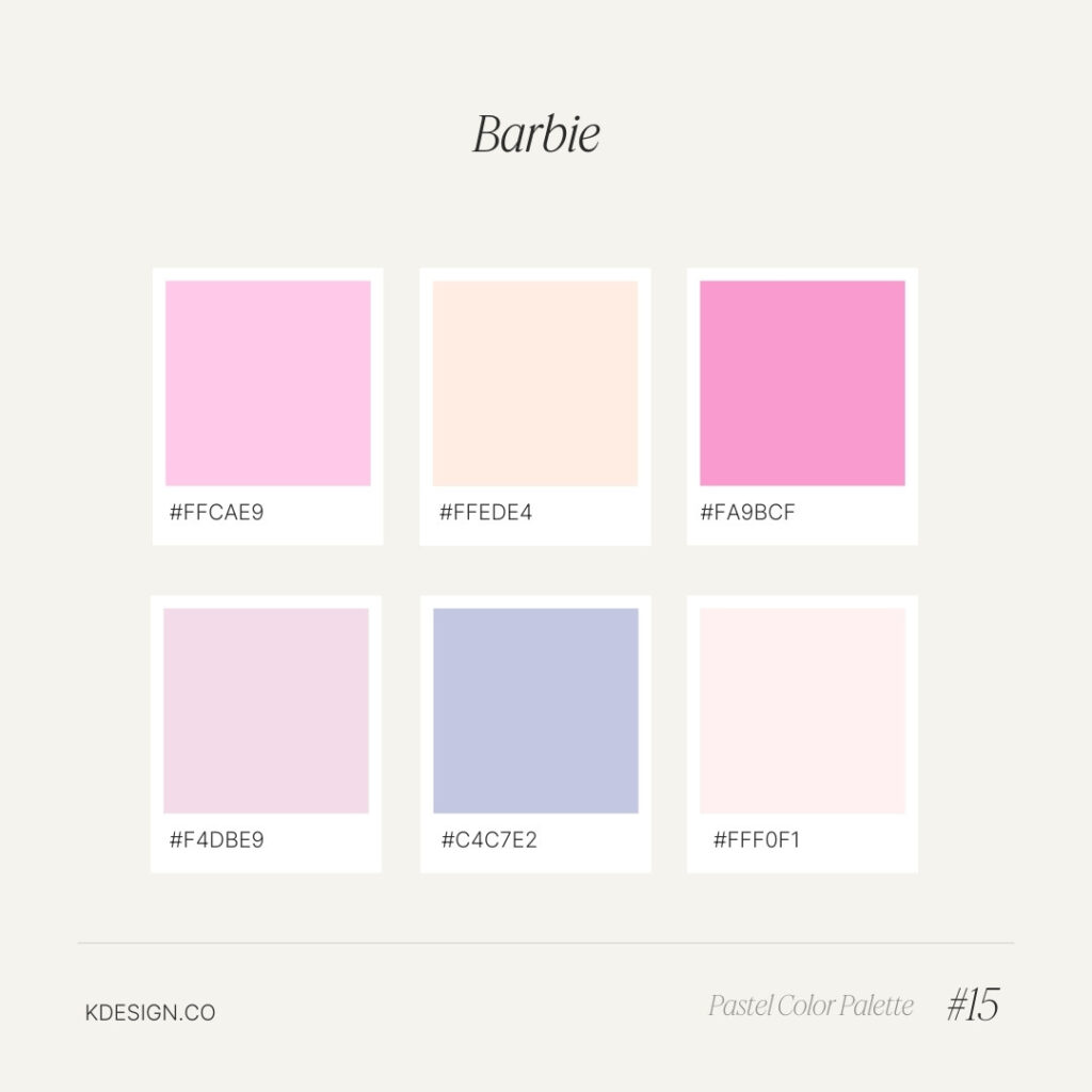
Barbie – Pink & Pastel Color Palette
A quintessential Barbie-inspired palette featuring a variety of soft pinks, perfect for any project that wants to channel that iconic, playful glamour.
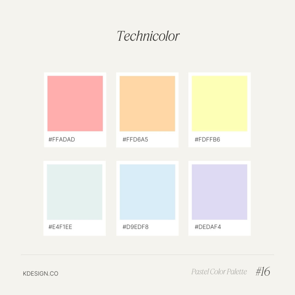
Technicolor – Bright Multicolor Pastel Palette
A vibrant mix of bright pastels, this palette is perfect for designs that need a burst of playful energy and a pop of color. Ideal for modern, dynamic projects.

Faded Glory – Muted Vintage Pastel Color Palette
A collection of desaturated pastels that evoke a sense of faded grandeur, perfect for vintage-inspired designs with a timeless, nostalgic feel.
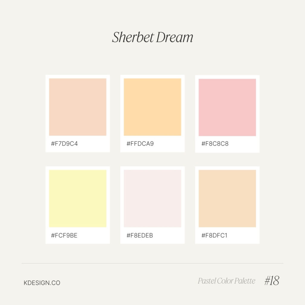
Sherbet Dream – Pink & Orange Pastel Color Palette
A sweet blend of pastel pinks and oranges, this palette is inspired by the soft, dreamy colors of sherbet. Ideal for cheerful, whimsical designs.

Sandy Beach – Neutral Pastel Color Palette
Soft, sandy tones dominate this palette, evoking the tranquil feel of a calm beach day. Perfect for coastal or nature-inspired designs.
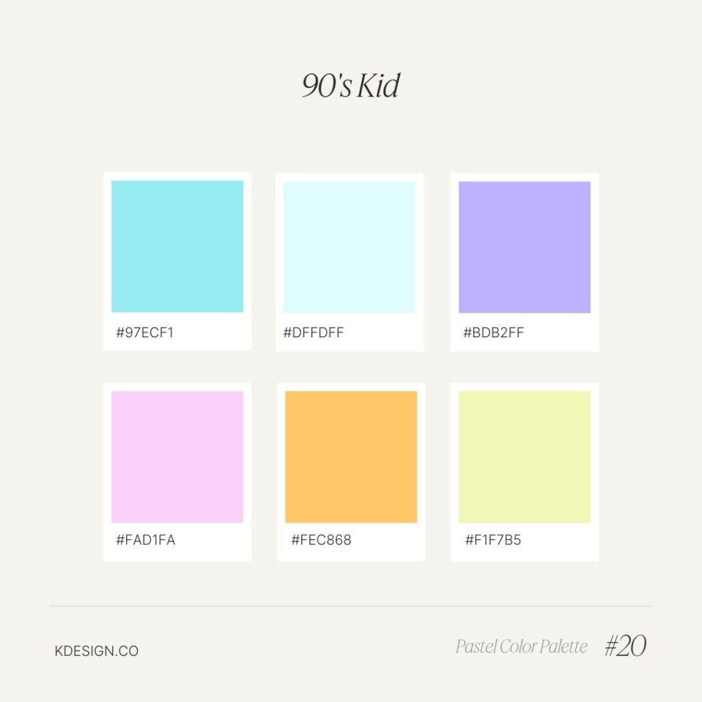
90s Kid – Retro Pastel Color Palette
A nostalgic blend of muted neons and soft tones, this palette captures the playful, retro vibe of the 90s. Ideal for designs inspired by vintage pop culture.
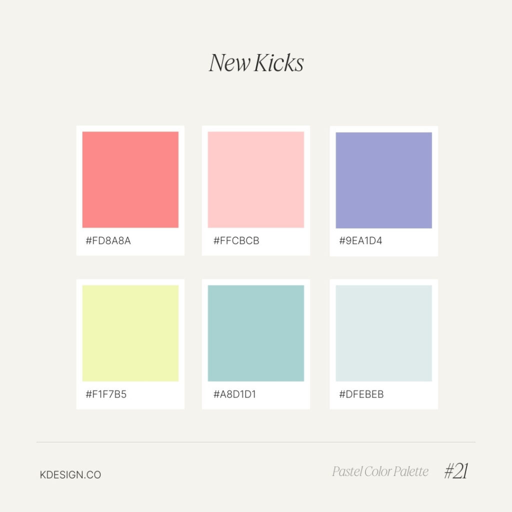
New Kicks – Bright Pastel Color Palette
Inspired by the pop of color in a fresh pair of sneakers, this palette features vibrant pastels that add energy and fun to any project.
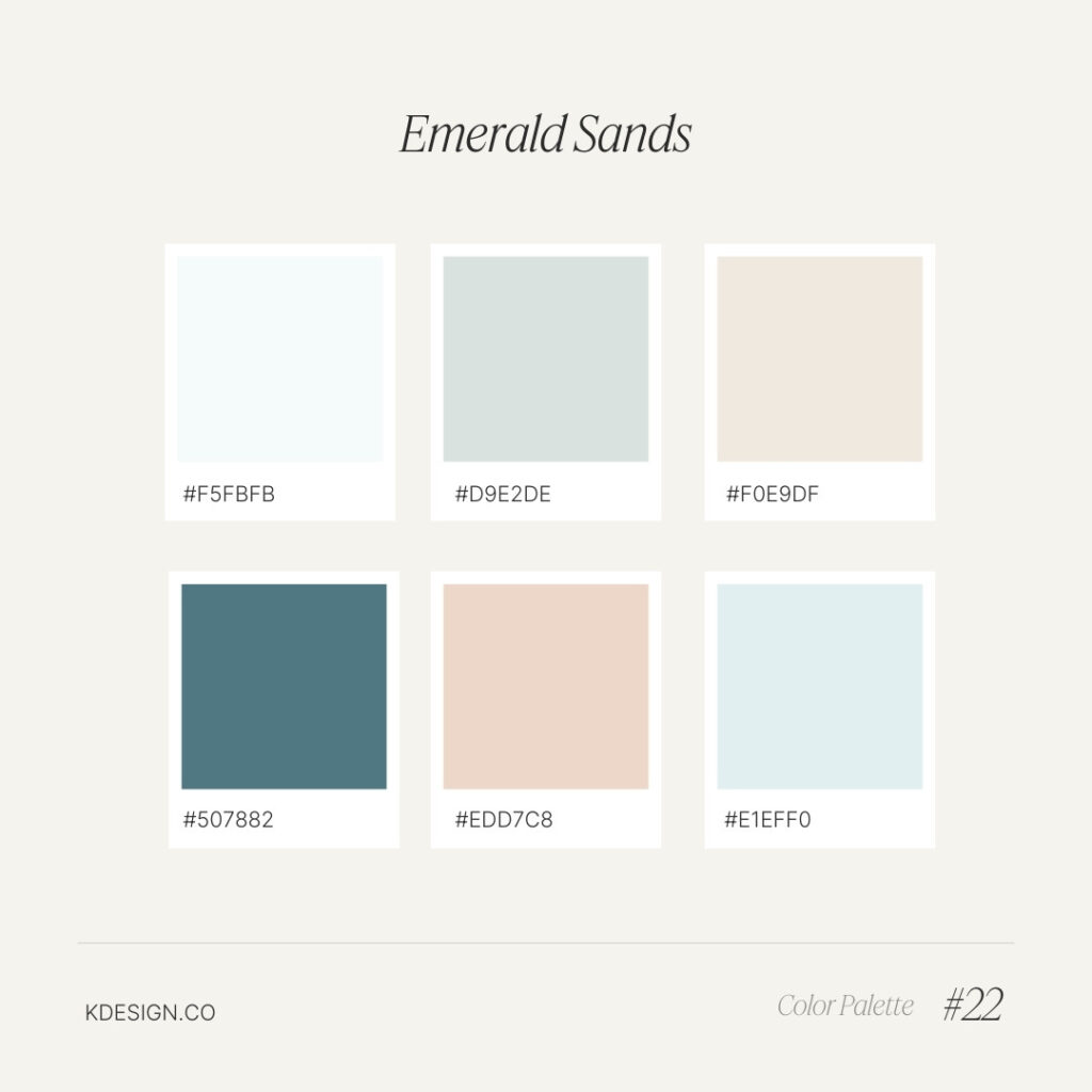
Emerald Sands – Green & Beige Pastel Color Palette
A sophisticated mix of muted emerald greens and sandy beiges, this palette is perfect for earthy, elegant designs inspired by natural landscapes.
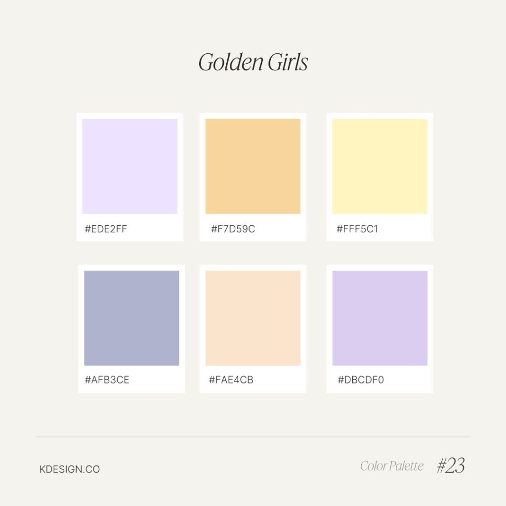
Golden Girls – Warm Pastel Color Palette
A warm and inviting mix of pastel hues, this palette is perfect for designs inspired by the retro charm and bold personalities of the Golden Girls era.
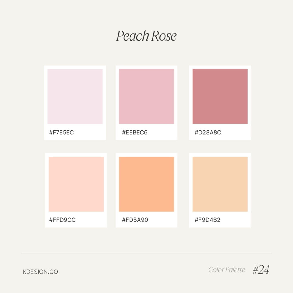
Peach Rose – Soft Peach & Pink Pastel Color Palette
A delicate mix of peach and pink tones, perfect for creating a soft, romantic aesthetic reminiscent of blooming roses. Ideal for wedding and feminine designs.
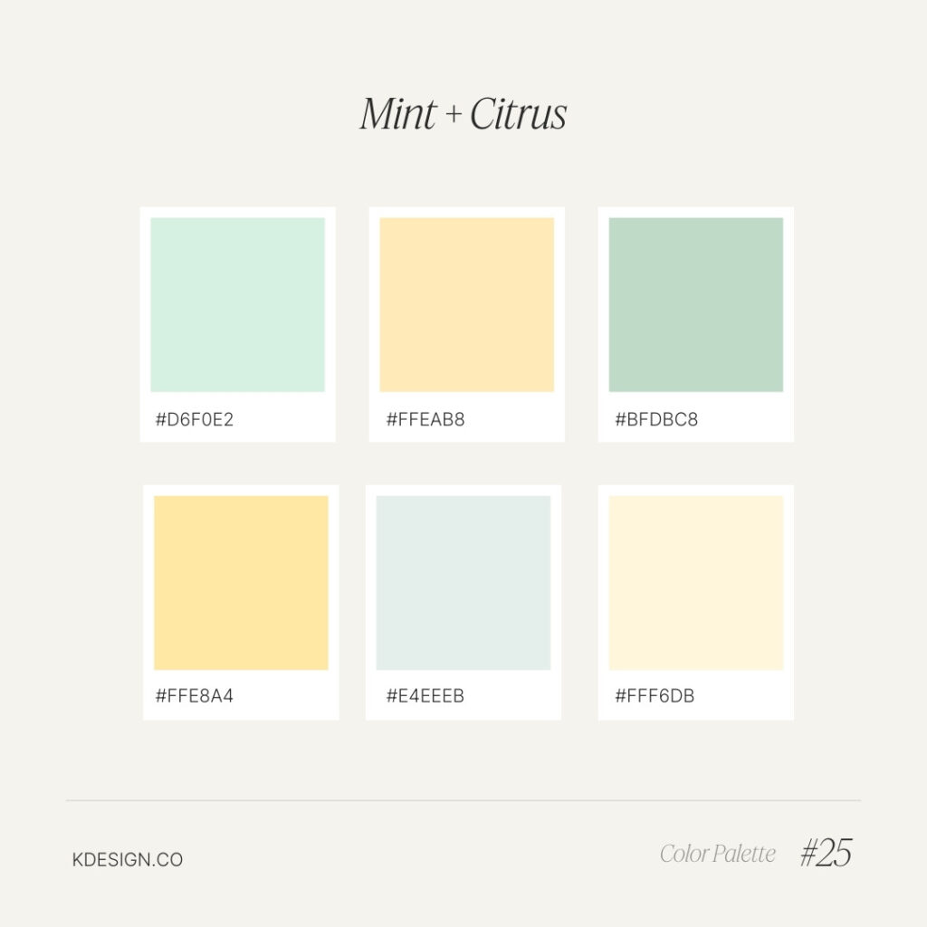
Mint and Citrus – Fresh Green & Yellow Pastel Color Palette
A refreshing mix of mint greens and citrus yellows, this palette brings a bright, zesty vibe to any design, perfect for fresh, lively projects.
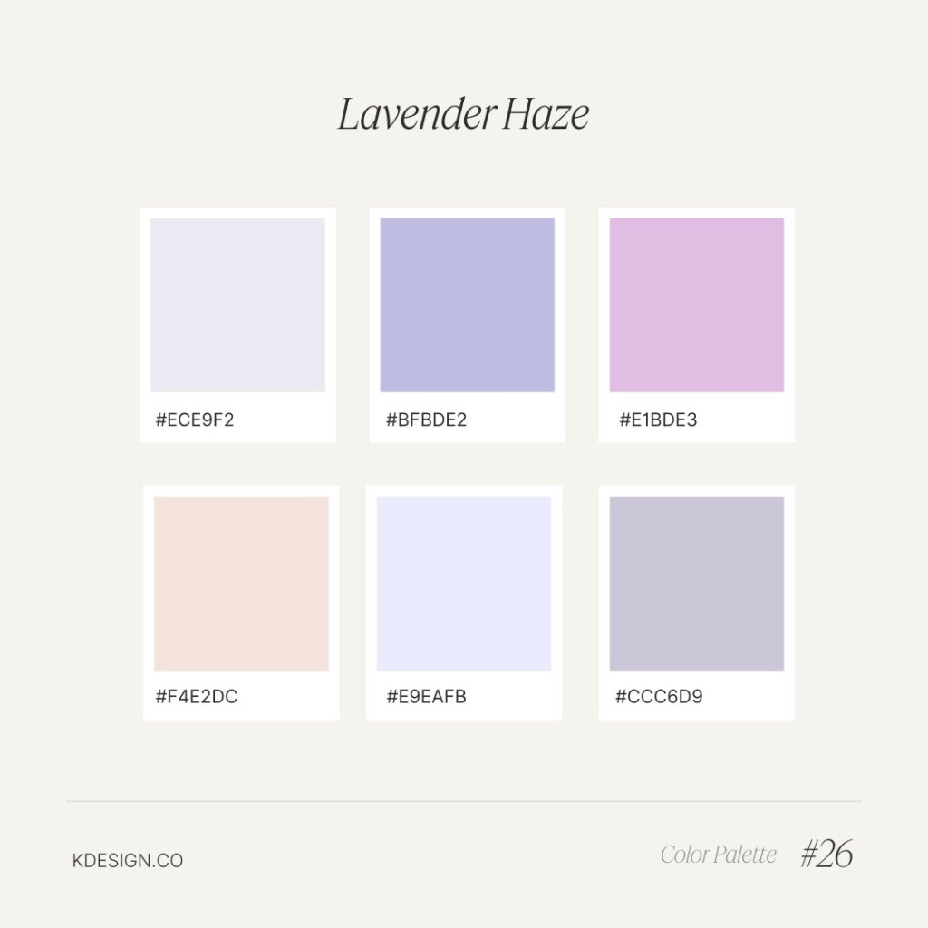
Lavender Haze – Soft Purple Pastel Color Palette
A dreamy mix of soft purples, this palette is inspired by a hazy, ethereal landscape. Ideal for designs that need a mystical, romantic touch.
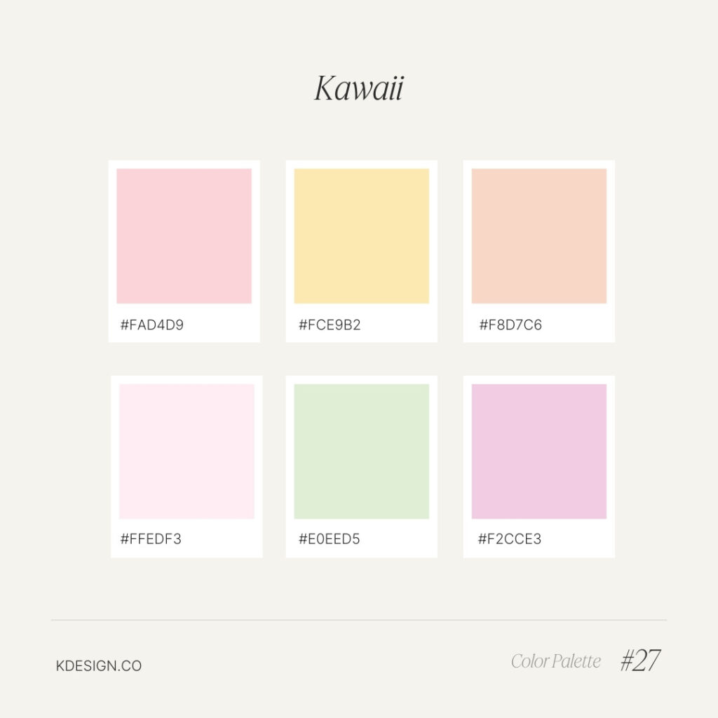
Kawaii – Pastel Pink & Mint Color Palette
A cute and playful palette featuring pastel pinks and mints, perfect for designs inspired by the sweet and adorable Kawaii aesthetic.
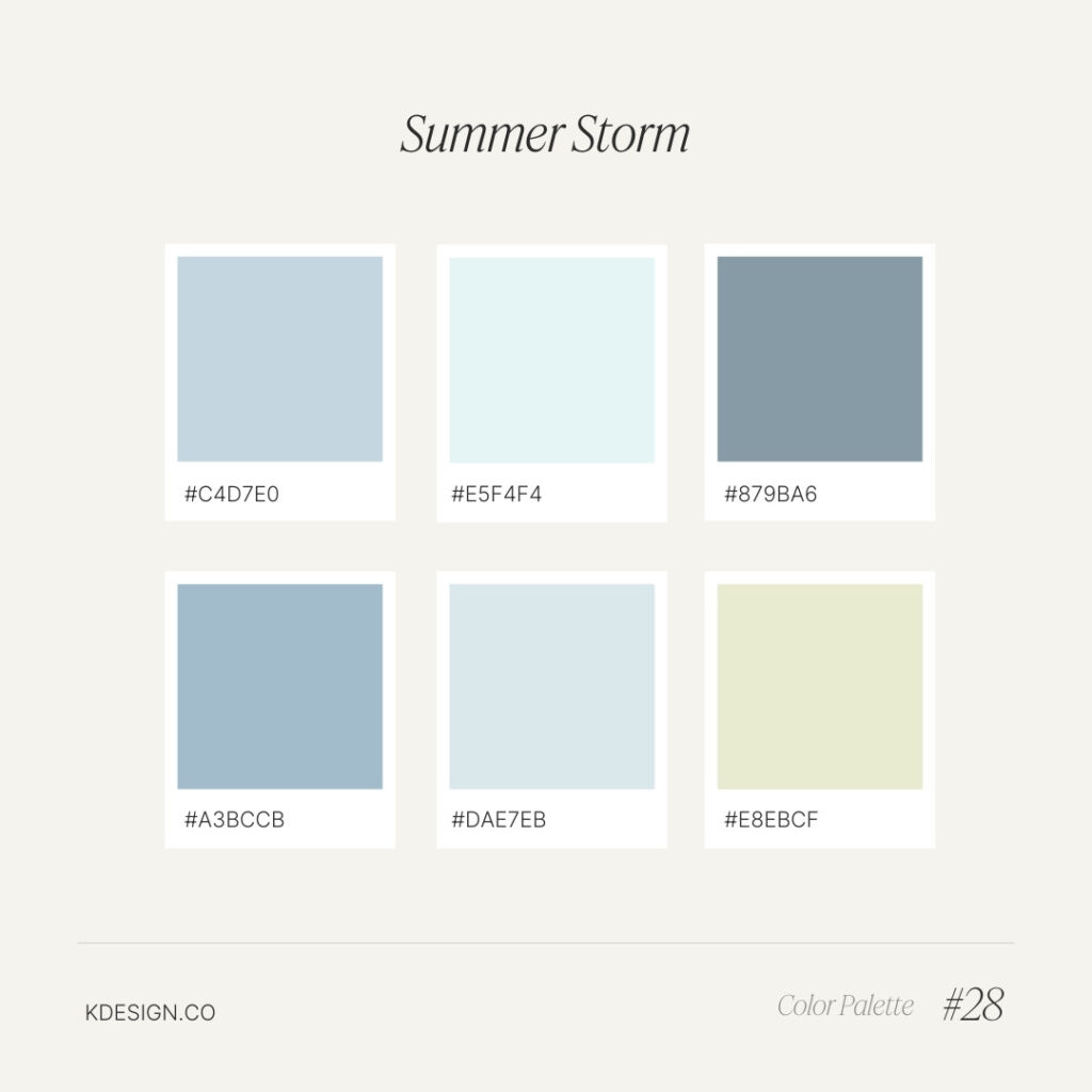
Summer Storm – Cool Gray & Blue Pastel Color Palette
A soothing palette of cool blues and aquas, inspired by the calm before and after a summer storm. Perfect for creating a serene, tranquil atmosphere.
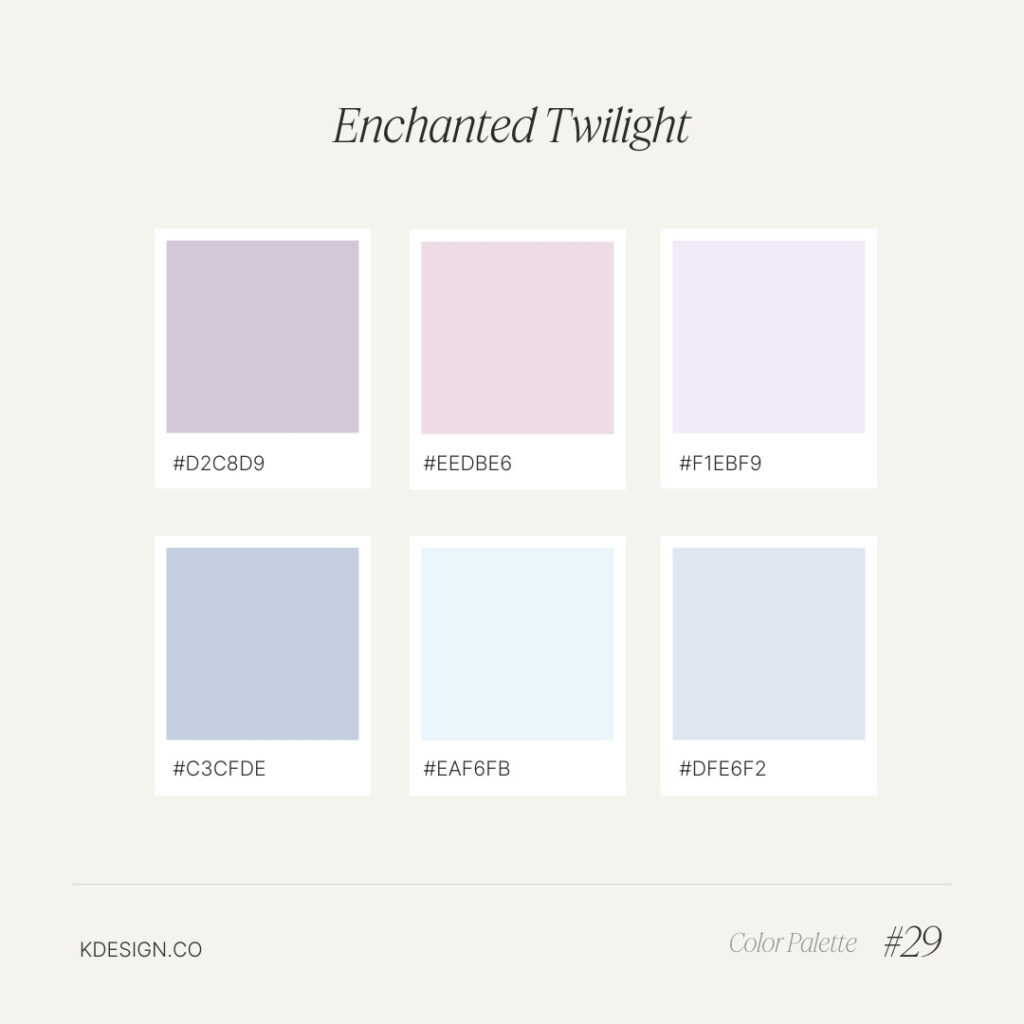
Enchanted Twilight – Pastel Purple, Pink & Blue Color Palette
A magical blend of dusky purples, soft pinks, and gentle blues, this palette captures the mystical essence of twilight. Ideal for dreamy, ethereal designs.
What did you think of our pastel color combinations? Or maybe you need some accessible color palette ideas?
Even though a beautiful pastel color palette isn’t hard to make, choosing the colors for your brand might seem overwhelming. If you feel stuck choosing the perfect color palette for your brand, we got you!
Reach out to K Design Co. for a custom brand design.
