Use Code SUMMER at Checkout

GET 20% OFF IN THE SHOP

00D 00H 00M 00S
woman looking at different color palettes for her brand

13 Accessible Color Palettes for Stunning, User-Friendly Designs

May 14, 2024

filed under  //

DESIGN TIPS
on Tap

Get my best tips and tricks on design & marketing in your inbox every week.

HOT TOPICS

Subscribe

1

Search:

Have you ever visited a website or used an app and found it hard to read the text, distinguish buttons, or make out important information because of poor color choices?

This happens more than you think. Many designers and website DIYers underestimate the importance of accessible color palettes when creating digital content, but it can have a huge impact on the user experience.

In this post, I want to talk about accessible color palettes and why they matter. I’ll also share some eye-catching color schemes that not only look great, but also meet accessibility guidelines for contrast ratios.

WCAG 2.0 level AA requires a contrast ratio of at least 4.5:1 for normal text and 3:1 for large text. 

WebAIM.org

So, whether you’re designing a website, an app, or any other digital content, you’ll feel confident to create designs that everyone can enjoy.

Why Accessible Color Palettes Matter

Before I dive into our inspirational accessible color palettes, I want to discuss why accessible color palettes are crucial. Designing with accessibility in mind means making your content available to as many people as possible, regardless of their visual impairments. It’s a matter of inclusion and usability.

Let’s say you’re designing a website, and your color choices make it challenging for users with color blindness to distinguish essential elements or read the text. You might unintentionally exclude a portion of your audience, which isn’t the goal for any designer.

Using an accessible color palette for your designs ensures that your content is:

  1. Legible for All: A well-considered color palette enhances the legibility of your content, ensuring that text stands out against the background.
  2. Inclusive: By following accessibility guidelines, you can accommodate individuals with visual impairments, ensuring that your designs are inclusive and user-friendly for everyone.
  3. Compliant: Many countries and organizations have legal requirements for digital accessibility. Compliant color choices help you meet these standards.

Related Post: Web Content Accessibility Guidelines (WCAG): Make Your Website Accessible

How do I know if my color palette is accessible?

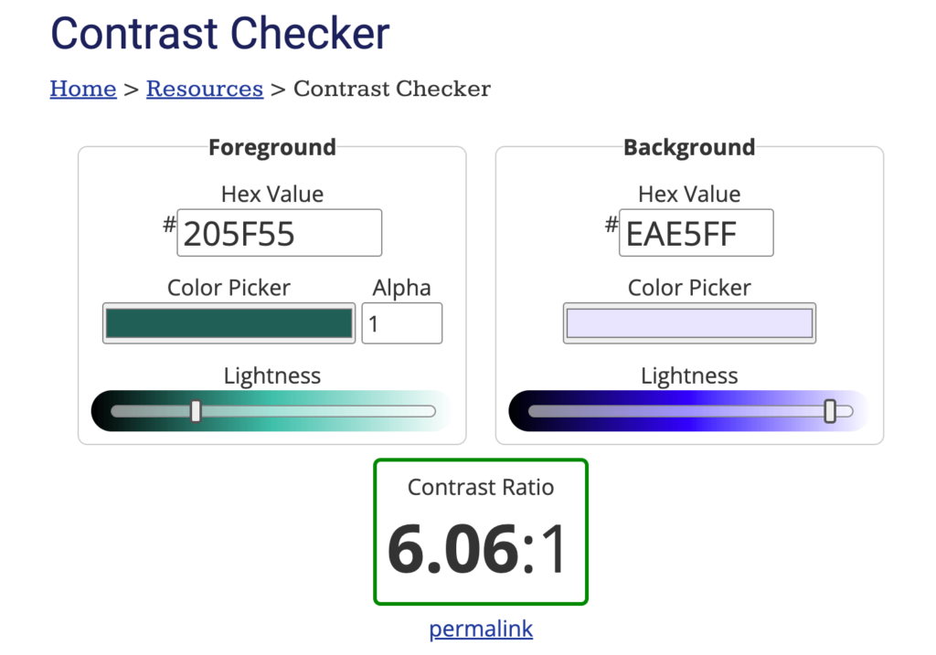
If you’re looking for an easy tool to help you determine whether your color palette is accessible, WebAIM has a super simple, color contrast checker that I love to use!

Just pop in any combination of 2 different hex code colors, and it will tell you if there is enough contrast to use those colors together for text at larger and smaller sizes.

Accessible Color Palette Examples

Now, for the good stuff!

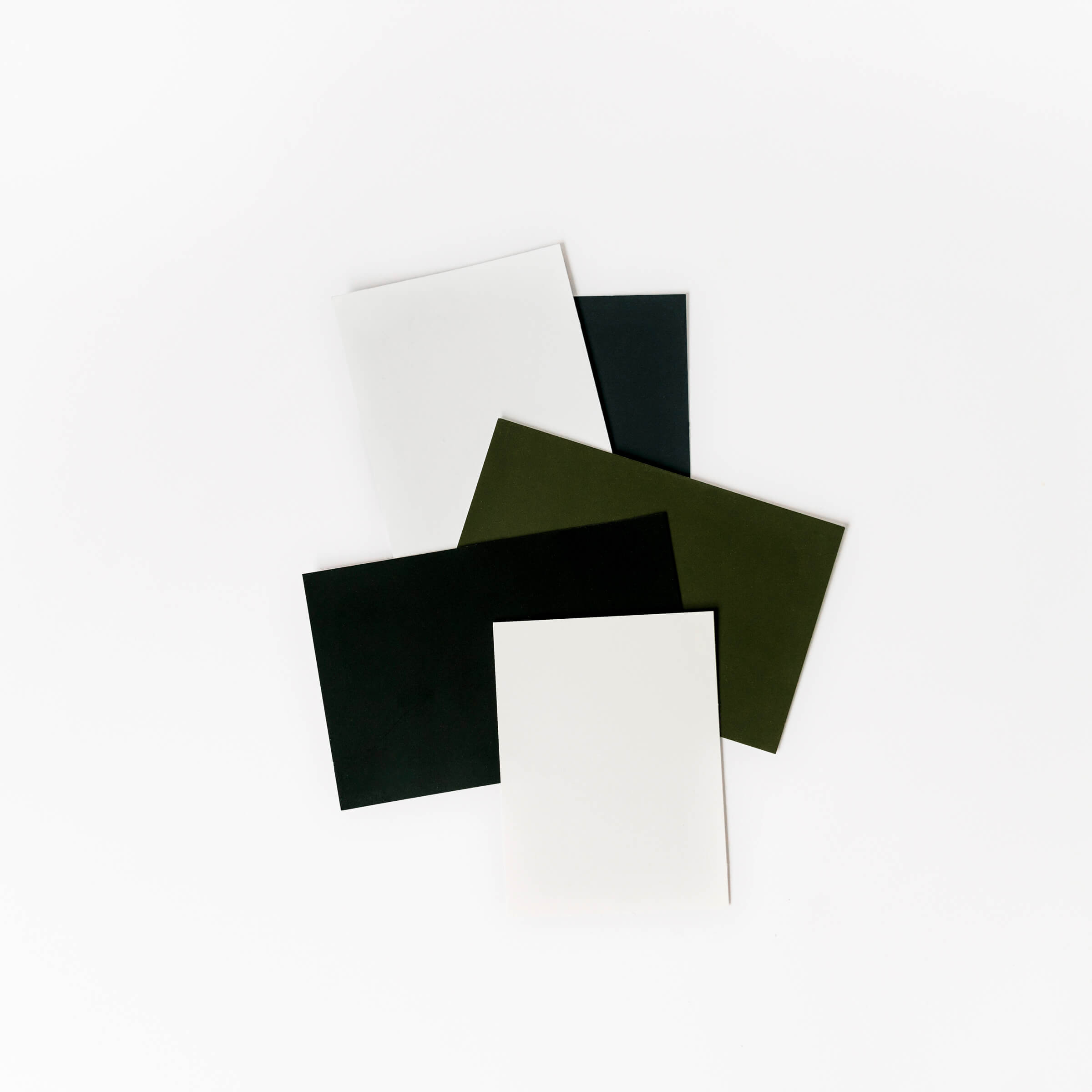
Take a peek at some accessible color palettes that you can use in your designs or use as a starting point to develop your own color palettes. These color palettes not only meet accessibility standards for WCAG 2.0 level AA but also look stunning and can bring boldness to your designs.

Keep in mind, not all color combinations meet accessibility criteria necessarily, but to make it easy for you, I highlighted the darkest and lightest color combos that I have personally tested for accessibility + are proven to have good contrast.

Psst… if you use one of my color palettes, make sure to tag me on Instagram @thekdesignco so I can see what you made 🙂

Color Palette #1: Lavender Meadow

  • Primary Color: Iris (#7855F)
  • Light Color: White Lilac (#EFE6F4)
  • Dark Color: Mulled Wine (#463769)

Iris

#8754ff

RGB: 135, 84, 255

CMYK: 47, 67, 0, 0

White Lilac

#ebe6f5

RGB: 235, 230, 245

CMYK: 4, 6, 0, 4

Lemon Chiffon

#fff8c9

RGB: 255, 248, 201

CMYK: 0, 3, 21, 0

Light Orchid

#dea4c5

RGB: 222, 164, 197

CMYK: 0, 26, 11, 13

Apricot Peach

#fcc9b5

RGB: 252, 201, 181

CMYK: 0, 20, 28, 1

Mulled Wine

#463769

RGB: 70, 55, 105

CMYK: 33, 48, 0, 59

Color Palette #2: Coastal Breeze

  • Primary Color: Deep Cerulean (#0077B6)
  • Light Color: Sky (#BFD7EA)
  • Dark Color: Night (#0A2E4E)

Deep Cerulean

#0077b6

RGB: 0, 119, 182

CMYK: 100, 35, 0, 29

Sky

#bfd7ea

RGB: 191, 215, 234

CMYK: 18, 8, 0, 8

Coral

#fa7268

RGB: 250, 114, 104

CMYK: 0, 54, 58, 2

Mandys Pink

#f1b7a5

RGB: 241, 183, 165

CMYK: 0, 24, 32, 5

Powder

#f8f9fa

RGB: 248, 249, 250

CMYK: 1, 0, 0, 2

Night

#0a2e4e

RGB: 10, 46, 78

CMYK: 87, 41, 0, 69

Color Palette #3: Vintage Charm

  • Primary Color: Berry (#8B0000)
  • Light Color: Romantic (#FFCCB5)
  • Dark Color: Cocoa (#4F4141)

Red Berry

#8b0000

RGB: 139, 0, 0

CMYK: 0, 100, 100, 45

Romantic

#ffccb5

RGB: 255, 204, 181

CMYK: 0, 20, 29, 0

Golden Grass

#daa520

RGB: 218, 165, 32

CMYK: 0, 24, 85, 15

Spanish Green

#839584

RGB: 131, 149, 132

CMYK: 12, 0, 11, 42

Champagne

#faebd7

RGB: 250, 235, 215

CMYK: 0, 6, 14, 2

Cocoa

#4f4141

RGB: 79, 65, 65

CMYK: 0, 18, 18, 69

Color Palette #4: Neon Lights

  • Primary Color: Cyan (#A7F3F7)
  • Light: Quill (#DFE0DD)
  • Dark: Gable Green (#153334)

Cyan

#a7f3f7

RGB: 167, 243, 247

CMYK: 32, 2, 0, 3

Cotton Candy

#ffb7dd

RGB: 255, 183, 221

CMYK: 0, 28, 13, 0

Sulu

#99ee8a

RGB: 153, 238, 138

CMYK: 36, 0, 42, 7

Starship

#f1eb51

RGB: 241, 235, 81

CMYK: 0, 2, 66, 5

Gable Green

#153334

RGB: 21, 51, 52

CMYK: 60, 2, 0, 80

Quill Gray

#dfe0dd

RGB: 223, 224, 221

CMYK: 0, 0, 1, 12

Color Palette #5: Twilight Garden

  • Primary Color: Biloba Flower (#CB9EEB)
  • Light: Lavender Mist (#EAE5FF)
  • Dark: Masala (#3D3232)

Biloba Flower

#cb9eeb

RGB: 203, 158, 235

CMYK: 14, 33, 0, 8

Lavender Mist

#eae5ff

RGB: 234, 229, 255

CMYK: 8, 10, 0, 0

Rose Bud

#faa49c

RGB: 250, 164, 156

CMYK: 0, 34, 38, 2

Paradiso

#205f55

RGB: 32, 95, 85

CMYK: 66, 0, 11, 63

Sazerac

#fff4e0

RGB: 255, 244, 224

CMYK: 0, 4, 12, 0

Masala

#3d3232

RGB: 61, 50, 50

CMYK: 0, 18, 18, 76

Color Palette #6: Tropical Morning

  • Primary Color: Froly (#F88379)
  • Light: Almond (#FFDAB9)
  • Dark: San Juan (#354E67)

Froly

#f88379

RGB: 248, 131, 121

CMYK: 0, 47, 51, 3

Almond

#ffdab9

RGB: 255, 218, 185

CMYK: 0, 15, 27, 0

Onahau

#c8efff

RGB: 200, 239, 255

CMYK: 22, 6, 0, 0

Carrot

#ffad69

RGB: 255, 173, 105

CMYK: 0, 32, 59, 0

Ecru White

#f9f9f1

RGB: 249, 249, 241

CMYK: 0, 0, 3, 2

San Juan

#354e67

RGB: 53, 78, 103

CMYK: 49, 24, 0, 60

Color Palette #7: Bohemian Sun

  • Primary Color: Terracotta (#E2725B)
  • Light: Pot Pourri (#F0E2D5)
  • Dark: Dorado (#685555)

Terracotta

#e2725b

RGB: 226, 114, 91

CMYK: 0, 50, 60, 11

Pot Pourri

#f0e2d5

RGB: 240, 226, 213

CMYK: 0, 6, 11, 6

Sandstone

#d2b48c

RGB: 210, 180, 140

CMYK: 0, 14, 33, 18

Ochre

#d4ac46

RGB: 212, 172, 70

CMYK: 0, 19, 67, 17

Creme

#fff8f0

RGB: 255, 248, 240

CMYK: 0, 3, 6, 0

Dorado

#685555

RGB: 104, 85, 85

CMYK: 0, 18, 18, 59

Color Palette #8: Fiery Fusion

  • Primary Color: Candy Apple (#DC143C)
  • Light: Wisp Pink (#FDEDED)
  • Dark: Nile Blue (#18404A)

Candy Apple

#dc143c

RGB: 220, 20, 60

CMYK: 0, 91, 73, 14

Wisp Pink

#fdeded

RGB: 253, 237, 237

CMYK: 0, 6, 6, 1

Pacific Blue

#05b2bc

RGB: 5, 178, 188

CMYK: 97, 5, 0, 26

Milan

#fefea8

RGB: 254, 254, 168

CMYK: 0, 0, 34, 0

Pearl

#e7dfd0

RGB: 231, 223, 208

CMYK: 0, 3, 10, 9

Nile Blue

#18404a

RGB: 24, 64, 74

CMYK: 68, 14, 0, 71

Color Palette #9: Serenity

  • Primary Color: Lilac (#C8A2C8)
  • Light: Merino (#F5F1E1)
  • Dark: Woodgrain (#7D6754)

Lilac

#c8a2c8

RGB: 200, 162, 200

CMYK: 0, 19, 0, 22

Merino

#f5f1e1

RGB: 245, 241, 225

CMYK: 0, 2, 8, 4

Swirl

#d6c8c3

RGB: 214, 200, 195

CMYK: 0, 7, 9, 16

Whisper

#e4dce7

RGB: 228, 220, 231

CMYK: 1, 5, 0, 9

Wafer

#ddd4cc

RGB: 221, 212, 204

CMYK: 0, 4, 8, 13

Woodgrain

#7d6754

RGB: 125, 103, 84

CMYK: 0, 18, 33, 51

Color Palette #10: Blossoms

  • Primary Color: Azalea (#F5C4CB)
  • Light: Spring Wood (#F7F7EE)
  • Dark: Kelp (#2F4027)

Azalea

#f5c4cb

RGB: 245, 196, 203

CMYK: 0, 20, 17, 4

Rosy

#fd867e

RGB: 253, 134, 126

CMYK: 0, 47, 50, 1

Apple Green

#d6f0e7

RGB: 214, 240, 231

CMYK: 11, 0, 4, 6

Sage

#97a285

RGB: 151, 162, 133

CMYK: 7, 0, 18, 36

Spring Wood

#f7f7ee

RGB: 247, 247, 238

CMYK: 0, 0, 4, 3

Kelp

#2f4027

RGB: 47, 64, 39

CMYK: 27, 0, 39, 75

Color Palette #11: Vegas Glow

  • Primary Color: Daffodil (#FFA500)
  • Light: Sorbet (#FFDAB9)
  • Dark: Indigo (#3C395F)

Daffodil

#ffa500

RGB: 255, 165, 0

CMYK: 0, 35, 100, 0

Sorbet

#ffdab9

RGB: 255, 218, 185

CMYK: 0, 15, 27, 0

Flamingo

#f781d9

RGB: 247, 129, 217

CMYK: 0, 48, 12, 3

Fire

#f57500

RGB: 245, 117, 0

CMYK: 0, 52, 100, 4

Lace

#ffe4fe

RGB: 255, 228, 254

CMYK: 0, 11, 0, 0

Indigo

#3c395f

RGB: 60, 57, 95

CMYK: 37, 40, 0, 63

Color Palette #12: Sunbeams

  • Primary Color: Sunshine (#FFDB58)
  • Light: Lemon Cream (#FFFACD)
  • Dark: Burnt Sienna (#5B4D45)

Sunshine

#ffdb58

RGB: 255, 219, 88

CMYK: 0, 14, 65, 0

Lemon Cream

#fff6cc

RGB: 255, 246, 204

CMYK: 0, 4, 20, 0

Atomic

#ff7566

RGB: 255, 117, 102

CMYK: 0, 54, 60, 0

Champagne

#f8f2e2

RGB: 248, 242, 226

CMYK: 0, 2, 9, 3

Amber

#ffc800

RGB: 255, 200, 0

CMYK: 0, 22, 100, 0

Burnt Sienna

#5b4d45

RGB: 91, 77, 69

CMYK: 0, 15, 24, 64

Color Palette #13: Azure

  • Primary Color: Cobalt (#0047AA)
  • Light: Dew Drop (#E4F7FF)
  • Dark: Midnight (#001D44)

Cobalt

#0047aa

RGB: 0, 71, 170

CMYK: 100, 58, 0, 33

Dew Drop

#e4f7ff

RGB: 228, 247, 255

CMYK: 11, 3, 0, 0

Pippin

#ffdfdf

RGB: 255, 223, 223

CMYK: 0, 13, 13, 0

French Blue

#bee4ff

RGB: 190, 228, 255

CMYK: 25, 11, 0, 0

Midnight

#001d44

RGB: 0, 29, 68

CMYK: 100, 57, 0, 73

Polar

#f4f9fd

RGB: 244, 249, 253

CMYK: 4, 2, 0, 1

Love these palettes but want your own custom color palette created just for you?

Creating color palettes is one of the most fun parts I get to help my clients with. Reach out about a custom brand design.

Don't worry, we hate SPAM too and we promise to never blow up your inbox!

Get our best tips and tricks on design & marketing in your inbox every week.

Subscribe

1

DESIGN TIPS

on tap

Subscribe to our newsletter and get free goodies, insights and discounts delivered to you with love.

Editor in Chief, Designer & Founder

kristin pruis

Before I enrolled in design school, I was *this* close to switching my major to become a writer. But God had other plans, and here I am, 10 years later, designing gorgeous brands & websites while nurturing my love for writing on the side.

hey-o

meet the blogger

learn more

Teaching others everything I've learned about branding, design, and marketing over the past 10 years is a passion that truly fills my cup. No matter where you are on your journey of owning your business, I hope you'll find something here that you can take with you and leave you feeling inspired.

FREEBIES

Flawless fonts Pairing Guide

take the quiz

QUIZ: Which Website Platform Is For You?

Looking for the free goods? Check out our curated collection of free resources and essential tools to help you craft a distinctive and bold online presence.

fan-favorites resources

color palette inspiration guide

0
Your Cart is empty!

It looks like you haven't added any items to your cart yet.

Browse Products