

Color is one of the most basic visual elements that you can use to create powerful brand recognition with your customers, but creating a unique and beautiful color palette for your brand can be harder than it looks. With all the colors, shades, tints and variations out there it’s no surprise that it’s difficult to choose a color palette to represent your brand.
Should you chose light colors or dark colors? Warm colors or cool colors? Neutrals or bolds? Pinks or blues? Or should you go bold with a monochromatic brand color palette? If you don’t know where to begin with choosing your colors, here are six different methods to help you get started.
01. Consider your audience.
While it’s great to enjoy the colors you select for your brand, it’s more important that they appeal to your target audience. Think about what colors your audience will be drawn to first and foremost before making any decisions. Or better yet – ask your audience directly what colors they like most. Don’t just choose colors that you like personally or you could be leaving the very customers out that you are trying to reach!
Related Post: 5 Smart Tips for Branding Your Startup Business
02. Gather color palette inspiration.
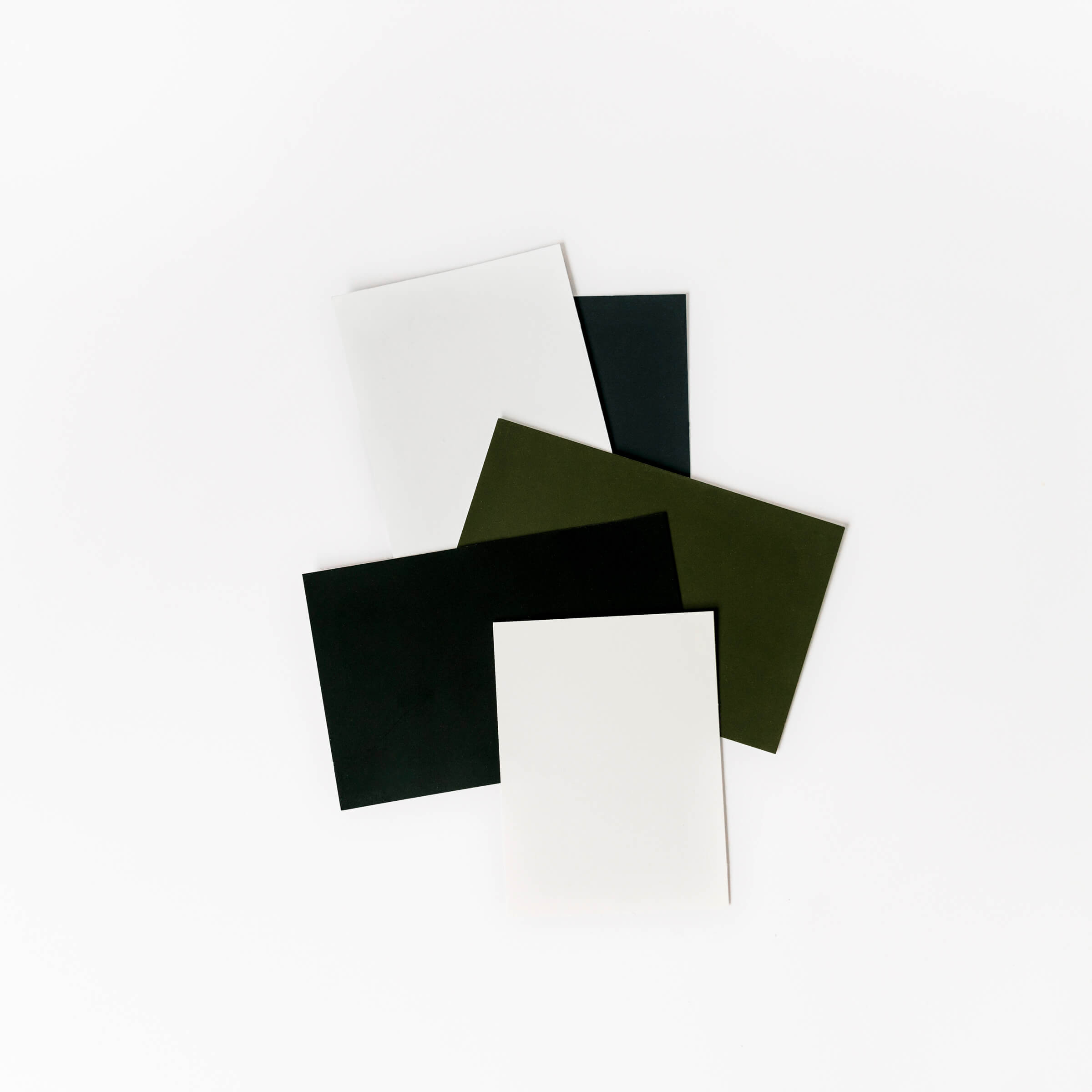
There is so much inspiration out there to help you build your own color palette. Look for examples and inspiration on different websites like Adobe Color, Design Seeds or my favorite, Pinterest. If you know the vibe you are looking for in a color palette, just type that into Pinterest and see what comes up, such as ‘earthy vibes’. Save your favorites to a folder on your computer or a board on your Pinterest account and see if you can pick out common themes or colors.
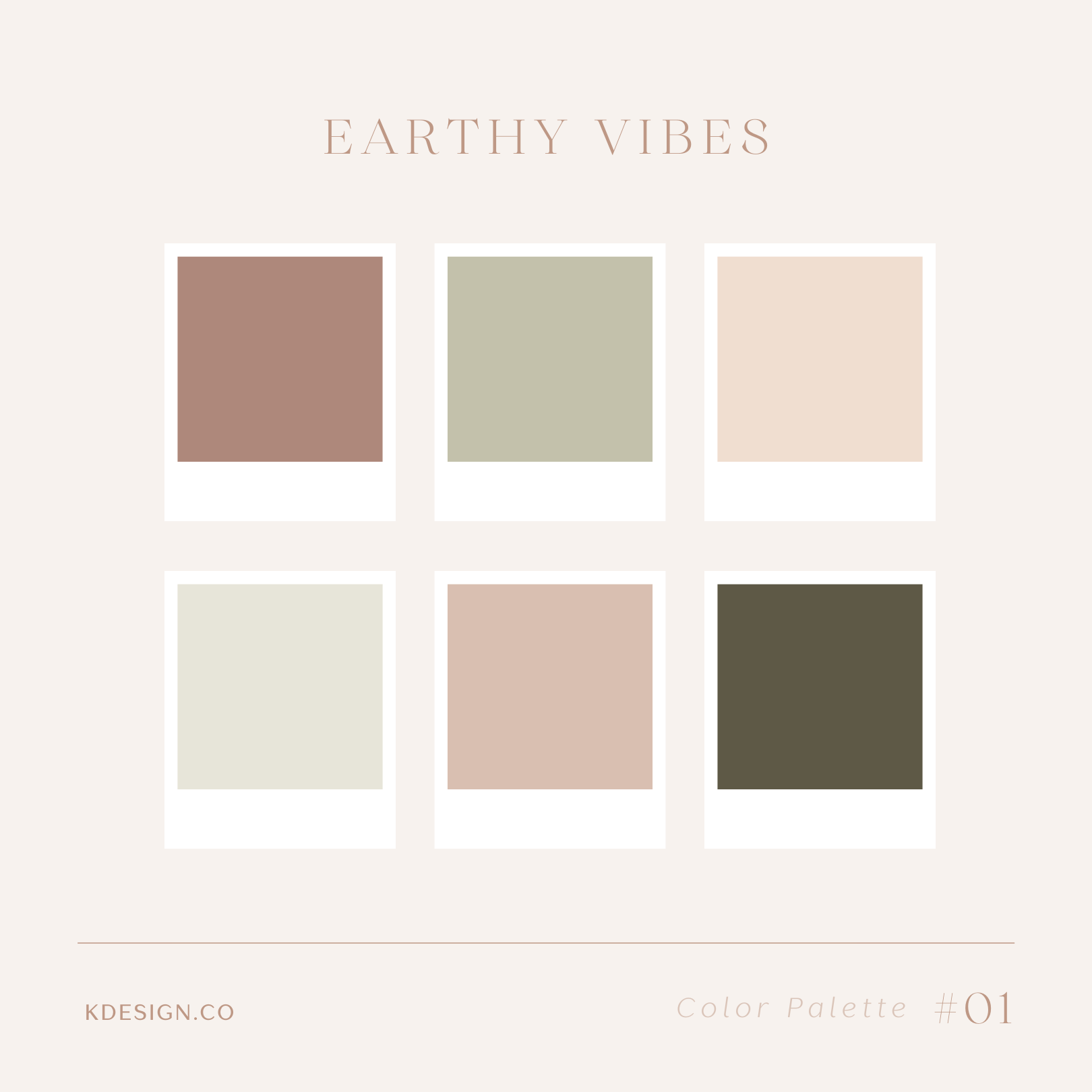
Or you might want to check out my girly color palettes and feminine color palettes for even more color palette inspiration. Take samples from different palettes to create your own original and unique color palette. The real beauty of a well put together color palette is all the different variations that can come from it.
03. Consider psychology and color theory
You may not know what colors you want to represent your brand but you may have an idea of the feeling you want it to provoke. As we know, certain colors have hidden meanings and psychological undertones. That’s often why you see similar brands gravitate towards similar colors.
For example, if you are a business or brand revolving around nature, then green is an obvious choice. If you want your brand to make people feel passion and to take action, then red should probably be in your color palette. Here are just a few more examples of these kinds of psychological associations you may not have known. Color theory also plays an important role in choosing complementary colors for your brand.
Related Post: The Magic of Color in Graphic Design
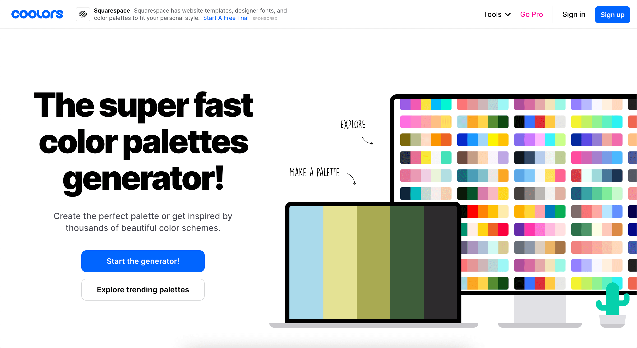
04. Experiment with a color picker.
If you already have a starting color in mind, but don’t know what else would work well with it, there’s an app for that. Coolors is a great color palette generator that will provide you with trending color palettes or allow you to start from scratch, giving you the ability to lock in certain colors while switching out the rest until you are satisfied.
Tools like these are great at helping you pick main colors, accent colors and supporting colors because you can visualize everything at once. Experiment with the thousands of different color options available until you find the perfect unique colors for your brand.
05. Be aware of your competitor’s colors.
One of the worst things you can do is to create a color palette that is too similar to your competitors’. Do some research of similar brands in your space to ensure you have at least a few distinct colors from them and that you aren’t confusing potential customers into thinking that you are the same business. If you want to get really extreme, you can use your competitor’s color palette to help you select totally unique colors that are the complete opposite of what they are using.
06. Go back to the basics.
If you are feeling totally overwhelmed with every other option, it might just be easiest to start at square one. Before you start worrying about shades and tints and all the color combinations out there, focus on the base level of colors – the rainbow, that is! A range of seven colors like ROY-G-BIV should feel much less daunting than thinking about the millions of colors out there. Choose a single color as your base and go from there!
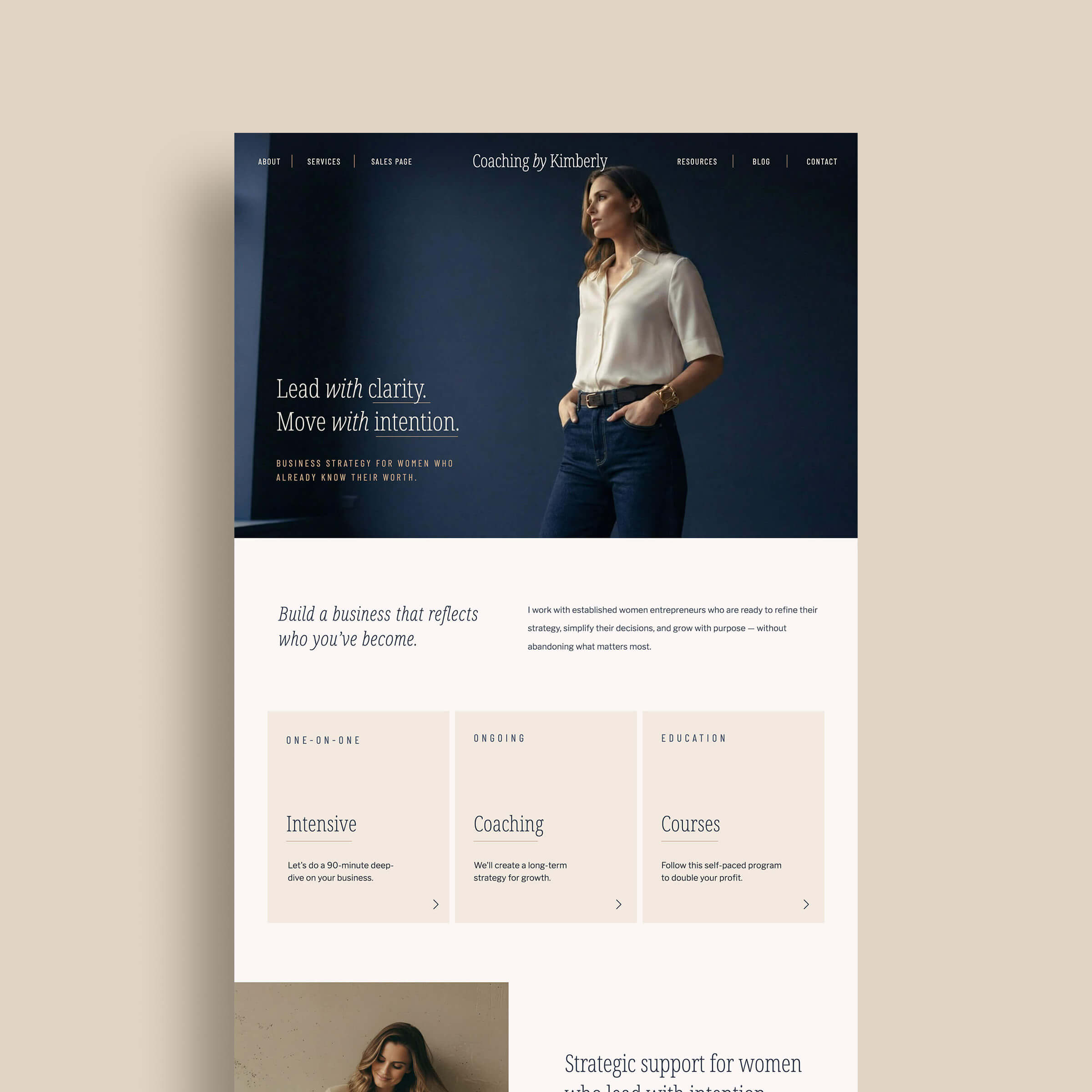
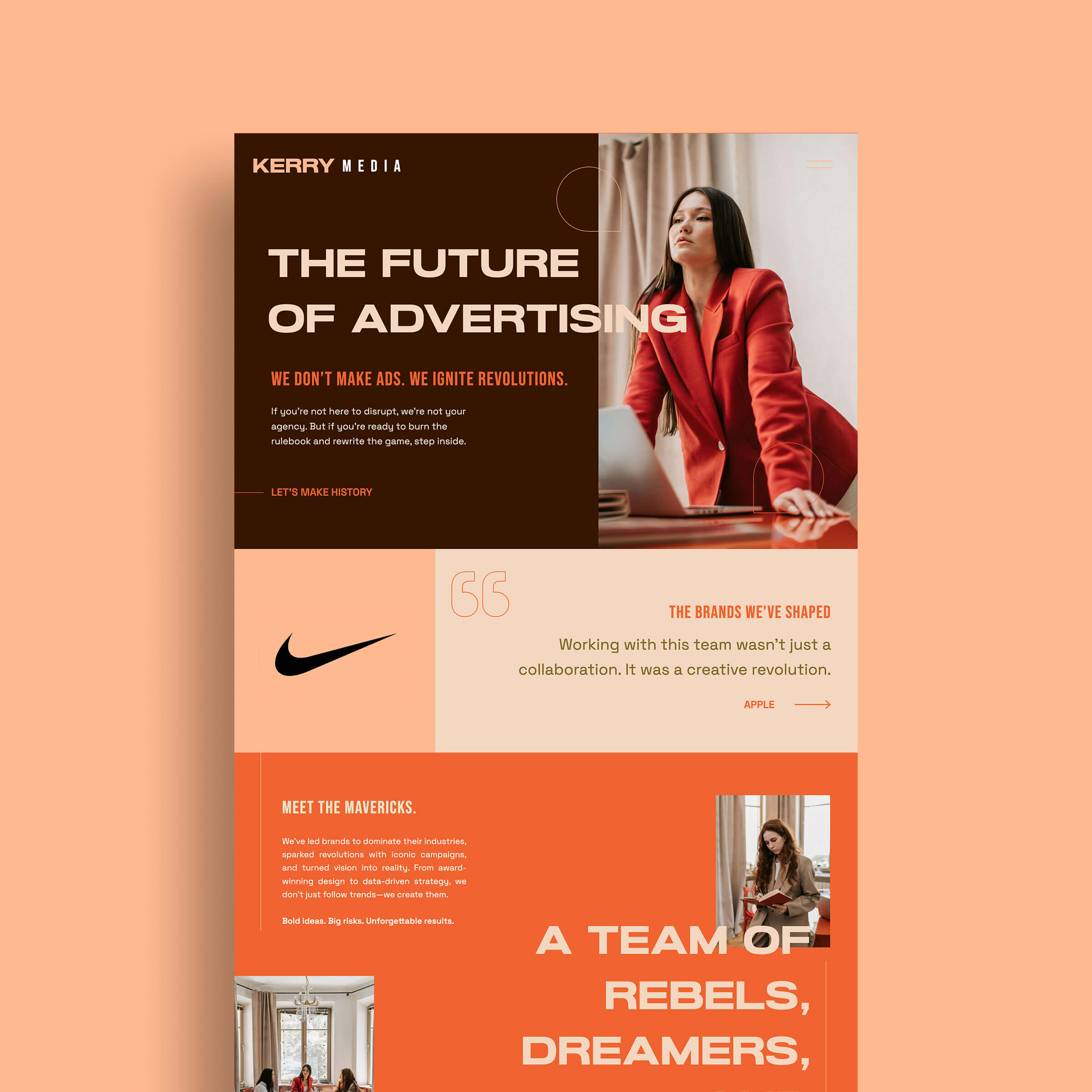
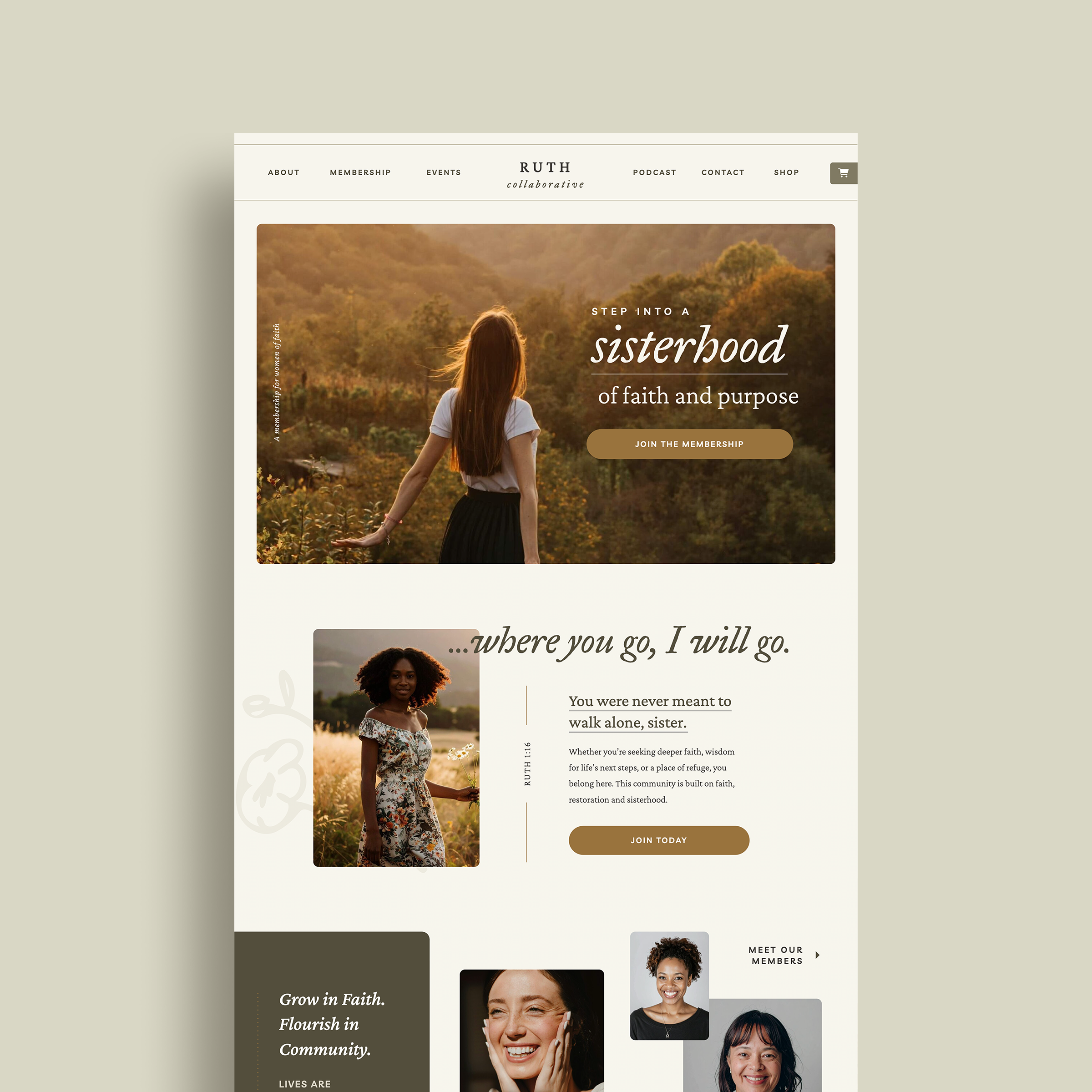
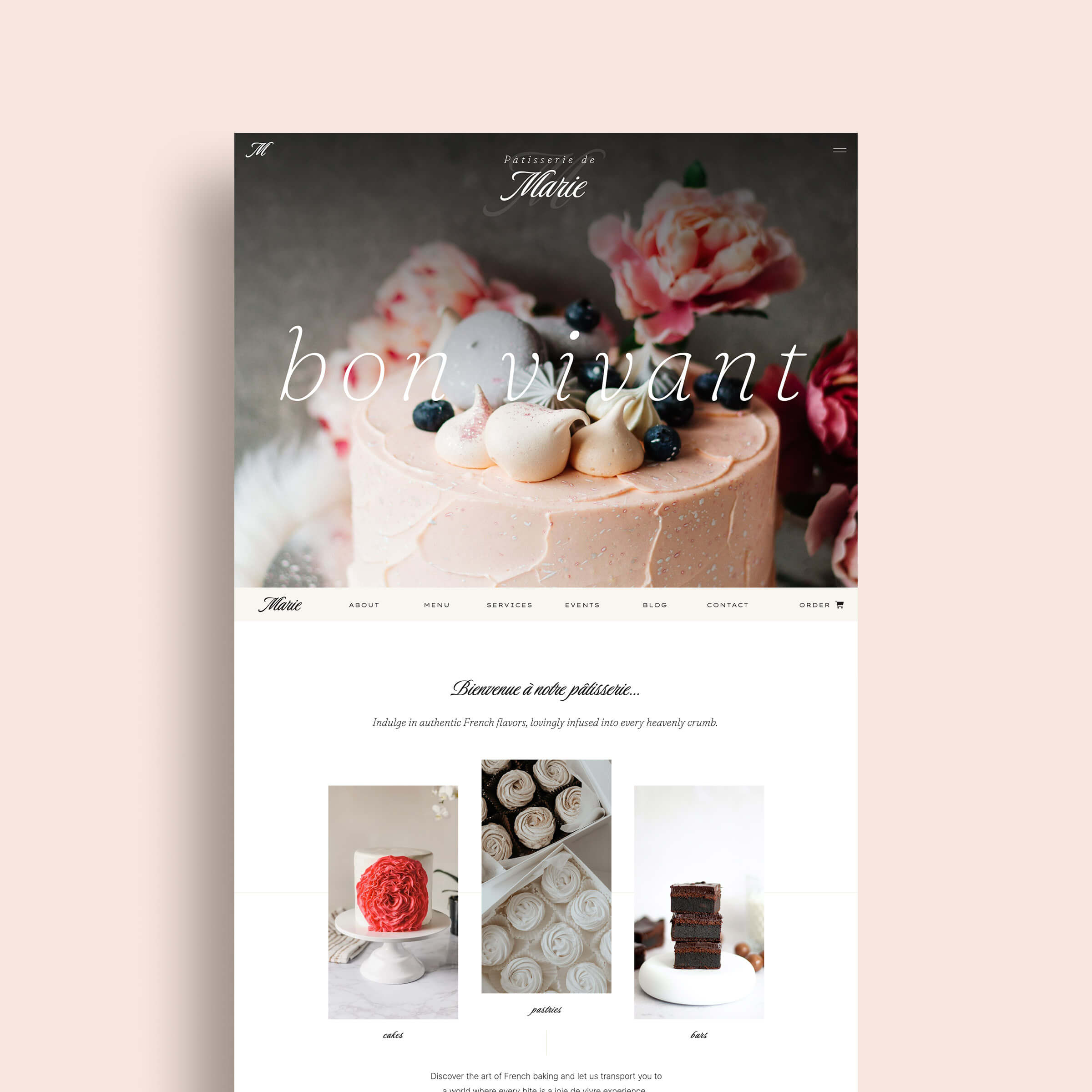
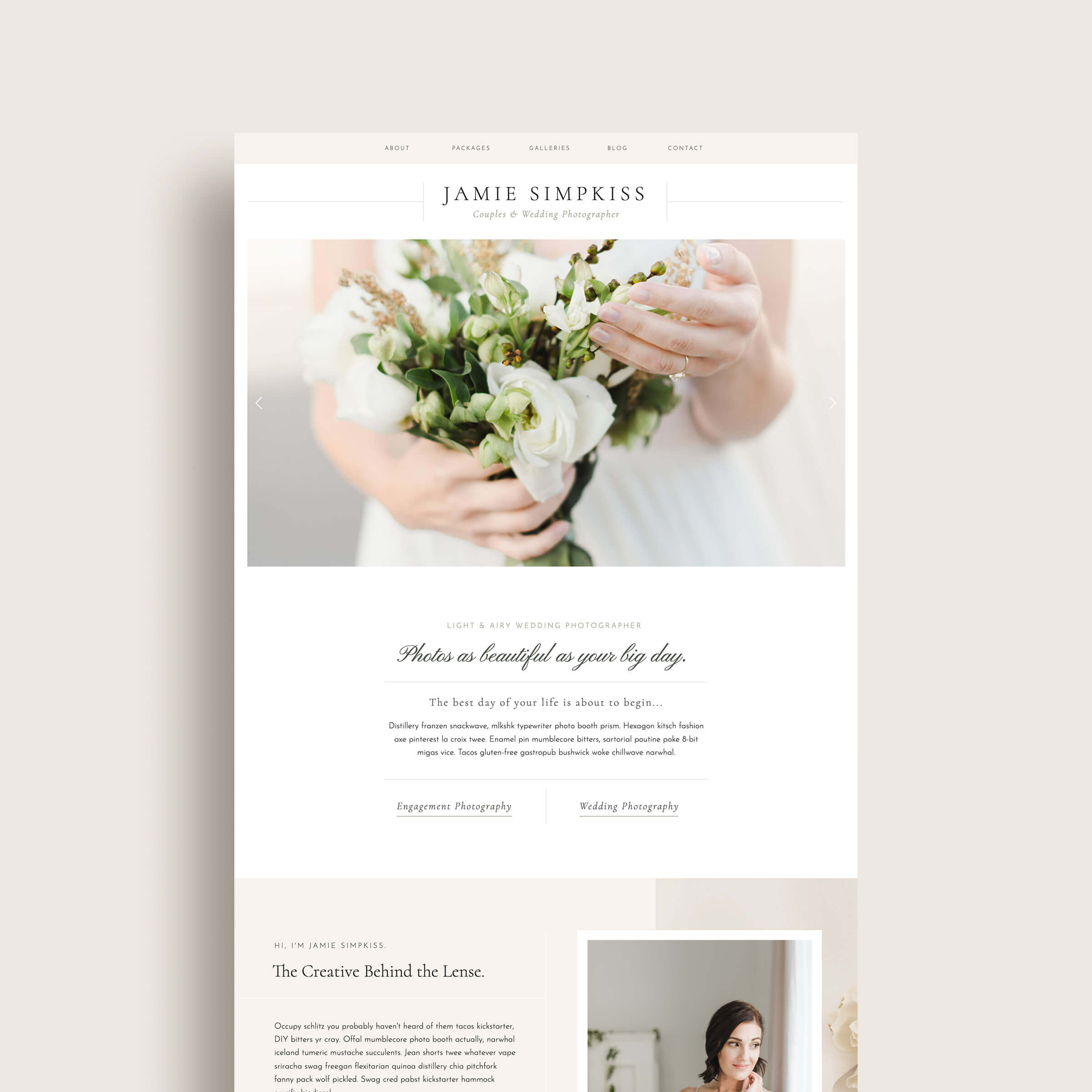
Where you can use your brand color palette
Once you’ve decided on the perfect method to choose unique brand colors for your business, you might wonder where you should be using them. Anywhere you can use your logo, you should use your brand colors too. This is something you should consider when choosing your colors because different surfaces and different formats reproduce colors differently and have their own unique limitations and strengths.
For example, on the web you can use a wider range of colors that appear much brighter than those that can be produced with printing processes. If you plan to do a lot of printing though, you may want to consider choosing PMS colors from the Pantone Color Systems library. Here are several ideas of ways that you can utilize your brand colors:
- Logo
- Website or phone app
- Emails
- Social media graphics
- Building signage
- Business stationery
- Merchandise and apparel
- Packaging design
Color has the unique ability to generate emotional responses, reference cultural symbolism, create brand awareness and help in creating balanced compositions; All of these amazing benefits make unique colors a critical component of your brand identity. While it can be tempting to just combine a few of your favorite colors together and call it a day, I hope you found at least one of the methods helpful for putting together unique colors for your brand.
Want to take a look at some pre-curated color palettes for your brand? Check out my Brand Kits!
Still having trouble putting together unique colors that reflect your brand’s personality? Shoot me a note at K Design Co.