

You’ve heard the saying before – Fake it ’til you make it. In some situations, this can be a good mantra. Creating the self-image of yourself for how you want to be instead of how you actually are has been known to be a great way to get ahead in life. However, when it comes to DIY design, getting away with faking it, might not come just as easily to some.
If you aren’t a designer by trade and are trying to DIY design for your business like your logo or your website, there are some huge red flags that will give you away as an amateur. You don’t want to look like a total newb, so how can you come off professional and put together? Here are some tips.
Typography Tips
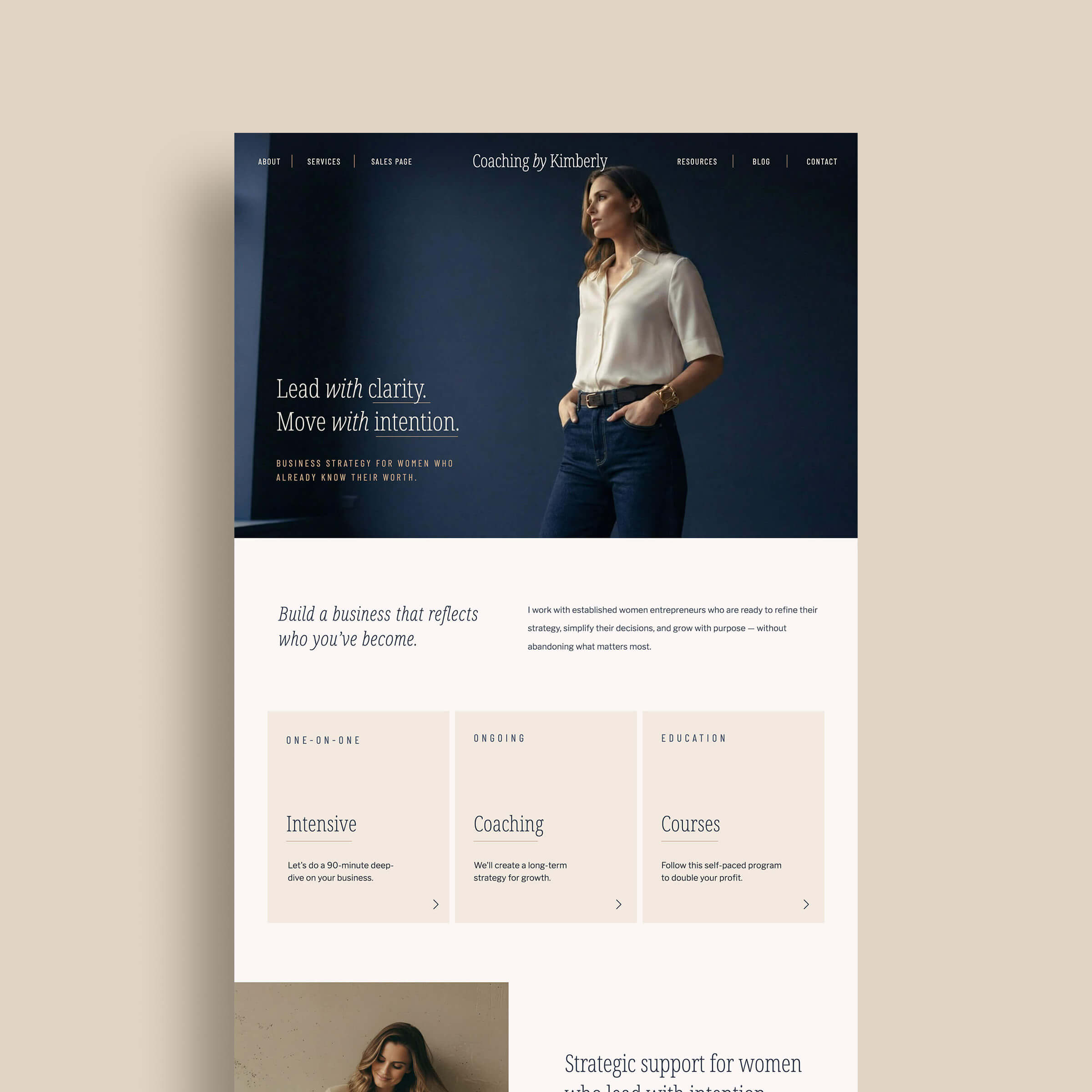
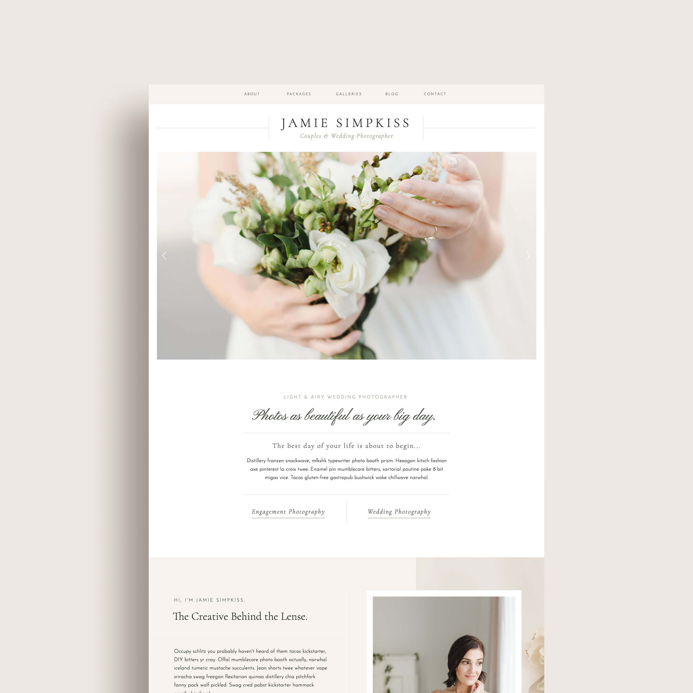
- Avoid paragraphs of text that span the width of the page. Smaller and more narrow width paragraphs are easier to read. Aim for ~60 characters for your ideal width. Wider paragraphs can look sloppy and are harder to follow.
- Avoid widows (paragraphs of text with only 1 or two words on the last line.) A hanging word can look a bit lonely and often gets lost on the page.
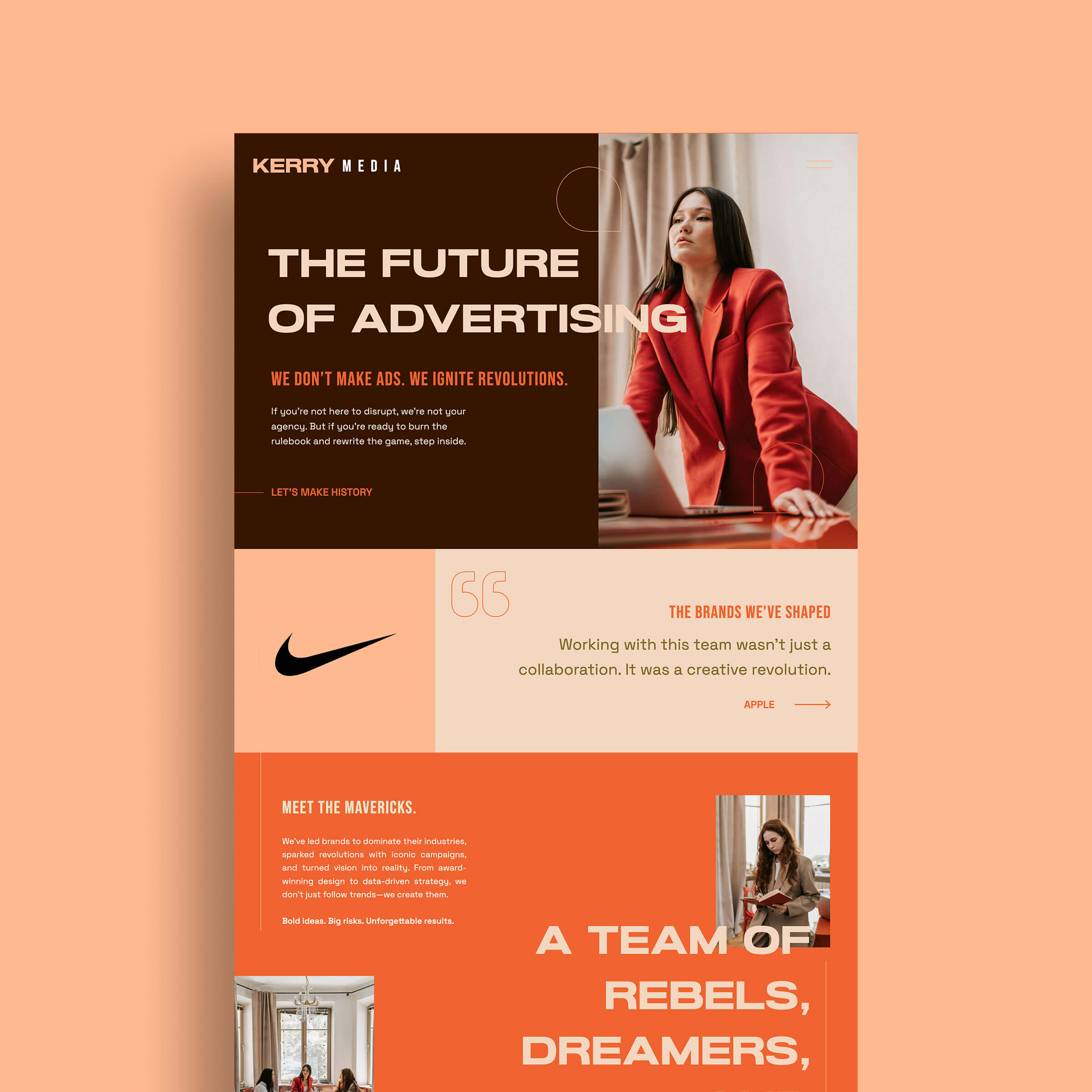
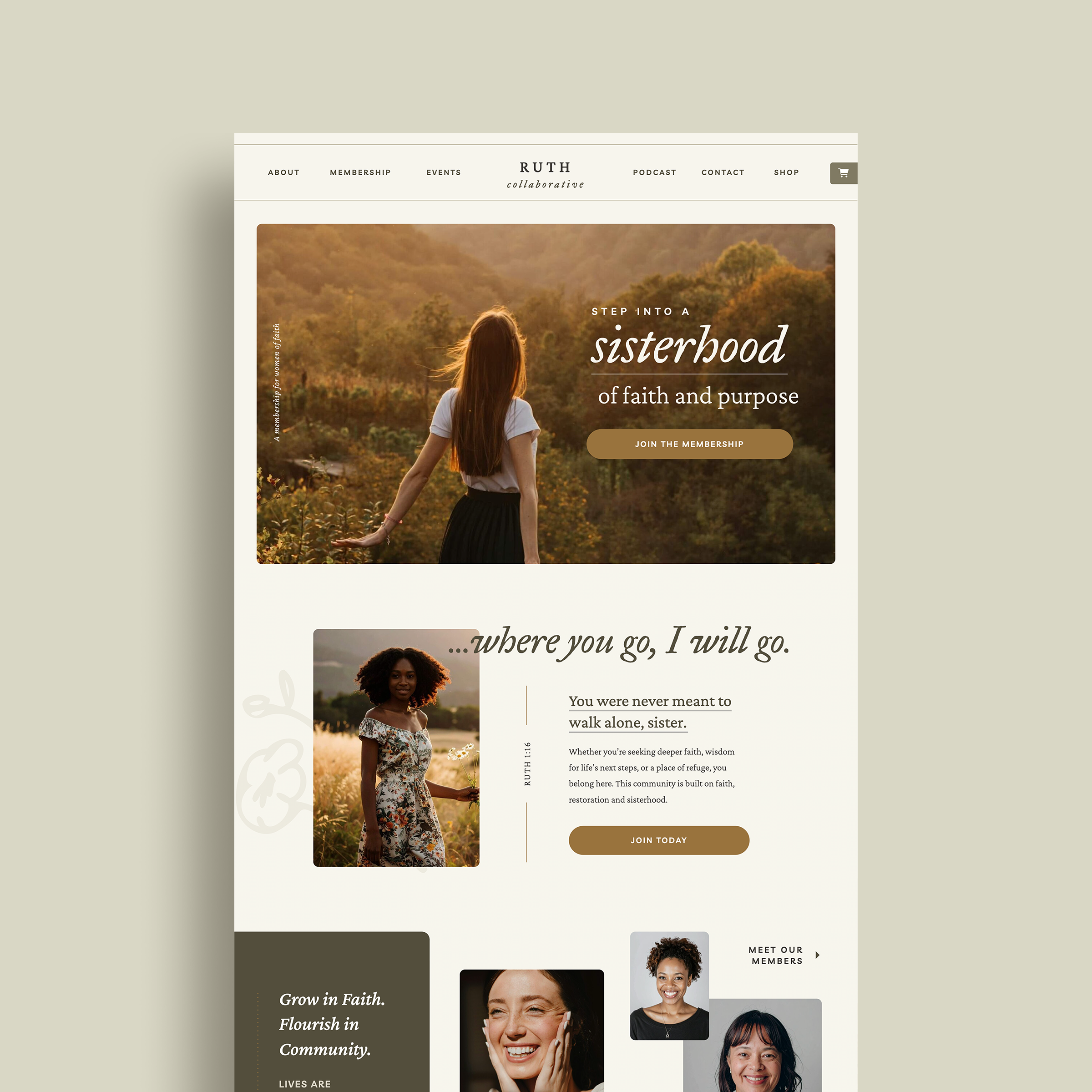
- Avoid overlaying text on a person’s face in a photograph. The text creates an awkward tension between itself the background image.
- Avoid adding a stroke or drop shadows to text. If the text is illegible over an image or background, change the text color or brightness or change the image itself. It may seem counterintuitive, but drop shadows and strokes on text can make it difficult to read and also looks very dated.
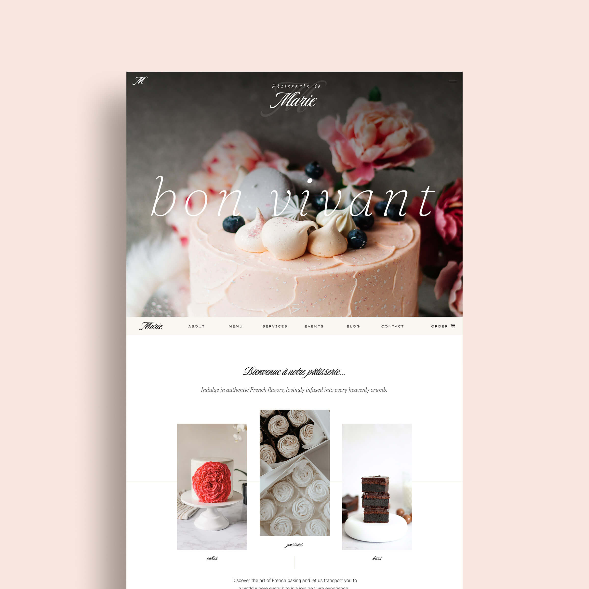
- Use different font sizes and styles to create clear levels of hierarchy. The most important information should be most noticeable. Details can be smaller.
Related Post: The Lazy Girl’s Guide to Finding & Using Fonts for Your Brand
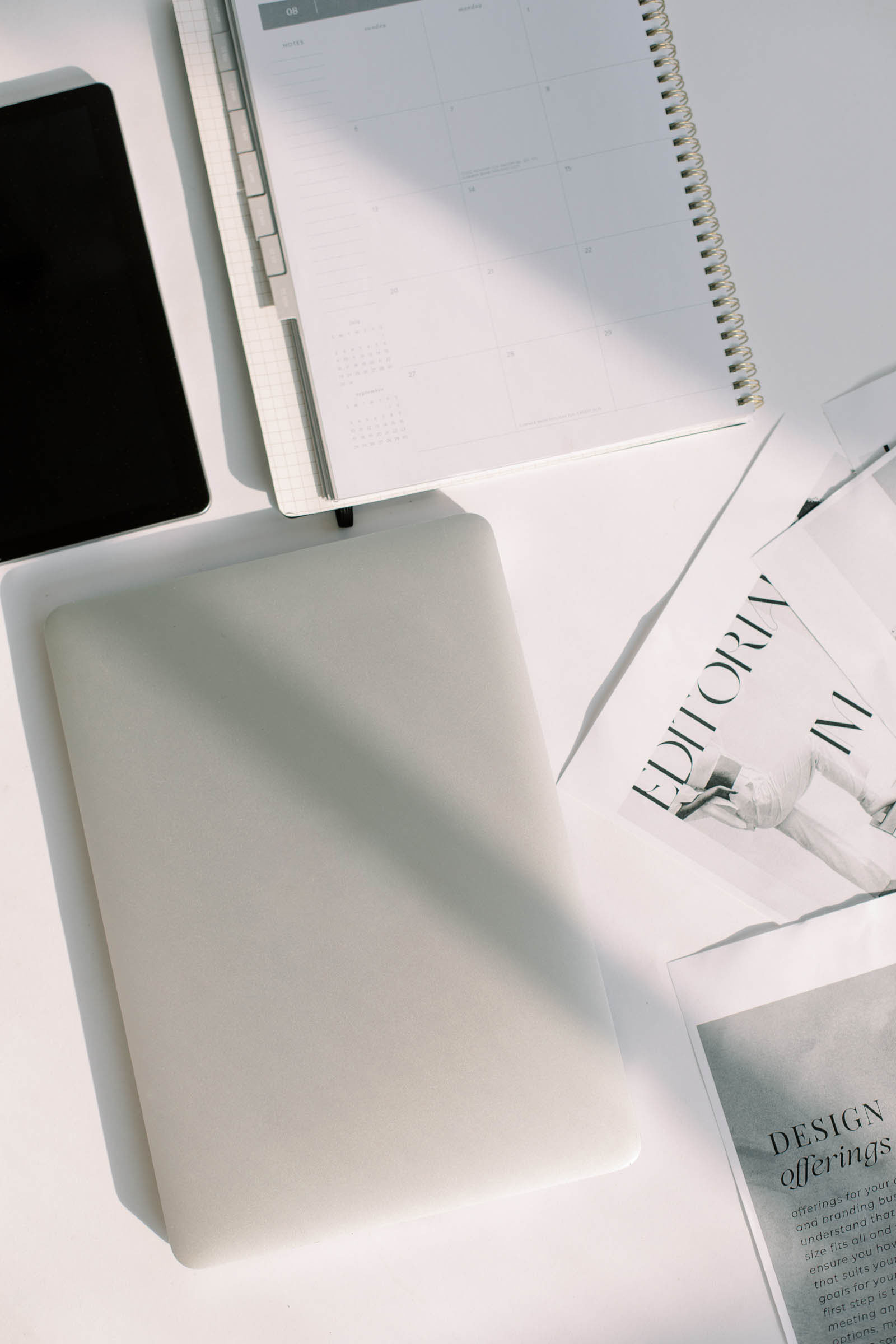
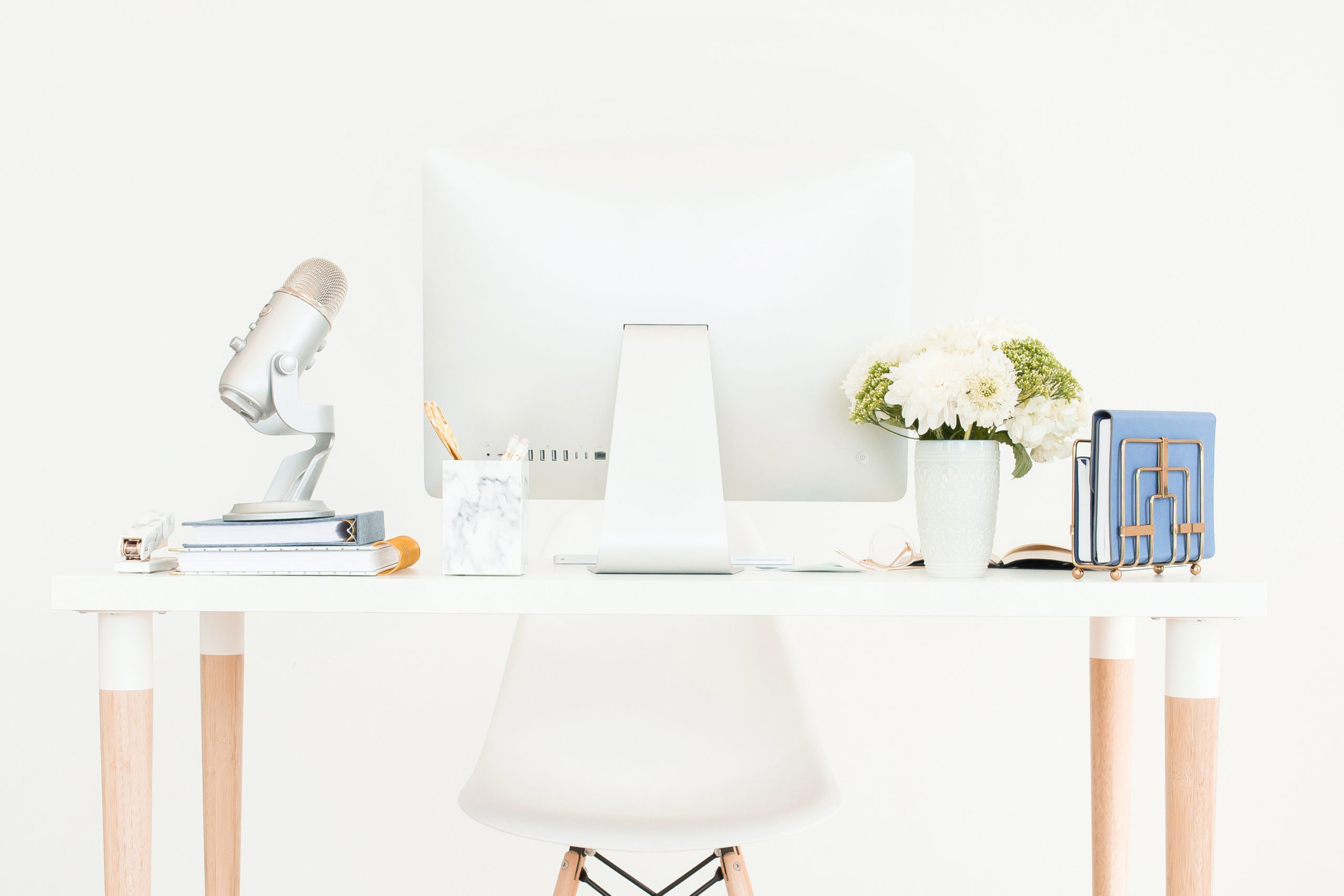
Design & Layout Tips
- Don’t be afraid of whitespace. You don’t have to fill your entire page or canvas. Adding more whitespace in your design can help you to achieve an elegant look.
- Avoid cramming too many elements or information into a design. Less is almost always more in design! Try to focus on one objective with your design to avoid a layout that is overwhelming to look at.
- Use borders sparingly. Too many borders can make your design unnecessarily busy.
- Create consistent and generous margins around your important design elements. Don’t crowd elements too close together or too close to the edge of the page. Usually a minimum of .25” – .5” is a good starting place for margins for letter-sized designs or smaller.
- Aim to create balance in your composition utilizing symmetry.
Related Post: 3 Things to Know Before You Create a DIY Logo
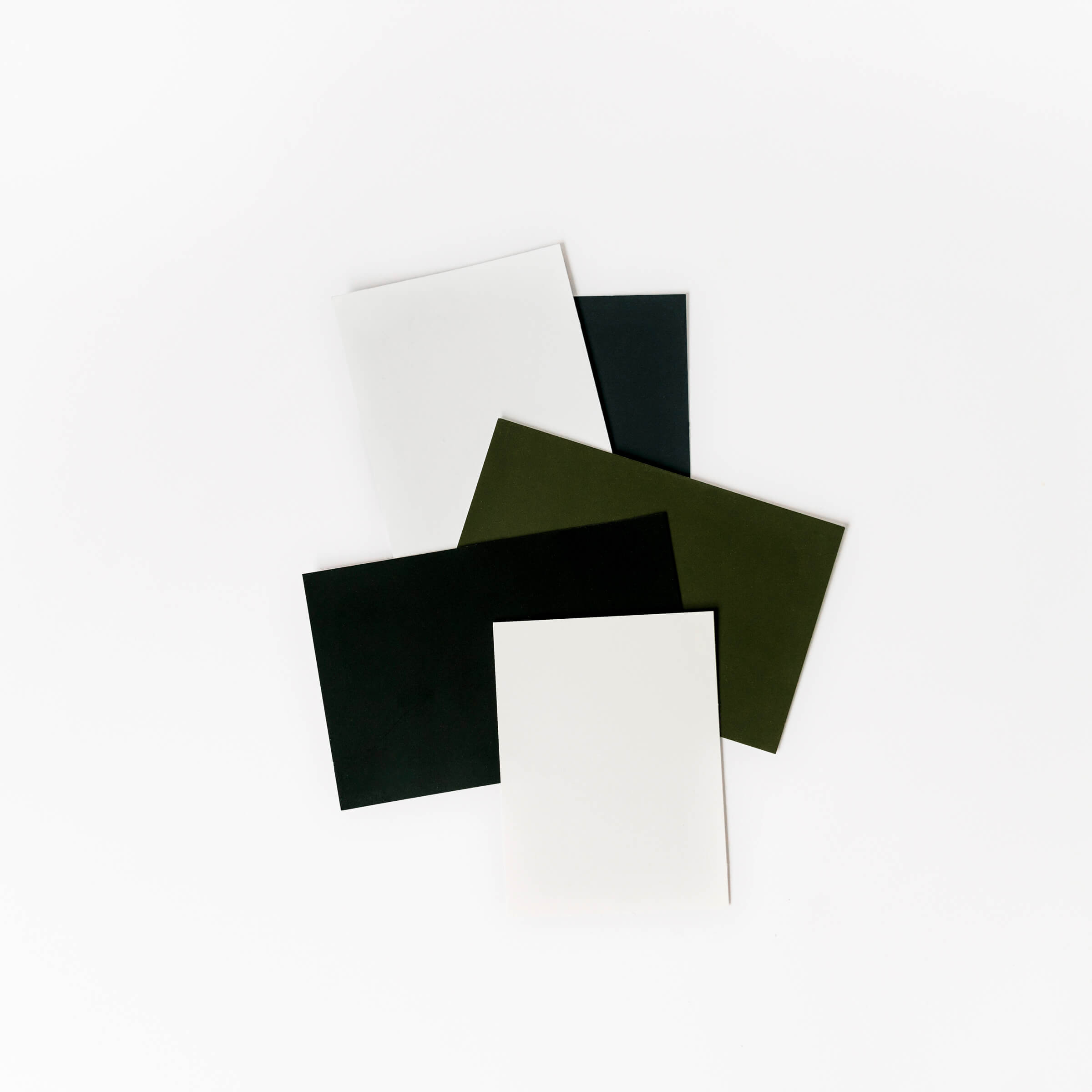
Color Tips
- Avoid simply choosing a palette of your favorite colors. Choose your palette based on the objective of your design.
- Choose colors that work well together and create an overall sense of harmony. Think about complementary and analogous colors.
- Use colors to create emphasis and perspective. Not everything has to be bright or dull.
- Don’t use too many colors in your design. Try to stick between 2-6 colors to create the best balance.
- Use the same colors consistently to keep your brand cohesive and recognizable. Changing your colors all the time can dilute the integrity of your brand.
Related Post: How to Create a Beautiful & Unique Color Palette for Your Brand
So let’s be honest… have you made any of these mistakes before as you DIY design for your business? If so, don’t worry – There’s always room to improve! Make a conscious effort to address areas where you need the most improvement and you’ll be creating designs for your business like a pro in no time!
Still, need a little help with getting your designs to look beautiful and professional? K Design Co. would love to help <3! Let’s chat! Reach out today for a free 30-minute consultation to talk about your business!