Not sure which fonts work best for your brand? We’re breaking it down by industry (with designer-approved picks you’ll love).
Listen, I know fonts aren’t the only ingredient in your brand.
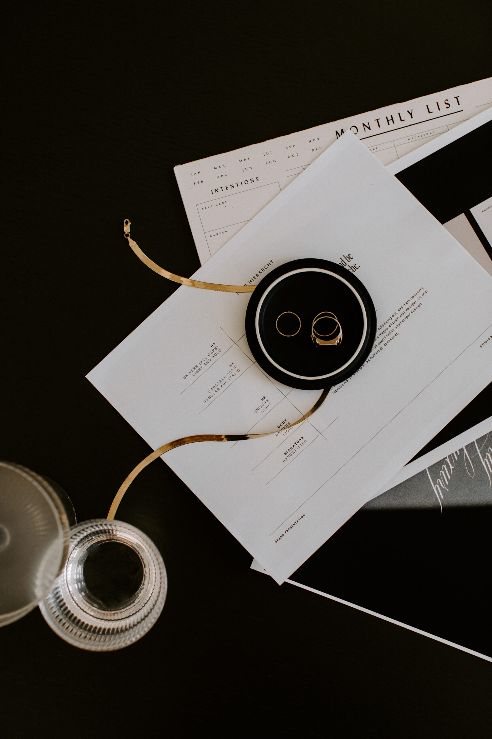
You’ve got your color palette, logo variations, brand patterns, and of course, all the behind-the-scenes heavy hitters: tone of voice, messaging, visuals, strategy…the full brand buffet.
But fonts are the thing that quietly tell people what you’re about before they even read a single word.
As a brand designer, I’ve seen the magic happen more than once. A brand can have the right vibe, great copy, solid strategy… and still feel “off.”
We tweak the fonts and boom. Suddenly, everything falls into place.
That’s how I know font pairings aren’t just a design detail – they’re a significant brand decision. And choosing fonts by industry? That’s where the strategy comes in.
Today, I’m walking you through 10 industries and the font pairings that suit them best, from fashion to finance.
These aren’t one-size-fits-all recommendations, either. This is based on years of real branding work, a lot of trial and error, and a total obsession with type (sorry, not sorry…I can’t help it 🙄).
(This article contains affiliate links, which means I may receive a small commission for purchases made through links in this post at no extra cost to you. I only recommend products I 100% believe in and use myself. Read the Privacy Policy for details.)
Why Font Pairing Matters by Industry

Not every font is going to work for every brand.
A bubbly handwritten script might be perfect for a bakery’s Instagram, but probably not what you want headlining a corporate law firm’s website. Pairing the right fonts isn’t just about what looks good, it’s about what’s right for your audience and your industry.
Here’s why fonts matter:
First impressions happen fast.
It takes users about 50 milliseconds to form an opinion about your website. Not even a full second. That snap judgment reflex means your fonts are a big part of that first impression.
Choose a font that feels too casual or playful, and you might lose credibility. Go too stiff or sterile, and you risk feeling out of touch. The right font pairings can help you strike a balance and send the right message, instantly.
It’s about brand alignment, not just aesthetics.
Sure, fonts should look good. But more importantly, they should feel like your brand. A tech startup might want to convey innovation and clarity. A wellness coach might want something soft, approachable, and grounded. The font combo you choose can quietly signal all of that without saying a word.
When fonts align with your tone of voice, audience expectations, and brand personality, everything else, your messaging, content, and visuals, starts to feel more cohesive.
Functionality matters.
Even the prettiest font pairing falls flat if it’s not functional.
That means if your audience can’t read your body text on mobile or if your heading font looks clunky on social media, you might be losing people.
Great font pairings don’t just work aesthetically. They work across every usage, from your website and emails to Pinterest pins, and the list goes on.
Legibility, hierarchy, accessibility. It all has to work together, not just look good on a moodboard.So, whether you’re booking clients, selling products, or trying to look less like you DIY’d your branding at midnight, here are 10 industries and font pairings that just work.
Creative Industries
Think: designers, photographers, agencies, writers, and content creators.
This is the one industry where “rules” bend a little, and that’s kind of the point.
In the creative world, your font pairing should feel original, expressive, and maybe even a little unexpected. (Just don’t forget readability.)
One of my absolute favorite font pairings for creative industries right now? Tangerine Skies by Jen Wagner Co.

It’s a designer font duo that includes a clean, modern sans serif and a flowing script, which means you’re set up for dynamic, scroll-stopping visuals from the jump.
What I love most about Tangerine Skies is the range: the sans looks amazing with both tight and wide kerning, and the script has over 70 ligatures, so it always looks custom, never cookie-cutter.
Need a 10/10 font pairing as a creative business owner? Don’t miss out on Tangerine Skies – click here to purchase with our affiliate link.
Corporate Industries
Think: law firms, consultants, finance professionals, and B2B service providers.
In the corporate space, you need a font pairing that feels clear, strong, and confident, without being stiff or soulless. Whether you’re pitching clients, building slide decks, or publishing case studies, your typography needs to reflect your professionalism and personality.
Cairo by Jen Wagner Co. is one of my favorite pairings for this industry.

Cairo is a perfectly balanced sans serif duo. Cairo Block and Cairo Grotesque are designed to work seamlessly together. This corporate font duo is bold, modern, and gives off just the right amount of edge. I especially love it for brands that want to feel strong, masculine, or somewhere in between.
Bonus: Cairo also comes with six pre-made logo options, making it even easier to build a cohesive, scroll-stopping brand presence right out of the gate.
Need a plug-and-play font pairing for your professional brand? Grab Cairo here via our affiliate link.
Fashion Industry
Think: stylists, boutiques, clothing brands, fashion bloggers.
In fashion, your fonts need to pull their weight visually, because let’s be honest, people are going to make assumptions about what you do based on a quick glance at your branding.
You want something that feels modern and editorial, with just enough edge to look high-end without trying too hard.One of my favorite picks for fashion brands right now? Goldie by Blythe Green.

Goldie is a clean, chunky sans serif duo that’s bold in an understated way.
Goldie is a modern sans serif with two weights that pair perfectly together. The Light version is sleek and simple, while the Bold version adds just enough contrast to make headlines or product names pop.
It’s easy to read, super versatile, and works really well for brands that want to keep things minimal but still have personality.
Looking for a clean and stylish font combo for your fashion brand? Snag Goldie using our affiliate link.
Tech Industry
Think: SaaS platforms, app developers, IT companies, and digital startups.
In the tech world, your fonts need to do a lot: feel modern, stay super legible across devices, and still have enough personality to stand out.
It’s a tricky balance, especially if you want to look cutting-edge without feeling cold or overly corporate.
That’s why I love Neue Swiss by Jen Wagner Co. for tech brands.
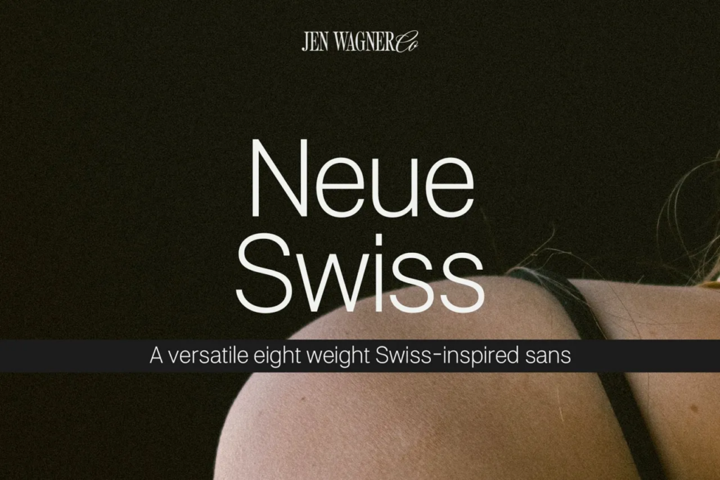
Neue Swiss is minimal but commanding – clean lines, no fluff, just strong design that works.
It’s an 8-weight, 16-font typeface (aka: plenty of range), so you can scale your brand consistently across web, product UI, slide decks, and social without switching fonts. The weights are simple and modern, which makes it easy to blend in (when needed) and stand out depending on how you use it.
If you’re looking for a go-to font for your tech brand that feels fresh, functional, and super polished, grab Neue Swiss using our affiliate link.
Food & Beverage Industry
Think: products, cafes, bakeries, restaurants, and food bloggers.
Food and beverage brands are all about flavor, and your fonts should reflect that *flavor*.
Whether you’re going for cozy and homemade or bold and gourmet, your typefaces help set the tone before your audience even sees the menu.
And Levitate Serif & Sans by Jen Wagner Co. could be the perfect font duo for your food & bev biz.

Levitate is super versatile and easy to use. It includes both a serif and a sans-serif — all built into one font.
You can switch between the two just by toggling uppercase and lowercase, which makes designing so much faster. It’s clean, modern, and works beautifully for packaging, menus, logos, and even social media graphics.
Want a polished, easy-to-use font pairing for your food or drink brand? Levitate might just be your new secret ingredient 😉 Click here to purchase via our affiliate link.
Quick note: If you’re planning to use this font commercially, make sure you’re aware of any licensing restrictions, so you can purchase the right font license for your business.
Education Industry
Think: tutors, online educators, children’s brands, curriculum creators, and influencers.
Fonts for education should feel friendly and approachable, especially if you’re working with kids or families.
But they also need to be clear and easy to read across platforms, from worksheets to websites to slideshows.
If your education brand needs a display font that feels fun and functional, check out Peaceful Island by Invasi Studio.

Peaceful Island is a playful handwritten font duo that combines a casual script with a retro-inspired sans. It’s got personality without being hard to read, which makes it a great fit for anything that needs to feel warm, upbeat, and kid- or student-friendly.
Whether you’re designing digital resources or just want your educational brand to feel a little more human, this duo totally delivers.
Want to bring a little fun to your educational content? Grab Peaceful Island using our affiliate link and give your brand that approachable, playful edge.
Health & Wellness Industry
Think: yoga instructors, coaches, therapists, nutritionists, and wellness brands.
In the health and wellness space, your fonts should feel calm, clear, and trustworthy. You want something that reflects balance and is not too serious, but still professional.
The goal is to make people feel at ease while still keeping things clean and polished.
A great font for this? Bakora by Hishand Studio.

Bakora is a modern sans serif and handwritten font duo with just the right mix of playfulness and structure.
It feels fresh and modern without being too trendy, which makes it perfect for everything from websites and social media to pamphlets and client handouts.
It’s easy to read and has a naturally calming vibe that works beautifully for wellness brands.
Looking for a font duo as a health & wellness professional?
Bakora is a great pick — grab it here.
Entertainment Industry
Think: podcasts, event brands, YouTubers, content creators.
Entertainment brands need fonts that know how to make an entrance. You want something with personality — fonts that feel expressive, stylish, and like they’re ready to steal the spotlight.
Just keep in mind that readability and balance still matter, especially when your brand shows up in lots of formats.One of my favorite duos for entertainment brands is Ed Venta Nueva Duo by Emyself Design.

This pairing blends classic and modern in the best way.
You get a smooth, handwritten script that adds warmth and flair, plus a minimalist sans that brings clarity and contrast.
Together, they create a playful-but-professional vibe, perfect for logos, content graphics, video titles, and more.Want a font duo that’s a little glam, a little grounded, and made for the stage (or screen)?
Ed Venta Nueva Duo is that font. Click here to purchase using our affiliate link.
Travel Industry
Think: travel bloggers, destination brands, boutique hotels, tour companies, and adventure content creators.
Travel brands need to spark curiosity and make people feel something – excitement, nostalgia, a sense of possibility.
Your font pairing should feel bold and confident but also welcoming, with a touch of personality that helps tell the story behind the place or experience you’re promoting.That’s why I love Miralona Stone Display by Letterhend Studio for travel brands.

This bold duo blends a vintage-inspired script with a strong, modern serif. The script gives off that handcrafted charm that feels personal and inviting, while the serif is sturdy enough to hold its own in logos, headlines, or travel guides.
Together, they create contrast and character, perfect for brands that are going for a timeless feel.
Want a font pairing that makes your travel brand feel confident and full of charm? Snag Miralona Stone Display using our affiliate link.
(It’s a passport stamp for your brand identity 🤭)
Real Estate Industry
Think: realtors, brokerages, interior stylists, home stagers, and property management brands.
In real estate, first impressions matter, and not just for curb appeal.
Your brand needs to feel trustworthy, high-end, and visually consistent across everything from presentations to Instagram Reels.
That’s why I love Bastia by Jen Wagner Co. for real estate brands.

Bastia is a classy serif that comes with a built-in bonus: a perfectly paired sans that takes all the guesswork out of your font combo. The serif is elegant and elevated (hello, luxury listings), while the sans adds clarity and balance.
Whether you’re designing a listing brochure, refreshing your logo, or creating content that stands out in a crowded market, Bastia makes your brand feel polished and professional from the start.
Need a no-fuss, high-impact font pairing for your real estate brand? Grab this font duo using our affiliate link.
Fonts don’t define your brand — but they do support it
At the end of the day, fonts are just one part of your visual identity, but when they’re chosen well, they pull everything together.
Remember: the goal isn’t to pick the trendiest fonts…it’s to pick the ones that feel aligned with your brand and actually land with your target audience.
When your fonts reflect your industry, style, and message, your whole brand shows up clearer, stronger, and more confidently.
That’s what good design does. It supports the story you’re already telling.
Ready to bring your new font pairings to life?

Our Showit templates at K Design Co. are built with strategy, style, and plenty of space for your personality (and your favorite serif/sans combo).
Whether you’re a service provider in the education industry or a designer in the creative space, you’ll find layouts that make it easy to plug in your content, launch confidently, and show off your visual brand without hiring a designer from day one.
Because if your fonts are giving main character energy, your website should too – and we’re here to help 😘