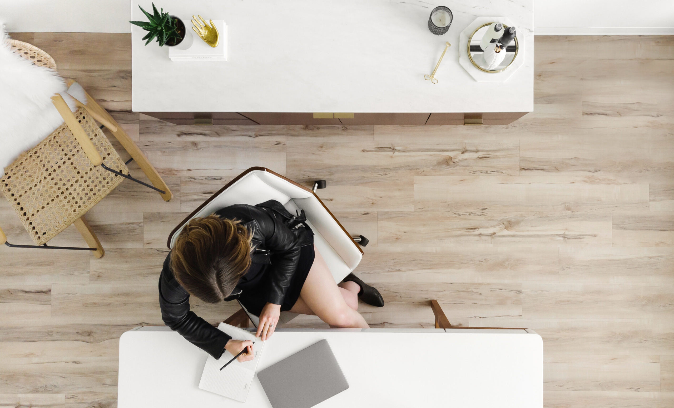


The perfect luxury font is out there waiting for you…. You just haven’t found it yet. Luxury fonts are known by their irresistible elegance and stylishness, but finding the right one can be tricky.
You’ve got to balance sophistication with readability. It’s a tall order but we’re up for the task of finding you some luxury font pairings that don’t sacrifice style for versatility 😉
Check out these gorgeous unique pairings that will set your brand apart with style & sophistication.
This article contains affiliate links, which means I may receive a small commission for purchases made through links in this post at no extra cost to you. Affiliate links are denoted with an asterisk (*). We only recommend products and brands we 100% believe in and use at K Design Co. Read the Privacy Policy for details.
Luxury Font Pairings We Love

Perfectly Nineties (by Jen Wagner)
Step back into the golden era of the 90’s with Jen Wagner’s classic serif typeface, Perfectly Nineties*. This 16-font family, in both italic and regular + light and bold styles) makes for an effortless luxury font pairing. Plus, the tightly spaced serifs make this font shine in both small and large settings.
Need this versatile, luxury font? Don’t miss out on Perfectly Nineties – click here* to get it!

Harlow (by Mila Garret)
This serif script luxury font duo offers your brand a luxurious and clean style. With 187 gorgeous ligatures, your brand is basically guaranteed to have a custom look.
Harlow offers an elegant serif typeface with a casual handwritten script, creating a wide variety of font combos for any + every application you could think of.
Be sure to purchase the right font license for your brand and click here to download.
Related Post: What Are Websafe Fonts and Do They Still Matter?

Levitate (by Jen Wagner)
Elevate your brand with Jen Wagner’s Levitate*, a unique font duo that was created with designers and Canva users in mind. Simply toggle between lowercase and uppercase to switch between serif + sans.
Here are a few fun ways Jen recommends using this luxury font pairing:
- Logos
- Headings
- Quotes
Download Levitate here*.

Recline (by Digitype Studio)
Meet Recline* from Studiotype Digital, a luxury font pairing that offers an elegant style with its ten different weights, and five straight and angled variations.
This font adds a touch of sophistication to a wide range of design projects, like books, magazines, business cards, logos, and packaging. Need a polished and professional luxury font pairing for your brand like this? Use this link and make Recline your brand’s go-to typeface.

Darline (by Davide Bassau)
Darline* is a luxury pairing of serif and script styles that balance each other out perfectly to create a refined and elegant look. This font duo offers both serif and script styles, both with a variation of weights and angles for a totally chic + luxury aesthetic.
Plus, Darline* comes with a full range of punctuation, numerals, and special characters for complete design versatility.

Carefree (by Jen Wagner)
Experience the elegance of Jen’s 16-font family, Carefree*. As a matter of fact, this striking condensed serif typeface is featured everywhere across our Reina Showit Template. 💃
With its perfect combination of sharp-angled italics and heavy weights, Carefree makes it simple to create unique and eye-catching designs for your brand.
Jen recommends setting the spacing anywhere between -10 and -20 for a trendy, sophisticated look. Download Carefree now*.

True Fate (by Sam Parret)
True Fate* is the sweet spot where timeless script meets classic serif fonts. Designed to effortlessly complement each other, the True Fate script exudes elegance while the True Fate serif brings a classic touch inspired by nostalgic headlines.
Add a stylish and refined aesthetic to your brand with True Fate’s full sets of script and serif characters.

Capri Italy (by Jen Wagner)
Jen Wagner’s elegant Capri Italy* font pairing features a striking Serif and complementary Sans. This luxury duo makes a statement in both large and small settings, while also being well-suited for minimalistic logos and body text.
Plus, Capri Italy* comes with corresponding Adobe templates so you can make this font completely unique to you and your brand.

Gofar (by EF Studio)
The Gofar font duo by EF Studio* is a sophisticated combo of serif and script fonts. The movement in the script pairs beautifully with the serif, and together they make a duo that is perfect for logos, editorial design, websites, social media, and more.
The full sets of lowercase and uppercase letters, numerals, punctuation, and multilingual characters *almost* guarantee your creative projects to have a refined and elegant finish.

Promenade (by Jen Wagner)
This luxury font by Jen Wagner is delicate, but with a rebellious spirit. Crafted with a flat nib pen, Promenade* showcases a beautiful flow of letters. I mean…look at those striking italics? The way both regular + italic font styles work together allows for endless design possibilities.
Seriously… we’re planning to snatch this font next. 👀

Juana by Latinotype
Okay. Ok… so while this font is a duo or pairing per say…Juana is a personal favorite typeface that I’ve used many times. It strikes the perfect balance of bold, unique and elegant which makes it a perfect font choice to create a luxury feel. I love that it has so many different weights, each with their own unique personality so you can easily pair a bolder weight with a lighter weight for an ultra sophisticated, yet cohesive look.
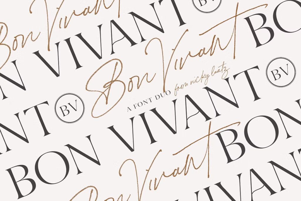
Bon Vivante By Nicky Laatz
This script font alone is seriously so gorgeous, I couldn’t help but use it for my own brand. The fact you can get a gorgeous serif font too makes this font duo all the more enticing. Nicky has outdone herself with this showstopper of a font pairing that screams luxury. Download here to get both now.

Marigold by Tropical Type
This understated, yet gorgeous semi-serif font stopped our scroll at first sight. Not only does it come designed with a complementary sans-serif font, but also 6 bonus logo templates to make creating a beautiful logo for your brand a total breeze. Download the Marigold Font Duo here.*
Love these luxury fonts, but need more font inspo?
Don’t we all?? We bet you’ll like these other posts with font inspiration too:
Want to create show-stopping luxury branding for your business? We’d love to partner with you. Contact us here!