




Maybe you’ve already got brand fonts picked out… you read our Ultimate Guide to Brand Fonts, fell in love with the most gorgeous pairing, and now you’re just… staring at your website builder wondering if that same font situation is about to become. A Whole. Problem.
Or maybe you’re the other kind of person (no judgment, we’ve all been here): you don’t have any “brand fonts” at all. You’re building your website and figuring out your brand at the exact same time, and the font dropdown menu is currently standing between you and hitting publish.
Either way… I promise this is more fixable than it feels right now.
Here’s the thing a lot of articles you might be reading about fonts conveniently skip…
Whether you’re translating fonts you already love to your website, or picking fonts fresh with your website as ground zero, the questions that actually matter are exactly the same, and they are NOT “which two fonts look cute together.”
(I know, I know. I built an entire 40-page freebie on cute font pairings. We’ll get there. 😅)
A font pairing that looks incredible on one perfectly-cropped Instagram graphic can fall apart fast the second it has to function as an actual website, standing up to a homepage headline, staying legible through three paragraphs of body copy, and still looking good at 11pm when someone’s scrolling your site in bed, half asleep, on a tiny phone screen.
And if your website is your whole brand right now (very common, very valid, no shame), then getting this right isn’t some secondary step you’ll circle back to later. This is the main event.
Fonts have to look good, obviously, we still like to keep it pretty. But on a website, they also have to perform. They need to load fast, stay readable at every size, and work together like an actual team across your headlines, subheads, body text, buttons, and nav, not just vibe together in one pretty screenshot.
Why Website Fonts Are Their Own Decision…
If you’ve already got brand fonts, think about literally every place they currently live: your logo, your Canva graphics, maybe a business card you ordered 200 of and still have 187 left of.
In every one of those spots, you control everything, the exact size, the exact spacing, the exact vibe. You designed it once, and it stays exactly how you wanted, forever. Your website does not always give you that same courtesy.
If you don’t have brand fonts yet, you might be doing this in the smarter order. (Brand designers, don’t come at me!!)
But let me explain… Most people pick fonts in a total vacuum, completely disconnected from where they’ll actually live, and then spend weeks trying to force them to behave everywhere after the fact. Starting with your website means you’re choosing fonts where they actually have to do real work, not just look pretty on a Pinterest board.
Either way, your website is not a moodboard, and it will humble you if you treat it like one.
- That same headline font has to look intentional and gorgeous at 60px on a giant desktop screen and still hold its shape when it shrinks down to fit a 5-inch phone.
- Your body font has to survive actual reading, full paragraphs, not just one punchy tagline everyone breezes past.
- And every extra font you load onto your site is one more file your website has to fetch before a visitor sees anything at all, so yes, that gorgeous script font you’re obsessed with? It’s also a tiny tax on your load time, whether you wanted it to be or not.
“I love how this looks” isn’t the only question anymore, unfortunately. The real question is: does this font actually work as a website font?
Let’s talk about how to actually answer that…
Quit scrolling through all those tabs of “pretty” font roundups for a second (we’ve all done it, no judgment). These are the four things that actually decide whether a font works on your site, the stuff most font content, including some of my own, conveniently skips.
1. Readability at a Real Size
Here’s a mistake I see constantly: someone falls head over heels for a font because it looks incredible as one massive, 80px homepage headline… and then uses that same delicate script for their body copy, where it turns into something totally unreadable three paragraphs in. Nobody’s sticking around on a website that requires them to lean closer to their screen.
Before you commit to a font, actually test it at the size it’ll really be used. Type out a full paragraph of your real website copy… not just “Lorem Ipsum” and not just your business name, repeated 47 times pretending to be a whole paragraph.
Look at it at the size a visitor will actually read it, on an actual phone, held at a normal arm’s length. If you’re tilting your head or slowing down to decode a word, that’s your answer, sis. Save the pretty little decorative fonts for short headlines and little accent moments, and let something clean and steady carry anything your visitor actually has to read.
This is what I do anytime I create a new brand or am preparing to work on a client website that doesn’t already have brand fonts…
- I go into Canva or Adobe Illustrator and I make a mock website page. This doesnt have to be fancy.
- I lay out a headline, a subhead a paragraph and a button.
- I figure out the default styles, sizing, spacing, weight that look balanced and cohesive together before I settle on anything.
- I also will try this on a light and dark background so I can make sure this system is truly versatile on a website.
- Keep tweaking until it achieves the right balance of brand personality + readability – this is your sweet spot!
2. Website Load Speed (The Invisible Cost of “Just One More Font”)
Every font on your website is a file your visitor’s browser has to download before your beautiful design even shows up, and yes, that includes each individual weight (regular, bold, italic all count separately, rude but true). Stack up four or five different fonts across your site, and it’s like your asking every visitor’s phone to download a whole care package before it’s allowed to show them anything.
Slower load times don’t just feel annoying to sit through, they directly hurt your SEO and increase the odds someone bounces before your gorgeous typography even finishes rendering. Devastating, honestly.
My rule of thumb: keep it to 3-4 fonts, max, for your entire website. Anything more than that, and you’re trading real performance for a font choice most visitors will never consciously register anyway.
I’ll be honest with you… I learned this one the hard way. I recently went through my own site to trim down the number of fonts I was using, specifically to help my page speed. Turns out I had one script font tucked into my footer and it was used maybe once or twice, total .. but because it’s in the footer, it was loading on every single page of my site!
One tiny signature moment, was taxing my entire website’s load time, on every page, forever 🙁
That’s when I decided load speed was more important than having a cute little script in my footer, and I cut it.
If you’re in that same boat… you want a script font or a special little detail somewhere on your site, but only in a couple spots, here’s the workaround: turn that specific text into an SVG or PNG image and export it, instead of loading the whole font file just for a few words. You get the exact look you want without your browser having to download and render an entire font just for a signature line or a cute little “xoxo.”
One important caveat: don’t do this for any text that’s critical for understanding your page, or anything a screen reader needs to actually read aloud to a visitor. Images of text don’t get read by screen readers and don’t get indexed the same way real text does, so this trick is great for a decorative flourish, but not for your headline, your button text, or anything conveying real information. Save it strictly for the “nice to have,” not the “need to know.”
How to actually check which fonts are slowing down your site:
You don’t have to guess at this! Google PageSpeed Insights will show you exactly what’s happening.
- Go to pagespeed.web.dev and paste in your website URL, then hit Analyze.
- Scroll down to the Diagnostics section. Look specifically for “Ensure text remains visible during webfont load”… if that flag shows up, it’s calling out fonts that are actively slowing down how fast your text appears on screen.
- Also check “Avoid enormous network payloads”(or a similar resource-size diagnostic) this lists out the biggest files your site is loading, and font files will show up here by name if they’re contributing real weight. If you see multiple font files stacking up, that’s your sign to trim.
- If you want to look even deeper into this, open your site, right-click and choose Inspect, click over to the Network tab, and reload the page. Filter by Font. You’ll see every single font file your site is requesting, plus exactly how big each one is and how long it took to load. If that list is longer than a few files, you’ve found your culprit. 👀👀👀
Once you know which fonts are actually weighing down your site, it’s a lot easier to decide what’s worth keeping and what’s better off as a one-off image instead.
3. Hierarchy Over Aesthetics
A font pairing is two fonts that look cute together. A font system is what your website actually needs: a clear, intentional hierarchy that quietly tells visitors what to look at first, second, and third, without them ever consciously clocking that it’s happening. That’s the whole magic trick.
At minimum, that means deciding:
- A display/headline font — bold enough to grab attention, used sparingly (it’s a main character, not the whole cast)
- A subheading font — this is a font that complements your headline but is secondary to your main headline
- A body font — clean, highly legible, doing the unglamorous heavy lifting of actually communicating
- An optional accent font — a script or unique style, saved for small, deliberate moments only (a quote, a little signature-style flourish, use it sparingly)
If you can’t immediately point to which font is doing which job on your homepage right now, that’s usually the real issue, not that you simply haven’t found “the one” yet. And if you catch yourself reaching for a 5th or 6th font “just for this one section,” that’s usually a sign you’re trying to solve a layout problem with typography, and it’s exactly the kind of thing that will bloat your page load time for basically zero visual payoff.
4. Licensing for Web Embedding
This can be trickier than most people thing, myself included, back in the day: a lot of fonts sold on marketplaces default to a desktop license, meaning you’re only legally covered to use it in a printed logo or a static graphic, but not to embed it directly into your live website’s code. Sneaky, right?
Website use almost always requires a separate web font license, and this is exactly the kind of thing that doesn’t cause a problem until, well, it’s suddenly a problem.
If you’re not sure whether a font you’re obsessed with is cleared for web use, this is worth five extra minutes of checking before you build your whole homepage around it. (I go deeper on exactly how font licensing works e.g. desktop vs. web vs. app embedding, in this post, if you want the full breakdown.)
5. Designer Picks for Web Fonts
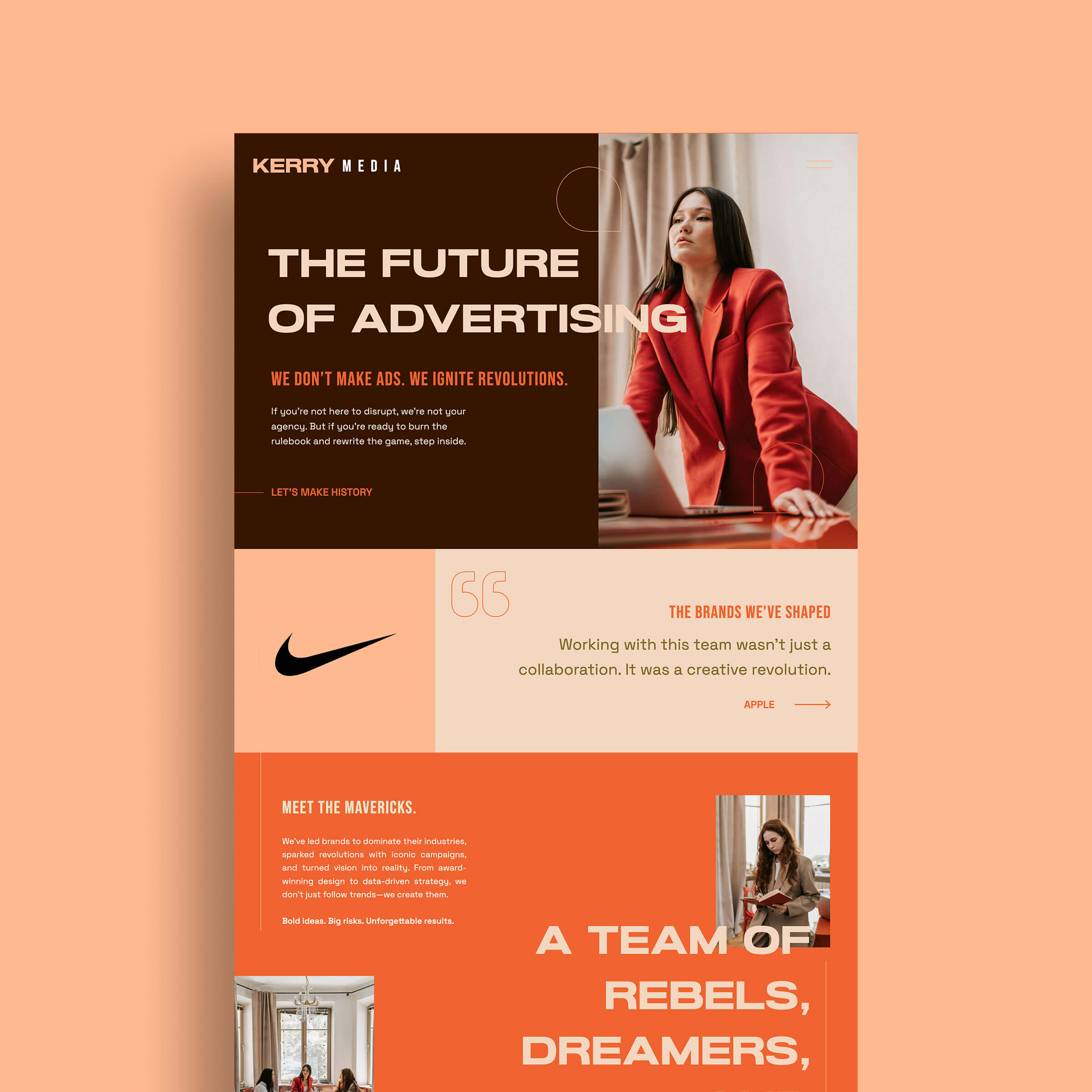
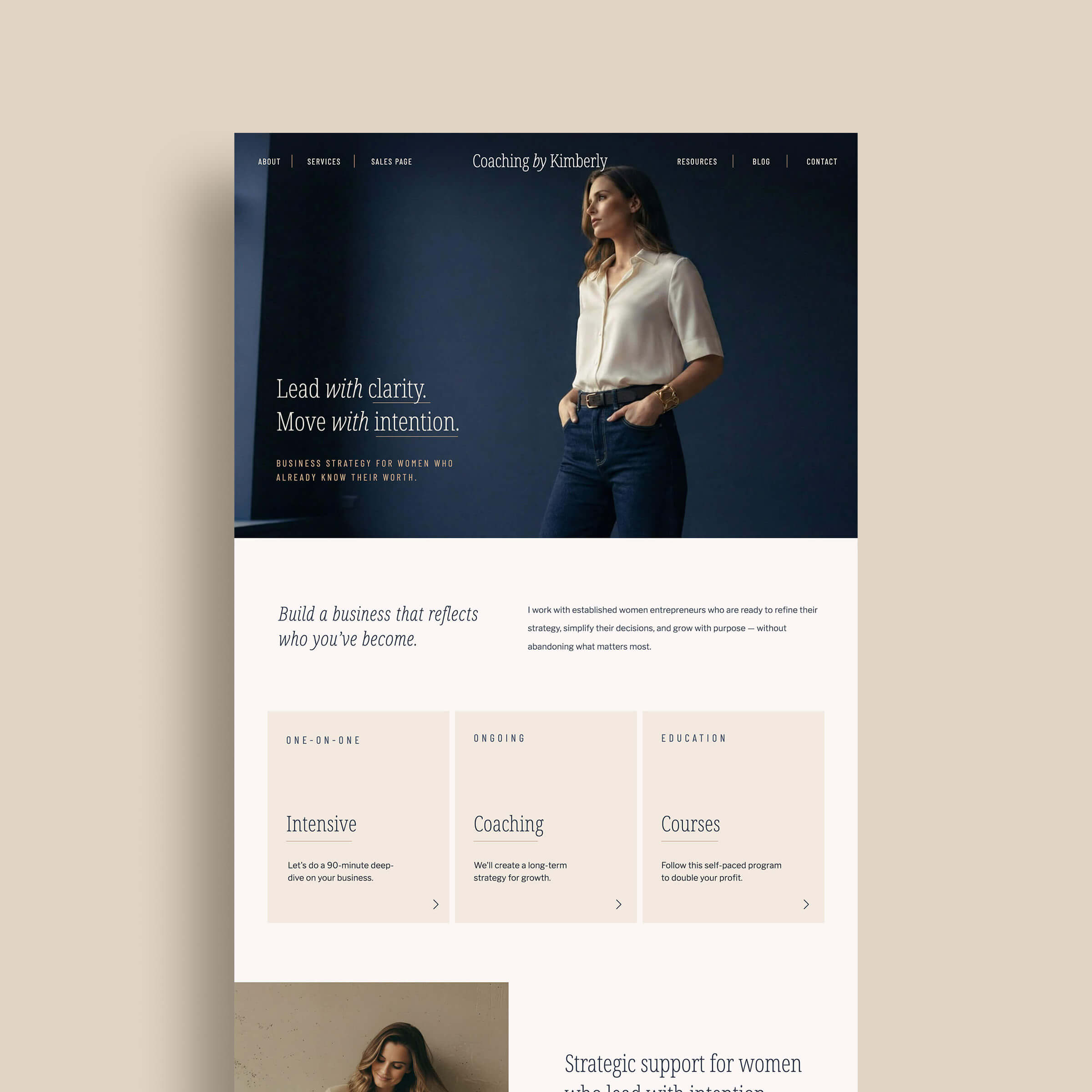
If you don’t want to start from scratch, here are a few of my favorite tried-and-true Google Fonts that you can mix and match together on your website. I put these together because they are readable and clean.
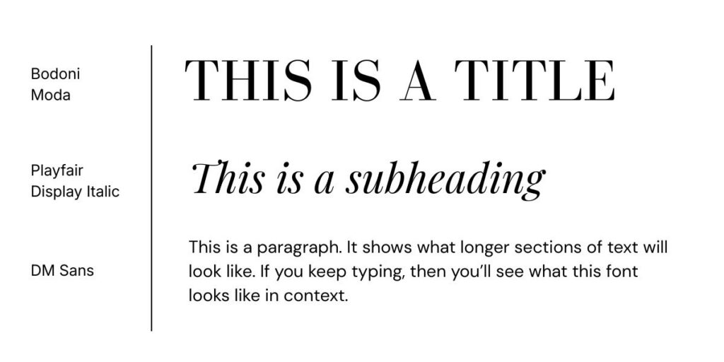
1. Bodoni Moda + Playfair Display Italic + DM Sans
Modern serif & sans-serif font pairing
This is the combo for the brand that wants to feel established the second someone lands on the page. Bodoni Moda brings serious, editorial-magazine energy to your titles, Playfair Display Italic softens it with a little movement and elegance in your subheadings, and DM Sans keeps your body copy clean and easy to actually read. High-contrast + high-polish, this is a go-to modern serif font pairing for brands that want to be taken seriously without feeling stuffy.
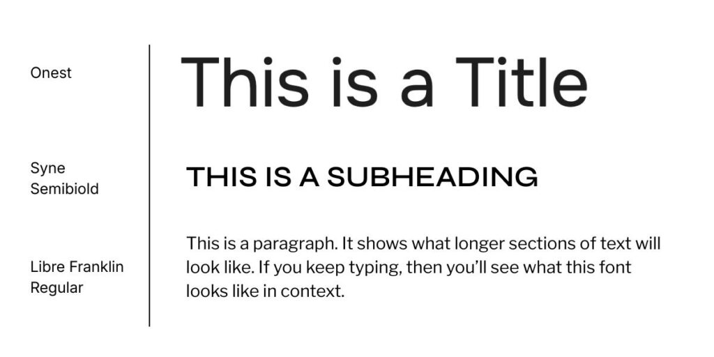
2. Onest + Syne Semibold + Libre Franklin Regular
Clean, modern website font combo
If your brand voice is more “let’s get to it” than “let me tell you a story,” this pairing gets it. Onest is bold and no-nonsense for your titles, Syne Semibold adds a little structure and confidence to your subheadings, and Libre Franklin keeps the body copy crisp and legible. It’s a clean, modern website font combo built for brands that want to feel current, credible, and easy to scan.
3. Bebas Neue Bold + Jetbrains Mono + Poppins Regular
Modern condensed sans-serif font pairing
This one has main-character energy. Bebas Neue Bold is tall, condensed, and impossible to ignore for your titles, Jetbrains Mono brings an unexpected tech-y, typewriter-like edge to your subheadings, and Poppins keeps the body text friendly and rounded so it doesn’t feel cold. It’s a bold, condensed sans-serif combo for brands that want to feel modern, a little edgy, and definitely not blend in.

4. Lora Regular + PT Serif Italic + Quattrocentro Regular
Traditional serif font pairing for websites
Warm, classic, and a little literary, this is a traditional serif font pairing for the brand that wants to feel timeless rather than trendy. Lora gives your titles a soft, rounded elegance, PT Serif Italic adds a graceful, handwritten-feeling touch to subheadings, and Quattrocentro keeps body copy warm and readable. It’s the pairing for brands built on trust, story, and heart.

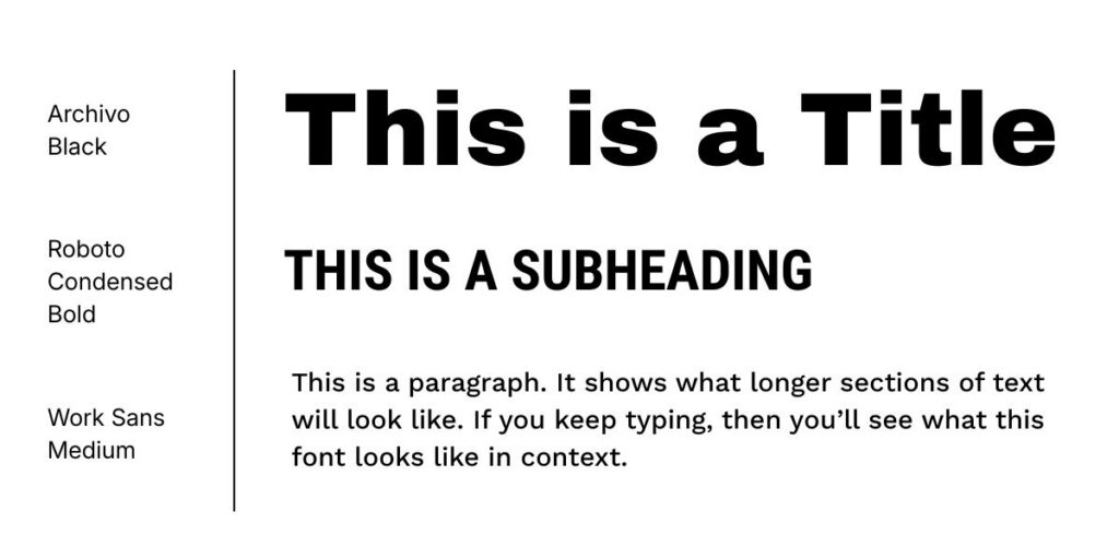
5. Archivo Black + Roboto Condensed Bold + Work Sans Medium
Bold sans-serif font combo
This combo is a thick, heavy, and impossible to scroll past for titles, Roboto Condensed Bold keeps subheadings punchy and structured, and Work Sans Medium brings just enough breathing room to the body copy so it doesn’t overwhelm. A bold sans-serif font pairing built for brands with a strong point of view and zero interest in playing it safe.
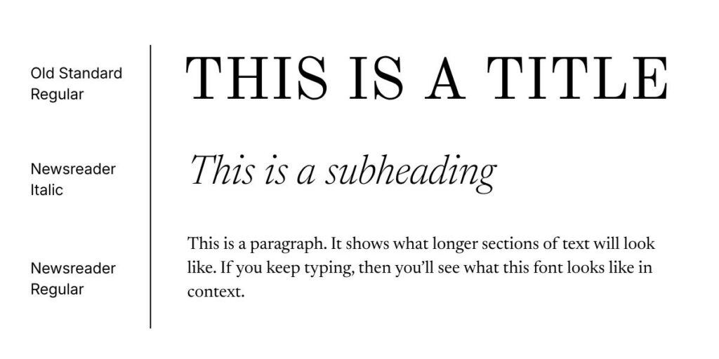
6. Old Standard Regular + Newsreader Italic + Newsreader Regular
Traditional serif font combo for websites
Think old library, leather-bound books, ink and paper… this pairing leans fully into timeless, editorial elegance. Old Standard gives titles a formal, classic weight, Newsreader Italic brings a graceful, storytelling feel to subheadings, and Newsreader Regular keeps the body copy warm and highly readable. A traditional serif combo for brands rooted in heritage, expertise, and craft.
Okay, You’ve Picked Your Fonts. Now What?
Picking the right fonts for your website is a real step, but it’s still just one piece of your site actually works, one that loads fast, guides visitors where you want them to go, and makes them trust you enough to hit “book now” or “buy.”
If you want to grab the full pairing guide and DIY the rest yourself, download Flawless Fonts here (it’s free, and now you actually know what to look for instead of just scrolling on vibes.)
And if you’d rather skip straight to “done,” that’s exactly what our Showit templates, One Week Website, and VIP Days are for, fonts already paired, hierarchy already built, load speed already handled, so you can just show up and launch.
Either way, you’ve got what you need to stop guessing. Go pick your fonts like you mean it.