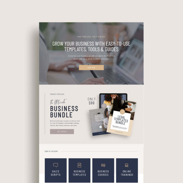
Whether you’re selling services, digital products, programs or courses – a well-designed sales page is an invaluable tool to help you generate more conversions. But a great sales page doesn’t come together by accident.
And you might not have the money to invest in a web designer to help you create your sales apge… So where does that leave you?
It’s time to make a plan for creating a sales page that will actually help increase your number of sales.
(This article contains affiliate links, which means I may receive a small commission for purchases made through links in this post at no extra cost to you. I only recommend products I 100% believe in. Read the Privacy Policy for details.)
Before we dive into sales page best practices and the key elements it needs to convert, let’s take it back to the basics and talk about what a sales page is and why you might need one…
What is a sales page?
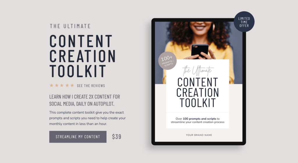
A sales page is a specific page on your website created with the primary goal of persuading visitors to take a specific action, ie. making a purchase or opting into an offer.
Sales pages are commonly used in digital marketing campaigns, especially for products or services that require more explanation or persuasion before a purchase decision is made.
They are designed to guide visitors through a structured narrative that leads them towards taking action, ultimately converting them into customers or leads for your business.
Now, let’s break down what your sales page needs to get your visitors to convert…
1. Sales Page Messaging Framework
The messaging on your sales page is inarguably the most CRITICAL part of your page. A great sales page should include the following copy-driven elements:
How to Write a Sales Page that Converts
- Headline – Your sales page should start off with an irresistible headline that makes the value of what you’re offering crystal clear. It should be as specific as possible and results-oriented to really pique your reader’s interest.
ie. Ultimate Marketing Playbook – 10 Proven Strategies to Double Your Online Sales in 30 Days
- Pain Points – This is where you remind your visitor why they’re here in the first place and that your product / service is for someone like them. This will establish an emotional connection between you and your audience because they will feel like you understand exactly what they’re going through.
ie. Struggling to get your visitors to click that buy button? Feeling defeated by low sales despite spending hours on social media? I get it… but the problem isn’t you, it’s your strategy.
- Transformation – Describe what someone will experience when they use your product/service. This should articulate how you will take them from where they are now to where they want to be and what it will be like once they reach the finish line.
ie. Imagine a steady stream of sales coming in daily, a website that practically sells for you, and the freedom to focus on growing your business instead of worrying about conversions. That’s the power of our conversion-optimized landing page templates.
- Features + Benefits – You want to make it clear not just what’s included in your product/service but how that will help them in the long run.
ie. Access to 10 customizable landing page templates so you can save hours of design time and launch high-converting pages effortlessly.
- Incentives – If you will really want to drive action on your sales page, adding incentives or additional motivation for your visitors is a no-brainer. Adding an incentive could look like offering a limited-time discount, a bonus (or two) added with their purchase or a limited number of spot available.
ie. Sign up before August 1st to get an exclusive early bird 20% discount! Plus, receive a bonus e-book on advanced conversion strategies – available to the first 50 customers only.
- FAQs / Objections – Inevitably your visitors are going to have questions or reservations about your offer / product. Take the opportunity to call out the elephant in the room to address these front and center. Instead of making your FAQs a space to provide generic answers, use it as a sneaky way to seal the deal about why this product / offer is what your customer needs, even if they have experienced certain circumstances in the past or don’t meet certain criteria.
ie. Q: I’m not a designer… How difficult is it really to customize the templates? A: Our templates are designed with ease of use in mind. Even if you’re not a tech expert, you’ll find our step-by-step guides and video tutorials simple to follow. Most of our customers are able to customize and launch their pages within a few hours.
- Call to Action – You should only have a single call-to-action focus that you want to include on your sales page, but that doesn’t mean you can’t include 2-3 (or more!) times on the same page. Make it clear what you want your visitors to do next and remind them again, what they’ll get if they do take action.
ie. Get Instant Access to Our Proven Landing Page Templates – Only $49! Unlock Your Exclusive Discount and Bonus Resources – Get Started Now!
Besides these components, you’ll need to make sure your page copy avoids excessive use of jargon and buzz words and instead is written in a conversational way that uses the words your ideal client would actually use.
Related Post: Should you Put Your Pricing on Your Website?
2. Sales Page Design
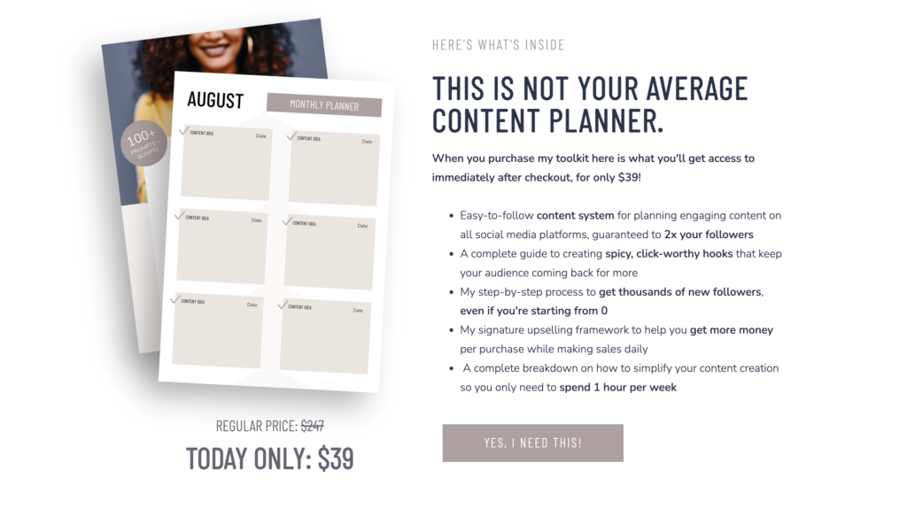
If you’ve already got killer copy written for your sales page, your design isn’t going to have to do as much of the heavy lifting, but it will add credibility to your brand and strengthen your message.
Here are some things you need to pay attention to when it comes to your sales page design:
1. Sales Page Design & Formatting
A well-designed sales page will allow your readers to more easily digest the copy you’ve written. Using plenty of bullets and headings will help keep your readers interested and allow them to easily scan the page for the most important information.
Last, but not least, you will want to consider on your sales page is the overall aesthetic of your page. If you have an existing logo and color palette, you’ll want to reinforce your sales page with these elements so that it’s consistent with everything else you are creating including your social media posts, ads, emails, and any other marketing content that you might be creating to drive people to your sales page.
2. Sales Page Imagery / Graphics
The graphics that you include on your sales page, help to bring your offer to life, especially if you are selling digital products or intangible services where it’s hard to envision what the outcome or final product really looks like.
This helps you sell the features of your product/service and helps your readers visualize the value. Here are several idaes of images and graphics you can use on your sales page to help support your content:
- High-Quality Product Images: Use multiple angles and close-up shots to showcase the details and features of your product. If you are selling digital products, you can use product mockups on a device.
- Product Videos: Create a short video demonstrating how your product works in real-life situations or a behind-the-scenes sneak peek.
- Infographics or Diagrams: Use infographics to visually explain complex processes or comparisons between your product and competitors. For example, a comparison chart showing features and benefits.
- Before-and-After Visuals: If your product offers transformative results, show before-and-after images or illustrations to highlight the improvement or change achieved. This could even include screenshots of analytics to prove that your product does what you say it does
- Interactive Demos or Virtual Tours: Allow visitors to interact with a demo of your software or product through a virtual tour. This could include clickable elements that showcase different features or functionalities.
- Usage Scenarios or Lifestyle Images: Show your product in use within different scenarios or lifestyles that resonate with your target audience. This helps them visualize themselves using the product.
- Visual Storytelling through Slideshows or Carousels: Use a slideshow or carousel format to tell a visual story about your product, how you created it, or walk through a customer journey.
- 3D Models or Virtual Reality (VR): For a more immersive experience, consider using interactive 3D models or VR simulations to allow visitors to explore your product from different angles.
- Infused Brand Personality Graphics: Incorporate custom illustrations or graphics that reflect your brand’s personality and values. These can add a unique touch and resonate emotionally with your audience.
Need beautiful photographic mockups for your sales page? We love HauteStock*. You can download 20 free high-quality feminine stock photos to help give your designs that high-end feel.
Or check out this quick video tutorial I made that will show you how you can make a product mockup in less than 2 minutes with Canva!

Related Post: How to Create a Bounce-Proof Homepage Design
3. Sales Page Navigation Design
Minimal navigation is a crucial aspect of your sales page’s design that can directly impact your page’s effectiveness in converting visitors. If you are aiming to create a true landing page (especially when driving traffic from ads) reducing the options in your navigation is a proven tactic for increasing conversions.
Here’s why it’s important and how to implement it effectively:
Why Minimal Navigation Matters
- Reduces Distractions: A landing page with minimal navigation limits options for the visitor, keeping their focus on your primary call to action (CTA). Too many links or menu items can distract visitors and lead them away from the conversion goal.
- Increases Conversion Rates: By removing unnecessary navigation elements, you create a more streamlined path for the visitor. This clarity can lead to higher conversion rates as visitors are less likely to get sidetracked.
- Enhances User Experience: Simplified navigation can improve the overall user experience by making it easier for visitors to find the information they need without feeling overwhelmed.

3. Trust Signals
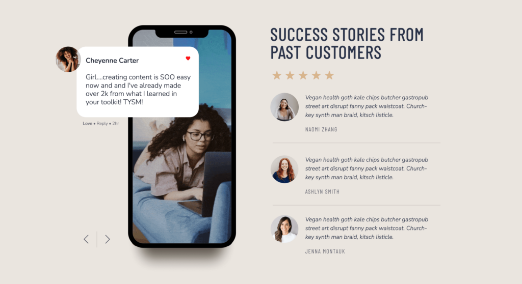
Including trust signals or “social proof” on your sales page is another easy and powerful way to establish credibility and trust with your readers.
One of the most popular ways to build trust is through testimonials. Testimonials can be screenshots of DMs, videos or written text on the page or a mix of all three. Sometimes it can feel like a pain to bug your past customers or clients for their feedback on your product/service, but trust me, it will be well worth your time!
Testimonials create a psychological effect that can make buyers more confident in their decision to buy. Here are a few statistics that help support this:
- 70% of people trust reviews and recommendations from strangers (Nielsen)
- On average, testimonials on sales pages increase conversions by 34% (Impact)
- Using customer testimonials regularly can generate approximately 62% more revenue (Strategic Factory).
If you don’t have any previous customer testimonials for a new offer, you can often get feedback from “guinea pigs” in your audience or beta-testers. By offering your product/service free or at a low cost to a small group of people, you can get valuable feedback on your offer that can also serve as testimonials that you can use on your sales page.
Besides testimonials, you can also build trust by including Google Reviews, client logos, awards, or certifications to reassure your visitors that you know what you’re talking about.
4. Sales Page Tech Setup & Automations
How tragic would it be if you had thousands of visitors coming to your sales page, ready to buy your offer, but when they clicked ‘Add to Cart’ it broke your website or gave people an error message? Pretty horrible, right?
That’s why choosing the right software (and testing it) is another critical element to a successful sales page. When adding the ability for your users to purchase your product/service directly on your site, you have a lot of options. Here are a few of my favorites:
- If you are building a full e-commerce website with hundreds of products, Shopify or Woocommerce (WordPress) are going to be your best options.
- If you have a smaller shop that you only want to sell a handful of products you can use an app like Thrivecart*, Send Owl or Shopify Starter.
When choosing the right software for your site, you’ll want to consider what type of features and functionality you need to have.
For example, will you want to be able to offer coupons, upsells or countdown timers at checkout? Or is a simple shopping cart that takes a user’s payment information sufficient? Do you need help with shipping and fulfillment?
Shopping cart software ranges widely in cost so make sure to do you research on what will be the best fit for your business.
Related Post: Thrivecart: Everything You Need to Know About The Shopping Cart App
5. Traffic Source for Your Sales Page
Lastly, you can’t convert your visitors if you don’t have any which is why a reliable traffic source is absolutely necessary to getting conversions on your sales page. My favorite traffic source to get visitors to my website and sales pages is through organic traffic, but organic traffic takes time to build – it’s not an overnight strategy.
Organic traffic is free traffic that comes from people simply searching for you on Google. You can build up your organic traffic by optimizing your sales page and your website’s copy to be search-friendly. This means making sure your page titles and content include relevant keywords along with other SEO-friendly practices.
Related Post: How to Massively Increase Your Website Traffic by Blogging
However, organic traffic is just one method you can get people to your sales page.
You can also use ads, social media, email marketing, and affiliate/referral traffic. Depending on your platform and your niche, one method may work better for you than another. Your target audience, where they hang out, and the cost of your product/service are all key factors in choosing the right traffic source for your sales page.
You will want to weigh the benefits and cost of each traffic generating method to decide what makes the most sense for you and your business.
Are you failing to convert visitors on your sales page?
Check out my Kimberly template in my shop which comes with a built-in sales page template design for courses, or our new Kimberly Shop template for products to help you get more conversions.
Or looking for a sales page designer to design a custom sales page for your offer? Reach out to me here and let’s chat about your project!
Kimberly – Showit Website Shop Add-on
The perfect template to help you start selling products on your Showit website.

