Brand fonts are fonts that you choose to represent and use for your brand on a consistent basis. For every brand project I work on with a client, one of the major items we tackle is selecting the appropriate brand fonts.
(The following post may contain some affiliate links. Please read the Terms of Service and Privacy Policy for more info.)
When it comes to picking fonts yourself, it’s easy to feel totally overwhelmed by all the font choices out there. Using the right fonts is probably one of the most underrated ways to add personality to your brand, but it can also be easy to pick fonts that give the wrong impression if you’re not careful. It might seem silly to say there is even such a thing as a “wrong” or “right” font – But if I’ve piqued your interest, you should keep reading.
Why You Need Brand Fonts
So, I bet you’re wondering…How do you know if you’re picking the wrong fonts for your brand and why that even matters? You’ll know you’ve chosen the wrong brand font because you’ve created the wrong impression – one that doesn’t match your messaging and repels your target audience.
Maybe you thought that cute script font, made you feel friendly and personable, but it actually turned off potential customers because they thought it made you seem unprofessional. On the flip side – the right choice of fonts can help add polish to your business and give strength to your marketing messages. Similarly to how colors and different styles of imagery work, different fonts have their own meanings and abilities to evoke certain feelings and sentiments.
In addition to strengthening your marketing, using a consistent set of brand fonts will help you to establish a visual tone for your brand that makes your business more recognizable in your niche. So where do you start?
Best Websites to Find Brand Fonts
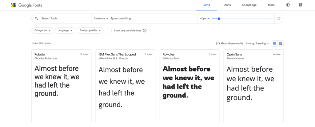
If you’re ready to choose your brand fonts, you’ll need to be sure you are looking in the right places. Some of my favorite websites for finding good quality fonts are:
- Google Fonts (free)
- FontSquirrel (free)
- My Fonts (paid / free)
- Adobe Fonts (paid)
- Creative Market (paid)
- Lost Type Co. (paid / free)
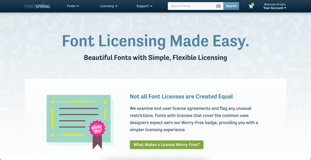
- Fontspring (paid / free)
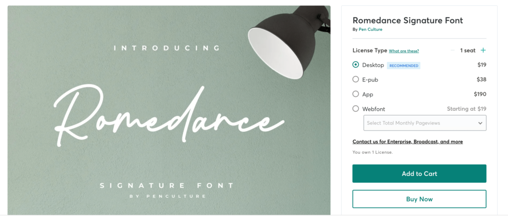
While it can be tempting to gravitate towards only the free font options, don’t totally rule out spending a bit of money. Most fonts can be purchased for less than $50, often times less than $20, especially if you are only choosing one style or weight.
There are plenty of great fonts out there that are free, but sometimes the perfect one comes with a little extra cost. Weigh your options and do your research before making any decisions. Also make sure that you buy the correct font license if you will be using the font for your business.
Consider any money you spend on fonts a great investment for your business and your brand. With paid fonts you can also usually score some extra glyphs or characters that can add even more style to your brand. Think ligatures, alternate characters, swashes and sometimes, even fun illustrations!
Beware of Sketchy Free Font Websites
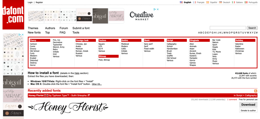
During your font search you may run into font websites like dafont.com or 1001freefonts.com. Usually these sites are plastered with PPC ads and you’d be best avoid them altogether! Many of the fonts available from sites like these haven’t been vetted for quality or consistency and are only available for personal use, meaning you can’t use them for your business.
It’s also easy for anyone to upload their own font without giving much care to how it was created. Be warned: you may discover missing characters and numbers, poor spacing or incompatibility with your computer when you are downloading fonts from sites that seem untrustworthy.
What Characteristics to Look for in a Brand Font
Consider that you will be using your brand fonts quite a bit so you need to make sure whatever fonts you choose for your brand, that you are fully committed to them. To ensure the brand fonts you choose have longevity…
- Consider different font personalities. Different types of fonts styles have different personalities that affect how people interpret you brand. Therefore, your brand fonts should ideally mimic the personality of your business. For example, serif fonts like Times New Roman are typically seen as more classic and traditional. Sans-serif fonts like Arial and Helvetica are viewed as modern or corporate. There are other font types you also might consider such as slab-serif, script, handwritten or decorative fonts depending on the brand personality you are trying to communicate.
- Consider readability first and personality second. Headlines and titles should naturally have the most emphasis. The font you use for your titles are a great opportunity for your brand personality to shine by choosing a font that is a little more unique, but it still needs to be readable. Use script fonts sparingly, only as an accent to more readable fonts.
- Consider how you will use your brand fonts. The best brand fonts will look great both in print and on the web so be sure you love how your chosen fonts look in multiple formats and different sizes. Your fonts will also be much more versatile if they come with varied weights so that you can utilize bold and italics to create emphasis in your designs.
- Avoid trendy fonts. Some examples of fonts to avoid include: Comic Sans, Lobster, Papyrus, Trajan, Copperplate, Impact, Brush Script, Hobo and Curlz MT. These are major offenders that often come by default with most computers, but should be avoided unless you want to look like an amateur.
- Avoid fonts that look too similar to your competitors. The whole point of choosing brand fonts is to help distinguish you brand from the crowd so make sure you don’t just copy what font a competitor is using, no matter how much you might love that certain font.
How to Choose Fonts for Your Brand
When you’re ready to pick and pair fonts together for your brand, you may feel like you need a little guidance. Here are some basic guidelines to help you choose brand fonts for your designs and brand materials:
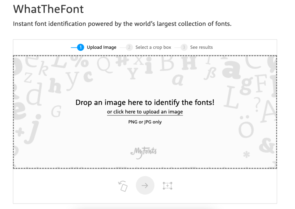
- Do some research. Look at different brands you admire and note what kinds of fonts they use and how they pair different fonts together. Get font inspiration first and then narrow down your options. You can try my Font Pinterest board, these Google font pairings or if you find a font on a website you like, but aren’t sure what the name of the font is, you can use a tool like What the Font to identify a font from an image.
- Decide on 2 or 3 fonts that you want to use. If you are looking for more variety, try to use the same font in different weights and styles (ie. light, bold, italic etc.) Too many fonts can make your designs and brand feel busy and disconnected.
- Use a graphics program like Canva to experiment with your brand fonts. Try out different font pairings in Canva, sizes and weights using dummy text to mock up what your headings, subheadings, paragraph and calls to action might look like. Make sure your selection of fonts feel balanced and cohesive as a whole. If you choose a bolder font for a heading, try a font that understated for your subheading so the two don’t compete with each other.
- Choose from these classic fonts if you are feeling unsure. If you simply don’t know which fonts match the personality of your brand or are feeling overwhelmed by all the options, it’s better to lean on the safe side and choose fonts that are timeless, stylish and readable. Some great classic font choices that never go out of style are Helvetica, Gotham, Futura, or Garamond.
Other Tips for Choosing the Right Brand Fonts
- Don’t just pick a font because it is your favorite. Think about the style of the font and what meaning it gives off. Is this the message you want to send to your audience?
- Don’t steal fonts. Make sure you understand the basics of font licensing and if a font says it has a personal license only, you should not use this for your business – it is considered stealing! If there is a commercial license available, you will need to purchase the font to use it.
- Don’t pair fonts that are too similar. If you choose fonts that are too similar with only slight differences, it can make your designs feel awkward, like something isn’t quite right.
- Brush up on your knowledge of web safe fonts to see what additional factors you will need to consider when using fonts on your website or in your emails.
Still need help choosing fonts for your brand or have a question about fonts? I’d love to help! Shoot me a message here or download my free Font Inspiration guide below!
This post was originally written February 1, 2018 and recently updated with more helpful and timely information. Cheers!


