

Color is one of the most powerful tools that a graphic designer can wield and manipulate. When you or the graphic designer you’ve hired is selecting a color palette for your brand, it’s more than a shot in the dark or what looks pretty. It’s about conveying a specific message. Your message.
“In order to use color effectively it is necessary to recognize that color deceives continually.” – Josef Albers
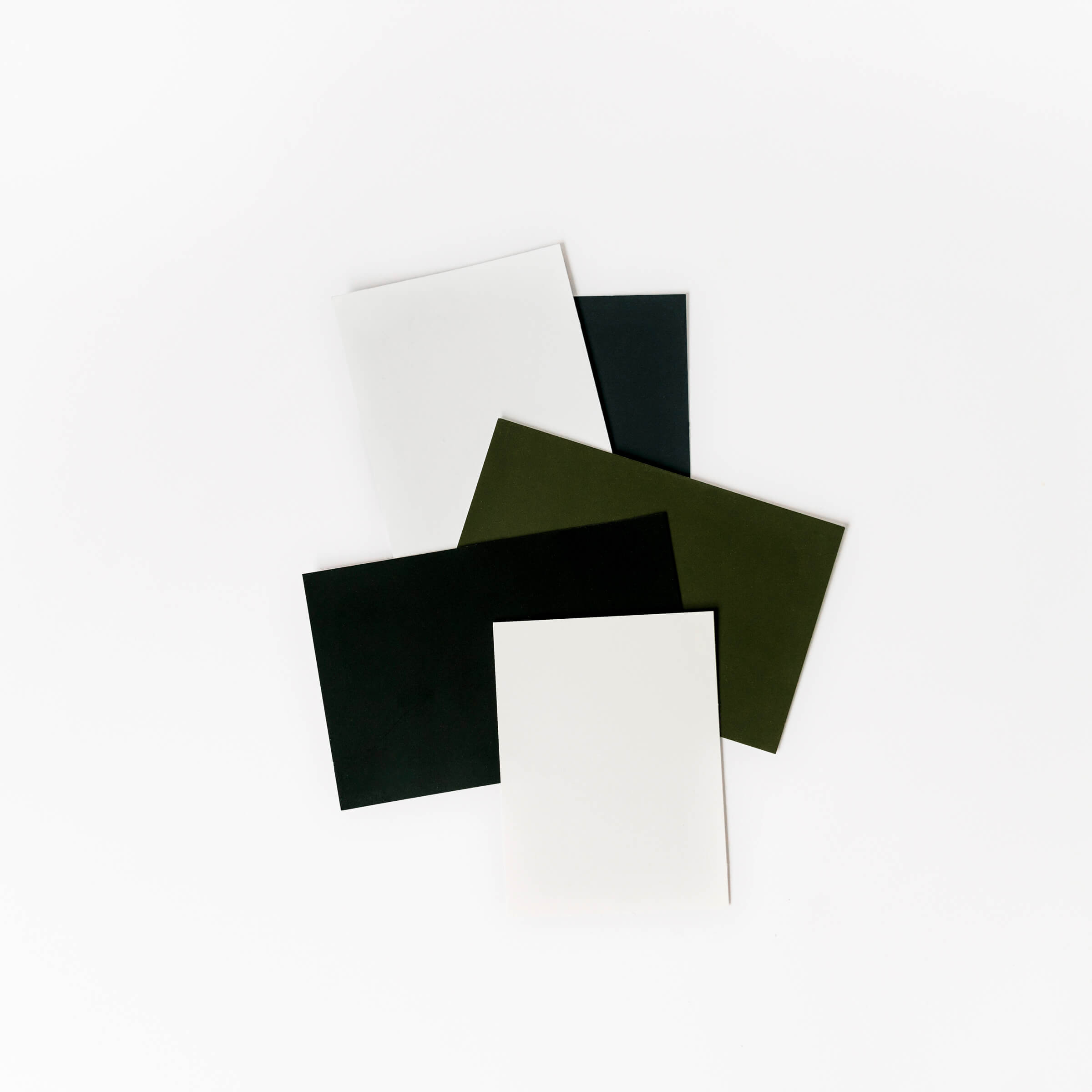
This quote from Josef Albers is spot on in describing color as an ever-changing design element. The most significant influence on color’s adaptive nature is based on it’s environment. A color that lives alone can make a statement, but when paired with other colors it can begin to tell a story.
For example, a huge difference can exist when pairing the color red with blue and pairing the same color red with green. The first pairing might make you think of the globally-loved brand Pepsi or perhaps a salute to American Patriotism while the second pairing might stir up thoughts of Christmastime. Because our perception of color is completely related to context, selecting a color palette requires a thoughtful and careful approach.
“One way to make yourself stand out from the crowd is by using color in ways nobody else thought of” – Josef Albers
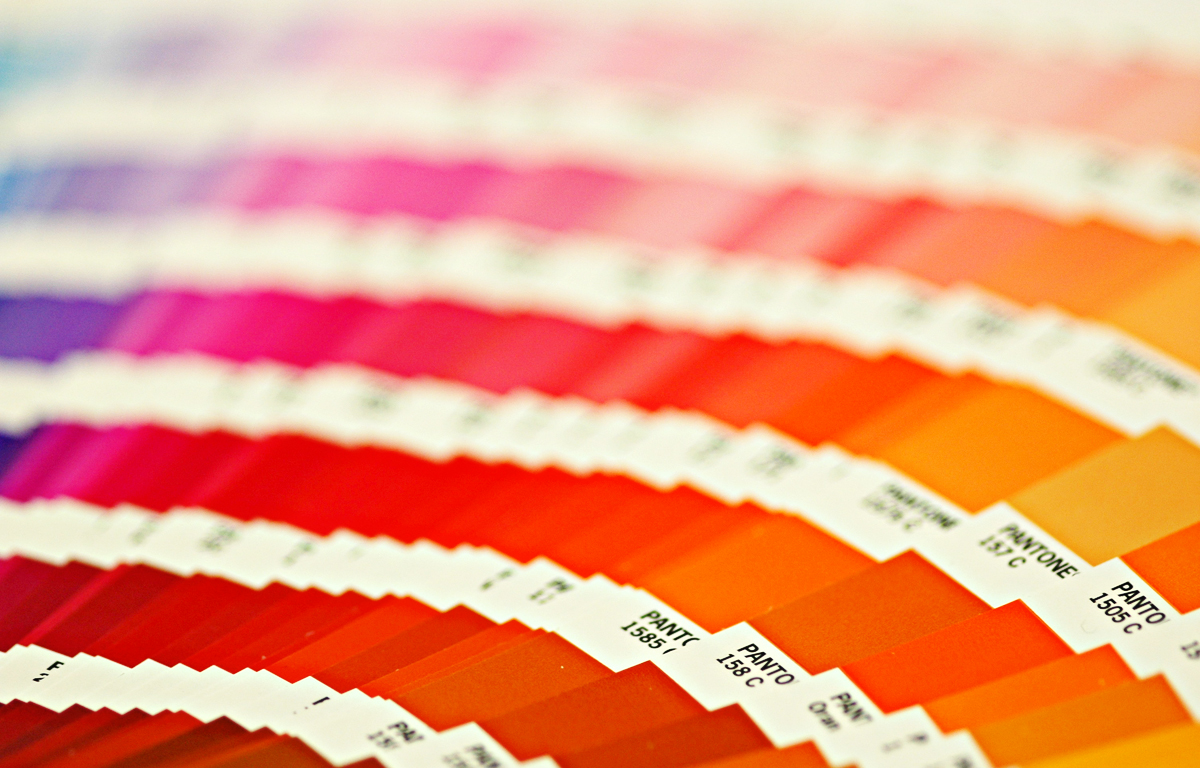
While one can certainly use color wheels and color theory to guide your decisions, it can take years of experience to master the art of combining colors and building evocative and meaningful color palettes. Tools like Adobe Color have been developed to aid designers and color enthusiasts share color palettes and create harmonious families of color. However, I believe the best approach to selecting complimentary colors comes from exhaustive experimentation, research and smart utilization of color resources like the Pantone Matching System.
Related Post: How to Create a Beautiful & Unique Color Palette for Your Brand
“Color is memorable. Marketing research indicates that more than 80% of visual information is related to color” – Terry Lee Stone
Using color effectively is not just about creating warm and fuzzy feelings. Color can have a very influential effect on the potency of your marketing communications and the memorableness of your brand. Next time you are planning your next marketing campaign or social media promotion be mindful of how color can contribute to your success and make your choices accordingly.
Interested in learning more about color in graphic design and how it can help grow your business? Talk to K Design Co.
photo credit: Mark Strozier via photopin cc