


You bought the template. You filled in your text. You uploaded a few photos. And somehow… your site still looks like the template…
That’s because making your Showit website feel custom is less about starting from scratch and more about knowing which details actually move the needle. Most people skip the things that matter most and agonize over things that barely register visually. My tips are hopefully going to help change that.
Whether you are working with a Showit template you just purchased or one that has been sitting in your account for six months, these are the design moves that make a real difference.
(This article contains affiliate links, which means I may receive a small commission for purchases made through links in this post at no extra cost to you. I only recommend products I 100% believe in and use myself. Read the Privacy Policy for details.)
Why Your Showit Template Still Looks Like a Template
Your website template looks generic for a surprisingly specific set of reasons, and it almost never has to do with the template itself being bad. The most common culprit is surface-level swapping like only changing the text and maybe some of the colors, but leaving the underlying visual logic untouched.
There are a few areas where this shows up the most: typography choices that feel off, photos that do not belong together, and layouts that feel cramped because nothing was adjusted to actually fit the business. When all three are off, the site reads as “a website” rather than “your website.”
The good news is that none of these are that tricky to fix. They just require a bit of intentionality.
Typography Choices That Actually Matter
Fonts are one of the easiest ways to communicate personality on a website, which means they are also one of the easiest ways to accidentally communicate the wrong thing.
A few guidelines that I think make a big difference:
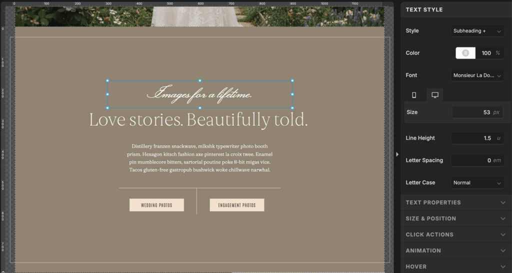
- Use script fonts sparingly. Script and handwritten fonts are lovely as accents — think a 3 or 4 word phrase, a section label, or a single highlighted word. The moment a script font shows up in full sentences or paragraph text, it becomes a readability nightmare. Your visitors should not have to squint.
- Ease up on the all caps, sis. I know they can look cute as a design detail… a short label, a nav item, a one-line callout. But even in an elegant serif font, all caps text starts to feel exhausting when it runs longer than a few words. Your readers are scanning, and you want to make that easy, not harder.
The general rule: your accent fonts are for moments of interest. Your body and heading fonts are doing the actual work. Let them do it clearly.
Your Photos Are Either Doing the Work or Undoing It
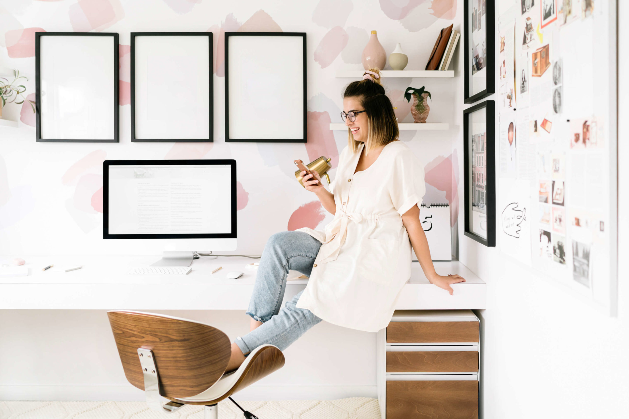
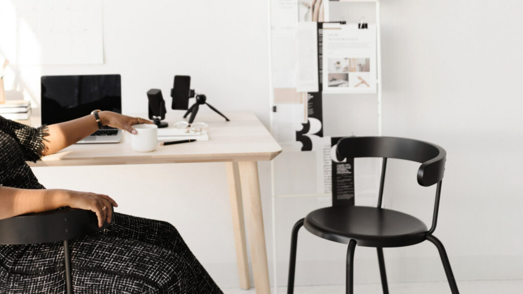
This is something a lot of people skip, and it is the one of the things that matters most… professional photos!
Any time I am working on a One-Week Website project with a client based on a Showit template, I ALWAYS ask for them to get professional photos before we design.
Inconsistent photography is the number one thing that makes a template look “cheap”, even when the template itself is beautifully designed. When certain photos do not belong together visually, no amount of color palette can pull your site together.
What I mean by “belonging together” is that your images should feel like they came from the same world or family, even if they were not all taken the same day. Similar lighting, a consistent overall color temperature, and a cohesive mood go a long way.
Here is what I love to see from my client’s share from their photographer:
- A mix of horizontal and portrait-oriented images so you have options for different layout sections
- 2 to 3 different outfits and/or backgrounds that feel complementary, not matchy-matchy
- Props, settings, poses, and lighting that match your brand’s energy… ultra clean and airy, warm and editorial, gritty and moody, whatever fits
In the end, I like to have at least 20-30 images for a 5-7 page website to give me enough options to choose from as I design.

The “10 different angles of the same headshot” approach does not give you enough variety to actually build a website with. One outfit, one location, one lighting setup, that is a start, but not a complete shoot.
If you are planning a brand shoot, think through the shoot the way a creative director would.
- What will the backgrounds look like?
- Are you wearing any of your brand colors? (You better be!)
- Does the lighting match the energy you want people to feel when they land on your site?
These are not random things to consider. They are the difference between a shoot that gives you 200 usable images and one that gives you 5.
And if a full brand shoot is not in the budget right now, Adobe Firefly’s AI image generation (including the Nano and Firefly tools) has gotten crazy good for creating certain types of supplemental imagery. Not a permanent solution for your brand photos, but a real one when you are in a pinch.
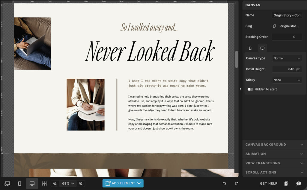
Give Your Content Room to Breathe
One of the most common Showit mistakes is when you try to fit too much content into too little space. When your website sections are crammed, the page reads as chaotic + messy even when the content itself is strong.
An easy rule of thumb for spacing: aim for each site section to be at least 700 to 800 pixels tall, and often more depending on what is in it.
White space is not wasted space. It is the thing that makes your site feel considered rather than rushed.
This is something that comes up constantly with One-Week Website clients… the instinct is to fill every inch of your site, but the edit is almost always to remove and expand, not add more.
When you give each section the room it deserves, the overall hierarchy becomes clearer, your calls to action stand out more, and your whole site reads as more intentional.
This is one of those changes that is invisible when done right and very visible when it is missing.
The Showit Features That Add a Custom Feel Without Extra Work
This is where things can get fun.
Showit has built-in animation options that can give your site a layer of polish without any coding, any plugins, or any design experience.
The easiest one to start with is a simple fade-in on elements as they load. It takes about 2 seconds to add to most elements and it immediately makes a site feel more intentional. (Skip the crazy bouncing or lots of flying-in effects… those tend to read as dated.) The fade is clean, subtle, and effective.
For hover effects, Showit also lets you add a little motion or formatting change when someone mouses over a button or an image. Used with restraint, this kind of micro-interaction signals craft. It says someone thought about the experience of being on this site.
And there is another cool new Showit feature worth knowing about…
Showit recently added Lottie animation integration. You can choose from a library of pre-made Lottie animations and drop them directly into your site, without knowing how to code! This is one of those “custom touch that almost nobody expects on a template site” moments. The Lottie library has a ton of options, from subtle looping graphics to more expressive motion, and it is definitely worth exploring if you want to add something unexpected to your site.
Note: this feature is still relatively new, so it is worth exploring the Showit help docs for the current setup process.

Moving Sections Around (More Than You Think You Can)
One thing people underestimate when working with Showit templates is how flexible the section structure actually is. You are NOT locked into the original page layout or any kind of grid. Sections can be added, removed, and reordered… usually in just a few clicks.
This matters because the template was designed for a hypothetical business, not yours. Your services might actually work better in a different order or laid out in a different way. You might have a strong testimonial section that should live higher on the page. You might not need a blog preview at all.
This kind of editing of repurposing sections, rearranging the flow, dropping in sections from other pages in the same template, is something that comes up in almost every template customization project I work on. Your template’s starting structure, not a final answer so treat it like one.
Frequently Asked Questions
Yes! And the gap between “template” and “custom” is smaller than most people think. The main difference is almost always in the photography and the typography choices. When those two things are dialed in, the underlying template structure matters a lot less.
This depends on your brand, but a general framework that works well: one clean, readable serif or sans-serif for headings, one clean font for body text, and a script or decorative accent font used very selectively.
Google Fonts are already built into Showit and give you a wide range to choose from but you can also choose custom fonts from your favorite font design. Jen Wagner is one of my favorite font designers* who we feature fonts from in our templates!
Just make sure you purchase the appropriate web font licensing whenever you use a font on your website.
It helps, but it is not the only option. What matters more than “professional” is “cohesive.” Even well-lit iPhone photos with consistent backgrounds and styling can work well on a website.
What does not work is a random mix of lighting conditions, backgrounds, and image orientations that were not shot with a website in mind.
You can also use stock photos like these* mixed in with your own brand photos to add more depth and variety to your design. Just make sure that the vibe and overall aesthetic is complementary to your own photos or the effect can be a little awkward.
A quick gut check: look at any given section and ask if your eye knows where to go. If everything is competing for attention, you probably need to increase the section height, reduce the number of elements, or both. If there is a clear visual hierarchy and one thing draws your eye first, you are probably in good shape.
Technically yes, though it requires some extra TLC to keep the styling consistent and you would have to purchase multiple templates. Within the same template, moving and repurposing sections from one page to another is super easy and something worth doing regularly.
Final thoughts…
A website template should be a starting point, not a full sentence. The version of the site you launch should feel like it was built for your business, your brand, and your people, not like something you picked up off a shelf and left in the packaging.
The changes that actually get you there are not complicated though: thoughtful typography, cohesive photography, generous spacing, and a few subtle touches that signal someone actually thought about the experience of being on this site.
None of this requires a design degree. It just requires knowing what to look for.
If you want help getting there faster, there are two ways to work together:
- My One-Week Website service is a done-for-you Showit template customization where we take a Showit template and build it out into a site that actually looks like yours, in one week.
- Or if you prefer to do it yourself, browse the template shop for Showit designs that are built to be customized without a fight.
Either way, you do not have to keep looking at a site that feels like someone else’s.