

I want to tell you something that took me way too long to learn: a beautiful sales page means absolutely nothing if the words on it aren’t doing the work.
I know, because I’ve made this mistake. I spent hours obsessing over the perfect color palette and font pairing for a new offering and then…crickets. The page looked polished + professional, but I hadn’t given my visitors a real compelling reason to buy. I was so focused on how it looked that I forgot to think about what it said.
If you’re selling services, digital products, programs, or courses and you’re not seeing the conversions you expected, your sales page is probably missing a few key ingredients. And no, you don’t need to hire an expensive designer to fix it. You just need a clear strategy.
Let me walk you through exactly what a high-converting sales page needs… from the messaging that does the heavy lifting, to the design that backs it up, to the tech that makes the whole thing run smoothly.
(This article contains affiliate links, which means I may receive a small commission for purchases made through links in this post at no extra cost to you. I only recommend products I 100% believe in. Read the Privacy Policy for details.)
First, what is a sales page? (and why do you need one)?
A sales page is a dedicated page on your website built with one goal: to convert visitors into buyers.
Unlike your homepage or about page that serves multiple purposes, your sales page exists solely to persuade someone to take a specific action, whether that’s purchasing a product from you, enrolling in your course, or booking a service.
Sales pages are especially important when you’re selling something that requires a little more explanation before someone is ready to hand over their credit card. The more context, nuance, or investment involved in your offer, the more work your sales page needs to do.
Think of it like having a one-on-one sales conversation with every single person who visits your site… except it’s running 24/7 without you having to show up!
Sales Page vs. Landing Page… What’s the difference?
These two terms get confused all the time but they’re not actually the same thing, and knowing the difference matters for how you build each one.
A landing page is any standalone page designed to capture a specific action. That action could be anything: signing up for a freebie, registering for a webinar, downloading a lead magnet. The goal is usually to collect an email address, not a credit card number. Landing pages tend to be shorter, simpler, and lower friction.
A sales page is a specific type of landing page, but its only job is to convert a visitor into a paying customer (hence, why it uses the word “sales” in the name). Because money is involved, there’s naturally more hesitation on the reader’s side, which means your sales page needs to do a lot more work. It needs to build trust, overcome objections, demonstrate value, and make a compelling case for why someone should spend their money with you right now.
The short version: every sales page is a landing page, but not every landing page is a sales page. If you’re selling something, you need a sales page, not just a landing page with a buy button slapped on it.
Get your sales page messaging right… this is the big one!
If I had to pick one thing that makes or breaks a sales page, it’s the copy. FULL STOP! You can have the most gorgeous design in the world, but if your words aren’t connecting with your reader, you’re leaving money on the table.
Here’s the messaging framework I come back to every single time I’m building out a sales page… for myself or for a client:
Start with your headline. Make the value unmistakably clear.
Your headline is the first thing people see, and it needs to stop them in their tracks. The best sales page headlines are specific, results-oriented, and speak directly to what your ideal customer actually wants.
Don’t try to be clever or cutesy here. Clarity wins every time. Ask yourself: “What is the single most compelling outcome my product delivers?” Lead with that.
Weak: The Ultimate Marketing Course
Stronger: 10 Proven Strategies to Double Your Online Sales in 30 Days (even if you’ve tried everything before)
Pain Points – Show them you get it
Before you can sell someone on any solution, you need to prove that you actually understand their problem. This section is your chance to connect emotionally with your reader by naming exactly what they’re struggling with.
When someone reads your sales page and thinks “wait, how does she know that’s exactly how I feel?”… that’s when trust starts to build. That’s when they lean in.
I like to think about what my client was Googling at 11pm before they found me. What was keeping them up at night? What had they already tried that hadn’t worked? Write to that person.
You’ve posted on Instagram every day this week. You’ve tweaked your pricing three times. You’ve sent the morning launch email and the pm reminder. And still… crickets. The problem isn’t your product. It’s that your page isn’t giving people a reason to say yes.
The Transformation – Paint the “after” picture
This is where you shift from the problem to the possibility. Your reader knows their “before” all too well — your job is to help them vividly imagine their “after.”
Don’t just list features or describe what’s inside your program. Describe how their life, business, or day-to-day experience looks different on the other side. Make it tangible. Make it feel real and within reach.
This could be your new reality…waking up to Stripe notifications instead of refreshing your analytics in a panic. That’s what happens when your sales page is built to actually convert, not just look good.
Features + Benefits – Tell them what they’re getting and why it matters
This is where you actually break down what’s included in your offer… but here’s the mistake I see constantly: people list features without explaining the benefit behind them.
- “10 video modules” is a feature by itself.
- “10 actionable video modules to help you implement and see results faster” is a feature plus a benefit.
Every single thing you include on your sales page should be framed through the lens of what’s in it for them. Here’s another few quick examples:
- 12 plug-and-play email templates so you’re not staring at a blank screen the night before your launch, wondering what to say.
- A built-in objection-handling guide that answers your buyer’s doubts before they bounce
- A conversion-tested page template that takes the guesswork out of design and is guaranteed to get you 1-2% conversions minimum
Incentives – Give them a reason to act now
If you really want to drive your website traffic to click the buy button, you need to give your visitors a reason not to wait. Some of my favorite incentives to add to a sales page include a limited-time discount, an early bird offer, a bonus that adds extra value, or a genuine scarcity element like limited spots available.
The key word here is genuine. Don’t manufacture fake urgency… readers can smell it from a mile away, and it will break the trust you’ve worked hard to build. But if there really is a deadline or a limited number of spots, absolutely call that out.
Enroll before Friday and you’ll get my Launch Day Checklist free… the exact process I use every time I release a new offer.
Related Post: Should you Put Your Pricing on Your Website?
FAQs – Handle objections before they become roadblocks
Here’s a reframe that completely changed how I write FAQ sections…
Stop thinking of it as a place to answer logistical questions, and start thinking of it as your last chance to close the sale.
Every question on your FAQ is really just unspoken objection in disguise. “Is this for beginners?” really means “I’m worried I’m not advanced enough for this to work for me.” Your answer should address that fear head-on, not just provide information.
Spend some time thinking about why someone might talk themselves out of buying, and then write FAQ answers that gently, but confidently counter those hesitations. See some examples below:
Q: I’ve never built a sales page before. Is this going to work for me?
A: Honestly, that’s exactly who this is for. You don’t need prior experience. You just need a clear framework to follow, which is exactly what this gives you.Q: I already have a website… do I really need a dedicated sales page?
A: A homepage and a sales page are for two completely different jobs. Your homepage is an introduction. Your sales page is a conversation designed to end in a sale. Without it, you’re essentially asking people to buy without ever giving them a reason to.
Call to Action – Tell them what to do next
Your CTA should have a SINGLE focus… that is one action, one goal. But that doesn’t mean you can only include it once. I typically add my CTA button three to four times throughout a sales page: near the top for ready-to-buy visitors, after the transformation section, after the features and testimonials, and at the very bottom.
And… don’t just write “Buy Now” on all your buttons. Make it specific to what they’re getting. “Get Instant Access” or “Start Building My Sales Page Today” outperforms generic button text every time.
One more thing on copy: write the way you talk. Avoid jargon, buzzwords, etc. and use the exact language your audience uses when they’re describing their own problem. The more it sounds like something a real human wrote (because it was!), the more it will resonate.
- Straightforward: Get Instant Access for $49
- Outcome-focused: Build the Sales Page Your Offer Deserves
- Urgency-driven: Claim Your Early Bird Price Before It’s Gone
- Conversational: I’m Ready to Stop Leaving Money on the Table
2. Sales Page Design: Credibility That Reinforces Your Message
Once your copy is solid, your design job becomes a whole lot easier. Great copy does the heavy lifting… your design just needs to make sure nothing gets in its way.
Here’s what I focus on when it comes to sales page design:
Sales page formatting + readability
Sadly, even if you pour your heart and soul into every word of your copy… most people won’t read your sales page word for word. They’ll scan it first. That means your formatting needs to guide the eye and surface the most important information immediately.
Use clear headings to break up sections, short paragraphs to avoid walls of text, and bullet points to make lists digestible. Bold your most important phrases so scanners catch them. And make sure there’s enough white space on the page that it doesn’t feel overwhelming to look at.
Unless you have a huge warm audience that already knows / likes and trusts you… a page that looks like a Google Doc you threw together in 20 minutes, is going to seriously undermine everything your copy is working to build.
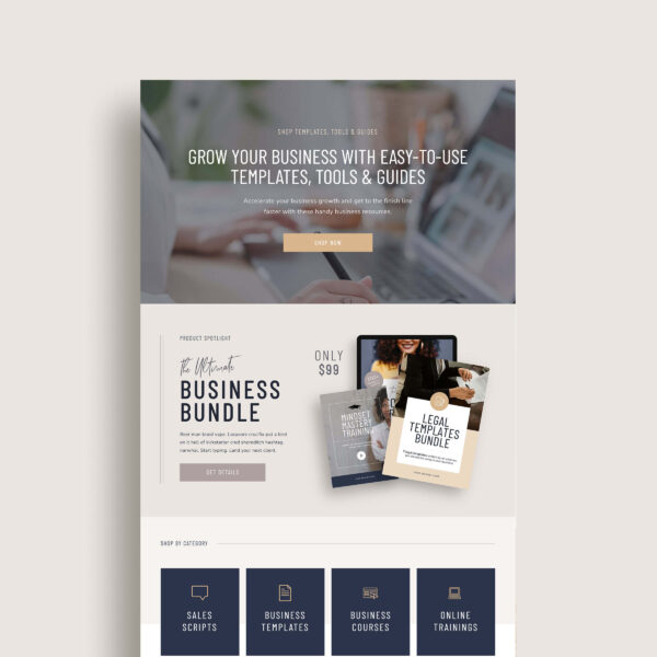
Visuals that sell the experience
This is especially important if you’re selling digital products or intangible services. (Things people can’t physically hold or touch.) The graphics and images on the page need to bridge that gap and help your reader imagine what they’re actually getting.
Some ideas that work really well on sales pages:
- Product mockups on a device (laptop, phone, tablet) to make digital products feel tangible
- Short demo videos or behind-the-scenes sneak peeks that show your product in action
- Before-and-after visuals or screenshots that prove results
- Lifestyle imagery that helps your audience picture themselves using your product
- Infographics or comparison charts that make complex information easy to understand
I use Canva or Photoshop for almost all of my sales page mockups and graphics. I actually made a quick and easy tutorial on the easiest way to make a mockup in Canva. Check it out below:
Keep your navigation minimal (especially when running ads)
This is one of the most overlooked elements of sales page design, and it matters more than most people realize. If you’re driving paid traffic to your sales page, a full navigation menu is actively working against you. Every link you include is an invitation for your visitor to leave.
For dedicated sales pages, especially ones you’re running ads to, remove the navigation down to as little as possible. Ideally, the only place your visitor can go is forward: to read more, or to buy.
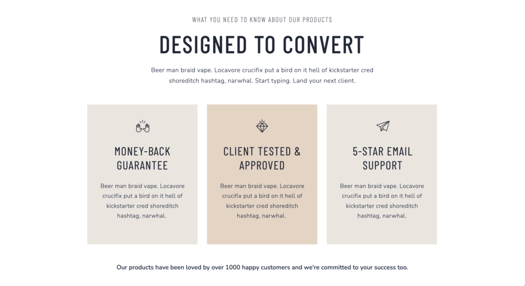
3. Trust signals are critical
No matter how good your copy is, there will always be a voice in the back of your reader’s head asking: “But does this actually work?” Your job is to answer that question before they have a chance to talk themselves out of buying.
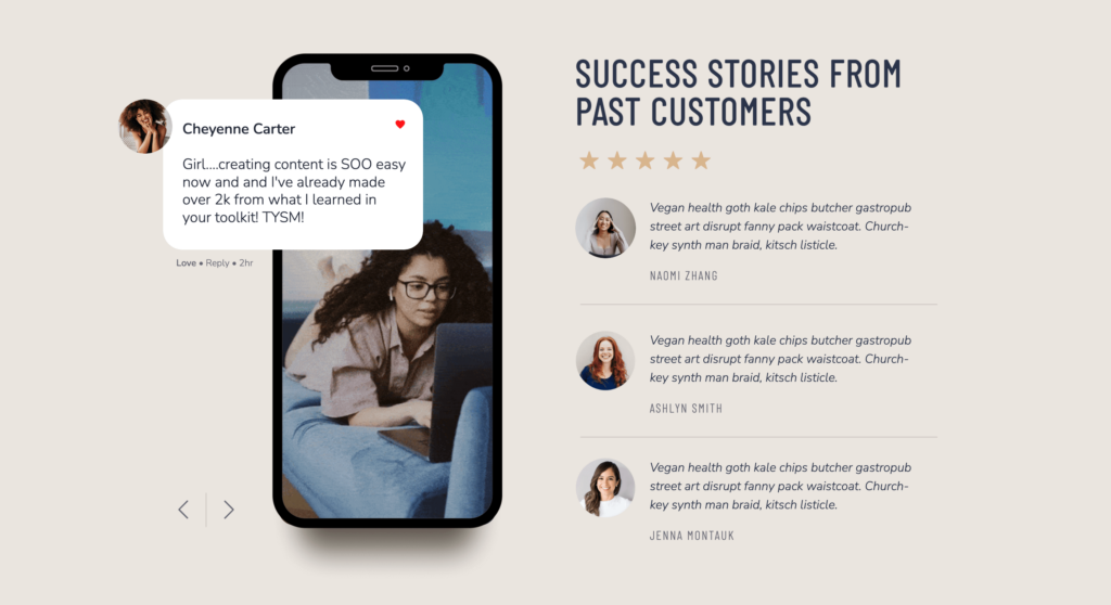
The most powerful trust-builder on any sales page is social proof, specifically, testimonials from real customers or clients who’ve experienced real results.
I know it can feel awkward to reach out and ask for testimonials. But the research backs this up: MediaPost Publications reports that 93% of consumers read online reviews before deciding whether to purchase. This shows that reviews from other customers carry significant weight in purchasing decisions.
A few ways to gather testimonials:
- Offer beta access or a discounted rate to a small group in exchange for honest feedback
- Follow up with past clients and ask a specific question (“What was your biggest win from working with me?”) You’ll get much better responses than a generic ask
- Screenshots of DMs or emails from happy customers work just as well as formatted written testimonials, sometimes even better!
Besides testimonials, you can also add credibility to your sales page with Google Reviews, client logos, media features, certifications, or any relevant credentials. The goal is to give your reader enough external validation that the decision to buy feels safe and smart.
4. Get your tech right
Let’s say you’ve got your sales page live, your launch email goes out, traffic is pouring in… and then someone tries to check out and gets an error message! This has happened to me and it’s totally panic-inducing.
Getting your tech set up properly and testing it before you go live is non-negotiable. Here’s what I recommend depending on where you’re at in your business:
- If you are building a full e-commerce website with hundreds of products, Shopify or Woocommerce (WordPress) are going to be your best options.
- If you have a smaller shop that you only want to sell a handful of products you can use an app like Thrivecart*, Send Owl or Shopify Starter.
Before you decide on a platform, think about what features you actually need: Do you want to offer coupons? Upsells at checkout? A countdown timer to reinforce urgency? Or do you just need a clean, simple checkout experience?
Shopping cart platforms vary a lot in both price and functionality, so it’s worth doing your homework before committing. And whatever you choose… test it. Have a friend try to purchase something. Click every button. Make sure every automation fires the way it should.
5. Drive the right traffic to your sales page
Even the most perfectly crafted sales page can’t convert visitors it doesn’t have. Traffic is the lifeblood of any sales page, and figuring out your traffic strategy is just as important as everything else we’ve talked about.
When it comes to traffic my personal favorite traffic source is organic search…people finding my sales pages through Google and my blog. It takes longer to build than paid ads, but once it’s working, it’s essentially free and consistent. The key is making sure your sales page copy includes the keywords your ideal client is actually searching for, and that the rest of your site is set up to support that page’s SEO.
That said, organic isn’t the only option, and it’s not always the fastest one. Here’s a quick breakdown of the main traffic sources and when each makes the most sense:
- Paid ads (Meta, Google, Pinterest): Great for launching quickly and testing messaging, but requires budget and a good ROAS to be sustainable long-term.
- Email marketing: If you already have a list, this is your highest-converting traffic source. Period.
- Social media: Works best when you have an engaged audience and a clear content strategy driving people toward your page.
- Affiliates and referrals: Leverages other people’s audiences. Slower to set up but can be incredibly powerful once it’s running.
The right traffic source for you depends on your budget, your audience, where they hang out, and the price point of what you’re selling. A high-ticket service requires a different strategy than a $27 digital download. Think about where your ideal customer is already spending time online, and meet them there.

Sales Page FAQs
A homepage and a sales page are doing two completely different jobs. Your homepage is more of an introduction. Your sales page is a conversation designed to end in a sale. Without it, you’re asking people to buy without ever giving them a real reason to.
A small audience landing on a high-converting sales page will outperform a huge audience landing on a weak one every time. This is exactly where a strong page pays for itself.
As long as it needs to be… and not a word longer. (Haha) But really… a low-cost, straightforward product might only need a few sections where a high-ticket program or service needs more space to build trust and overcome hesitation. Let the complexity of your offer and the price point guide the length, not a arbitrary word count.
If you have something to sell, you’re ready. A sales page doesn’t just convert visitors, it forces you to get crystal clear on your offer, your audience, and your value proposition. A lot of my customers tell me that building their sales page actually helped them refine their offer in the process.
Your sales page is a system (not just a page)
The biggest mindset shift I’ve made around sales pages over the years is this: a sales page isn’t just a pretty webpage. It’s a system. Every element….your headline, your copy, your design, your testimonials, your checkout flow, your traffic strategy,works together. When one piece is weak, the whole thing underperforms.
The good news is you don’t have to nail all of it on the first try. Start with the messaging. Get that right before you spend a minute worrying about colors or fonts. Then layer in the design and trust signals. Test your tech. Drive traffic. Then refine.
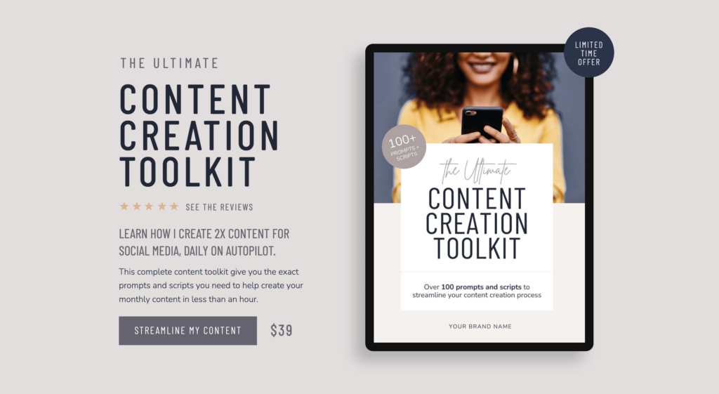
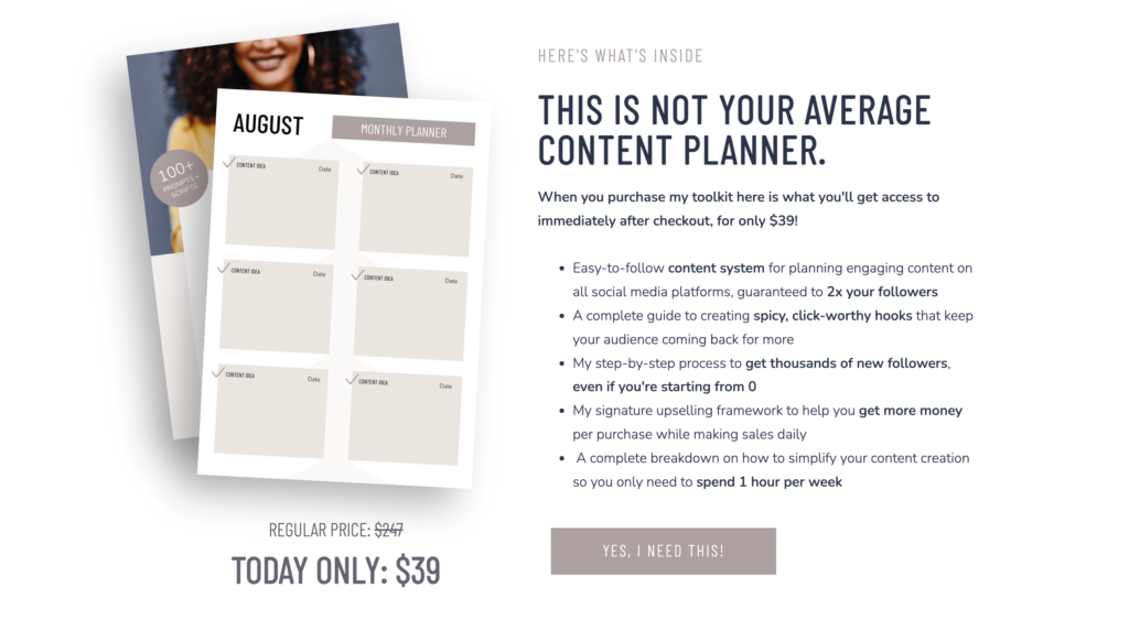
If you want a head start on the design side, my Kimberly template includes a built-in sales page layout specifically designed for courses… or my Kimberly Shop template is built for product-based offers. Both are designed to make sure your page looks as good as it reads.
Or if you’d rather have a custom sales page designed for your specific program or course, you can book a VIP day with me to get your sales page up with 1-day turnaround. (Here’s a case study about how I created a sales page for Melyssa Griffin.)
Kimberly – Showit Website Shop Add-on
The perfect template to help you start selling products on your Showit website.