DIY websites are great until they’re not. Like those bangs you impulsively cut with optimistic curiosity….they’re cute in theory, but can quickly turn into a disaster.
This post isn’t to scare you away from DIY-ing your own website (because you totally can), but just some advice to proceed with caution. Here are a few tips to help you along the way…
1. Give your text some room to breathe
Nothing screams amateur hour louder than text awkwardly jammed up to the edge of a page / section. Your website’s text should feel spacious and have plenty of room around it on all sides.
Quick fix: Add consistent padding or margins to every text box and section and you’ll instantly polish your design.
2. Fix those broken links, please!!
Clicking a menu link that goes nowhere is a deeply disappointing experience we can all relate to.
Quick fix: Test every menu link right now (seriously, right now) and make sure they lead somewhere meaningful. Bonus points if you recruit a friend to test-drive your menu.
Related Post: 5 Smart Website Updates to Make When Inquiries Are Slow
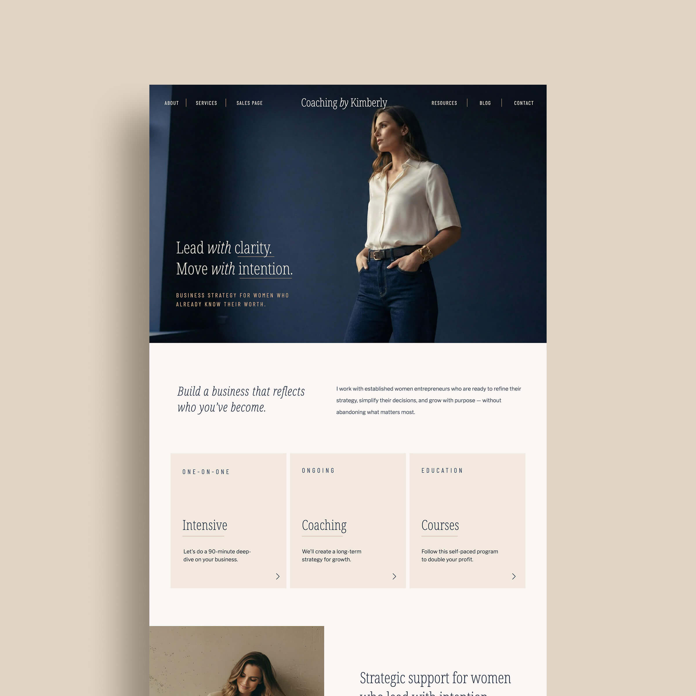
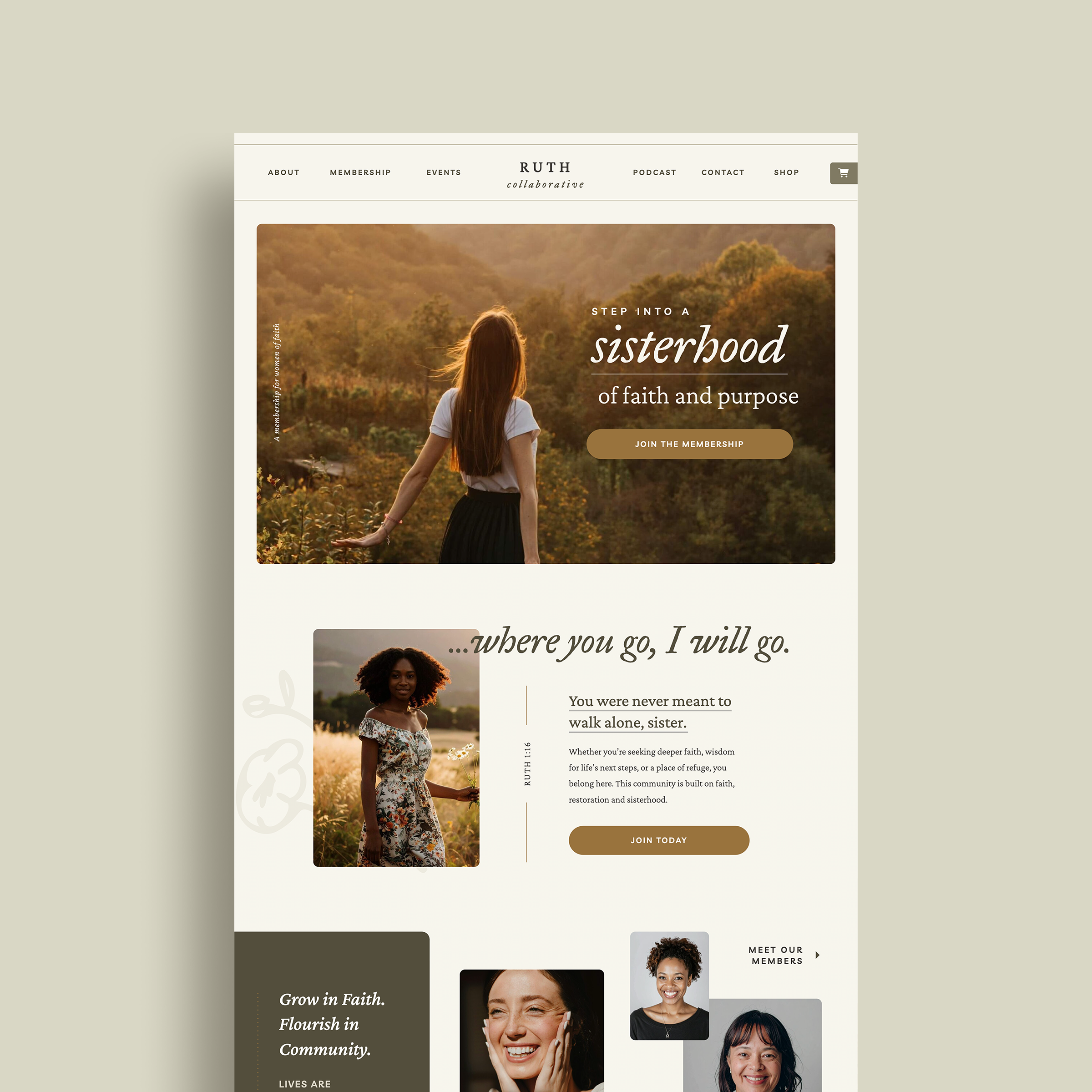
3. Show your face (yes, you!)
If I land on a site without a single picture of the human behind the magic, my first thought is always, “Who are you and what are you hiding?!”
Quick fix: Snap a clean, simple photo of yourself. Natural lighting, clutter-free background, and please, for the love, don’t crop your head off.

4. Break up those giant paragraphs
Long paragraphs = instant overwhelm. No one wants to or has time to read a novel on your homepage.
Quick fix:
- Shorten your paragraphs to 2-3 sentences.
- Use bold headlines.
- Add bullet points like these!
Related Post: The Bullet-proof Website Strategy: Convert Your Visitors into Customers
5. Clear calls to action
If you’re not explicitly telling visitors what to do next, you’re basically leaving them stranded and they’ll happily move onto the next website if you don’t make it easy for them.
Quick fix: Add clear, clickable buttons or links like:
- “Book your free consult”
- “Download the guide”
- “Shop now”
6. Provide context + specifics
Being overly vague doesn’t equal mysterious or intriguing, it equals confusion. Tell visitors exactly what you offer upfront.
Quick fix: Spell it out clearly at the top of your homepage: What you do, who you help, and the specific problems you solve.
7. Skip the corporate robot speak!
Nothing makes your visitors glaze over faster than stiff, overly corporate language. Trying too hard to sound “professional” just makes you sound inauthentic.
Quick fix: Write conversationally. Imagine chatting with a friend (me!) over coffee (or wine). Be genuine, relatable, and delightfully human aka yourself.
Making your DIY site look pro doesn’t have to take hours or insane tech abilities. Just a few quick tweaks can completely elevate your brand and make visitors feel confident you’re the real deal (because you totally are).
Now, here’s your next step:
Loving these quick fixes but ready for more?
Check out my DIY Website Workbook, your step-by-step guide to transforming your website into a professional powerhouse (minus the overwhelm!).