

Colors add a layer of meaning and depth to the world around us – in nature, at work and at home – but did you know that they can do the same for your business and your brand?
What are brand colors?
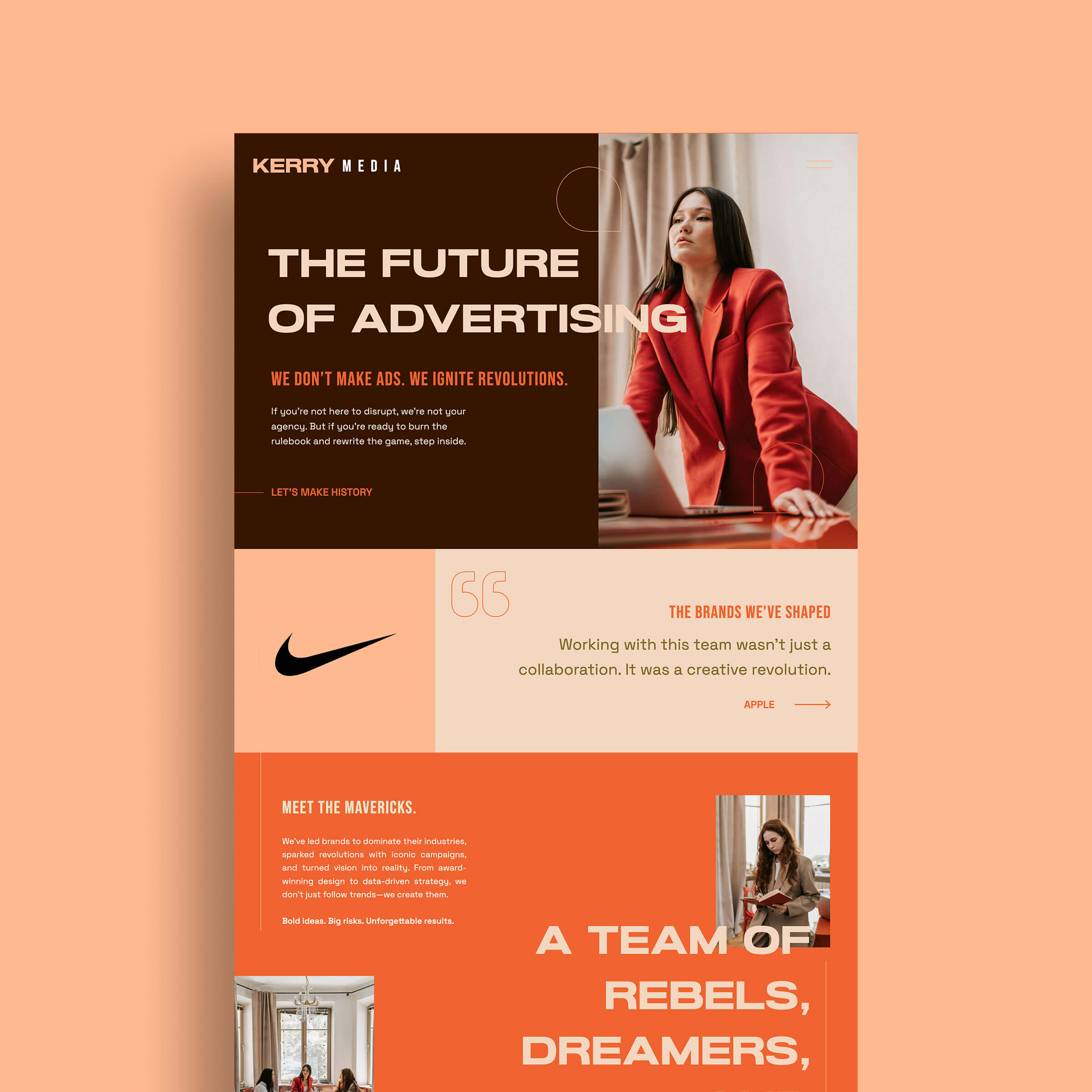
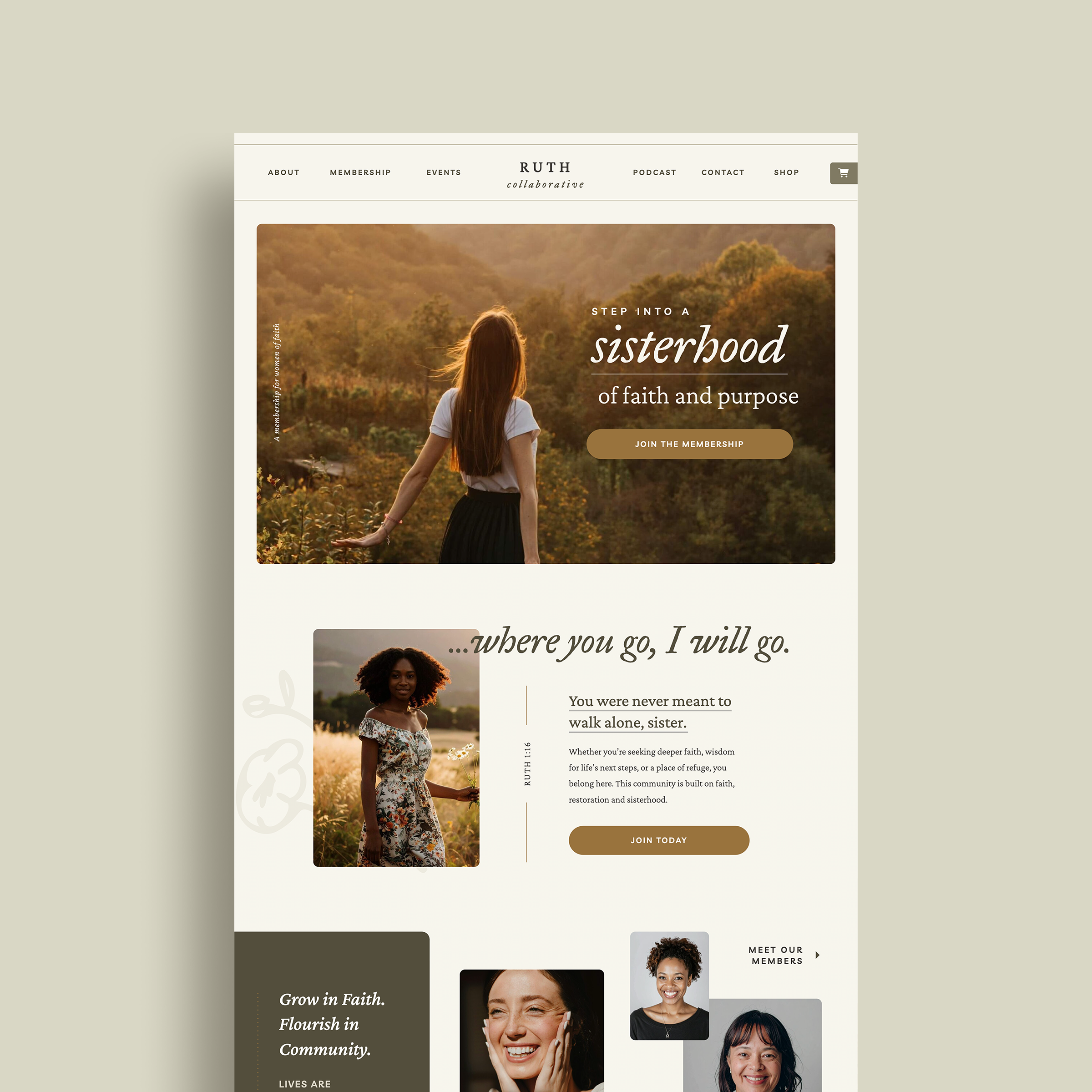
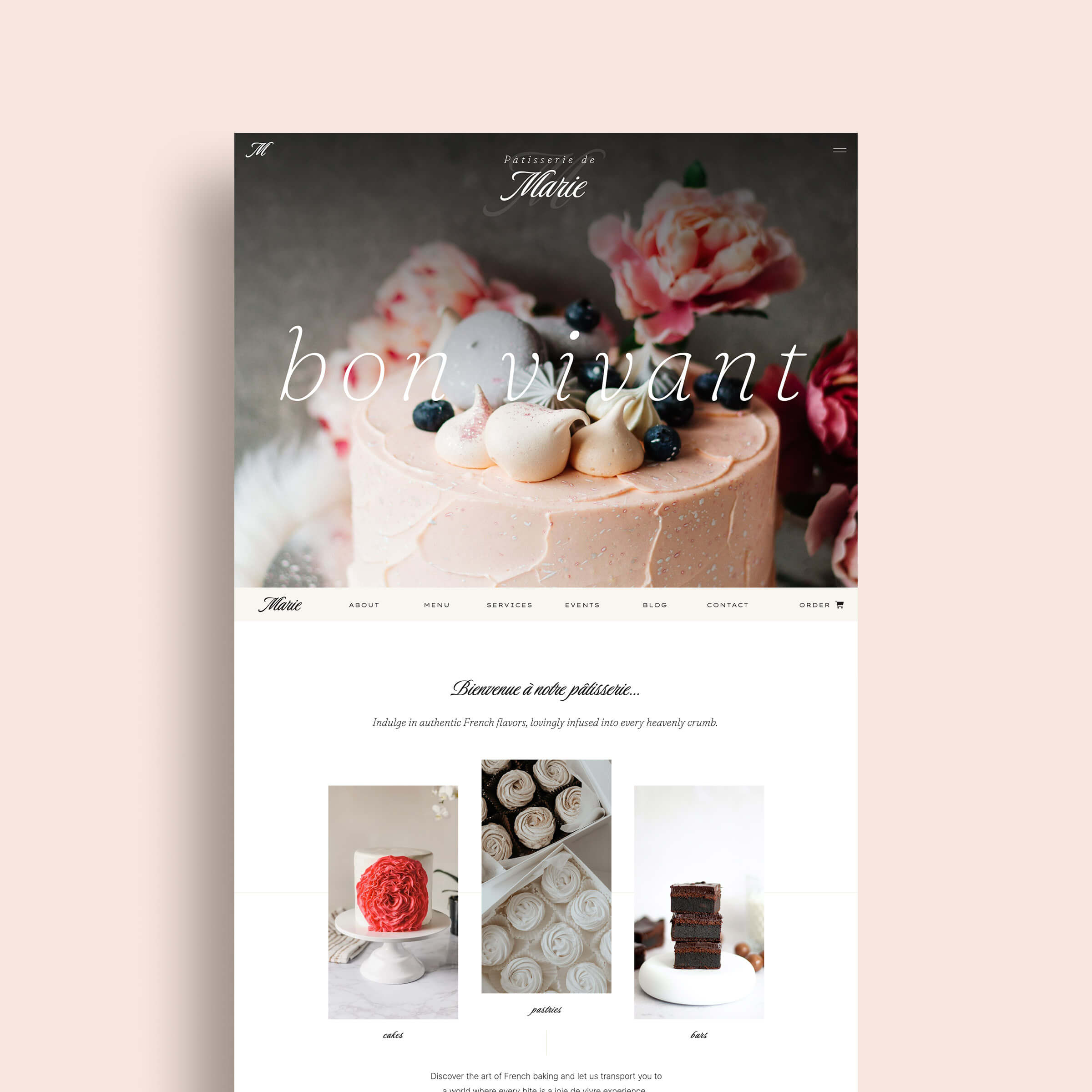
Brand colors are colors that you choose to use consistently to represent your business. Usually your brand color palette consists of 5-10 colors that range in hue, saturation, and shade. Choosing your brand colors wisely can have many benefits including drawing more attention and engagement for your brand and helping to communication the right emotions and ideas to your audience.
While color is often thought of as a subject or concept, using different hues for your brand can have a real psychological impact and is something that should be considered more highly than just personal preference when choosing your brand colors.
Understand the psychological meaning behind colors
You may have heard that colors have “hidden” meanings before and it’s true. That’s why before you pick the colors you want to use to represent your brand, you should have a good understanding of how they will be interpreted by your audience, whether you like it or not. Here are some of the psychological associations we have with colors, that we tend to interpret subconsciously.
- Red – Red can be associated with passion, anger, taking action or danger. Many brands in the food industry use red as this color has also been known to kickstart hunger. Some well known brands that use a red color palette as a part of their brand colors are Coca-Cola, Target, Adobe, Pinterest and Netflix.
- Orange – Orange is seen as a fun, energetic and stimulating color. It is often used as a color in brands that cater to children such as Nickelodeon or brands with a light-hearted tone. A few other brands that use orange as a brand color are Dunkin’ Donuts, Etsy and Fanta.
- Yellow – Yellow is a bright and bold color that represents joy, warmth, playfulness and optimism. Snapchat, McDonald’s, Best Buy and Ikea are just a few of the brands that use yellow as a part of their brand color palette.
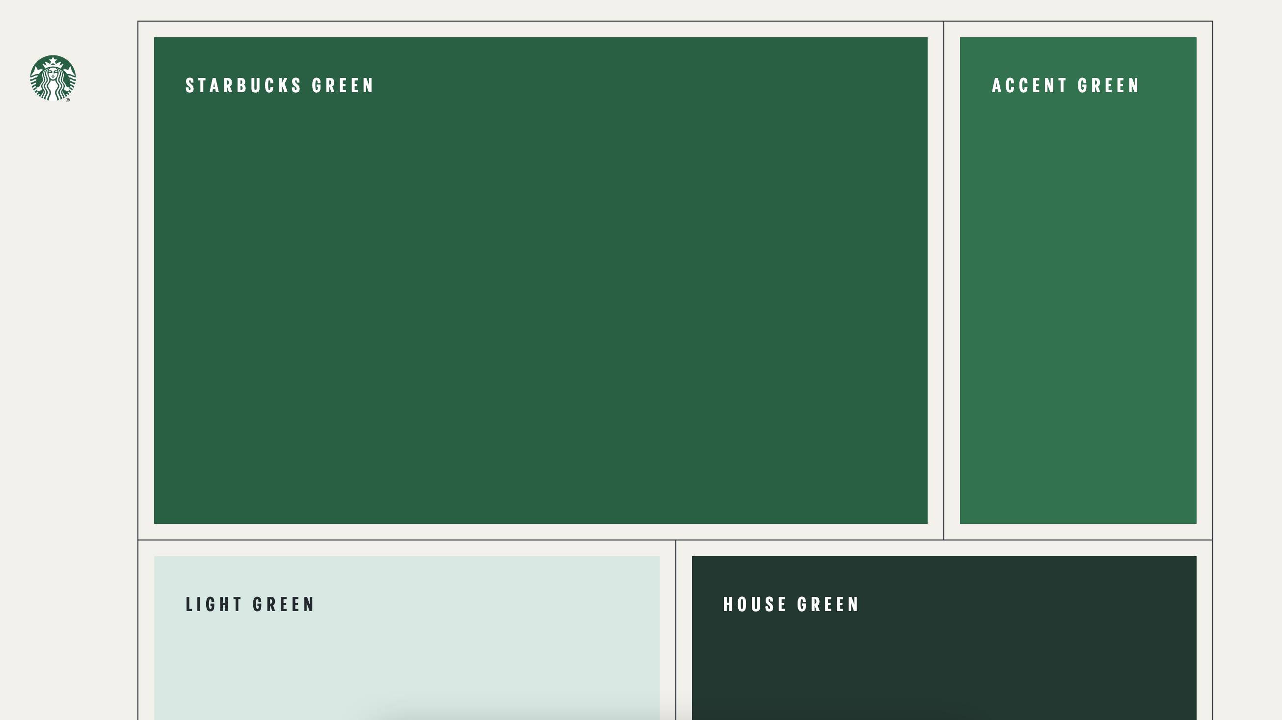
- Green – Green can represent many ideas such as nature, money, health and sustainability. It is often used by natural food brands or wellness brands. Some examples of popular companies that use green in their brand palette are Starbucks, Whole Foods, John Deere and Land Rover. Take a look at the range of greens in Starbuck’s brand colors:
- Blue – Blue can symbolize peace, water, technology or trust. It is one of the most common brand colors for a good reason. The calming effects of the color blue make it a popular choice for many brands such as IBM, Paypal, General Electric, Chase and Facebook.
- Purple – Purple is a less common brand color but holds just as much its own meaning as any other color. Purple can often signify royalty, mystery or spirituality. Popular brands that use purple are Cadbury, Yahoo, Taco Bell, and Hallmark.
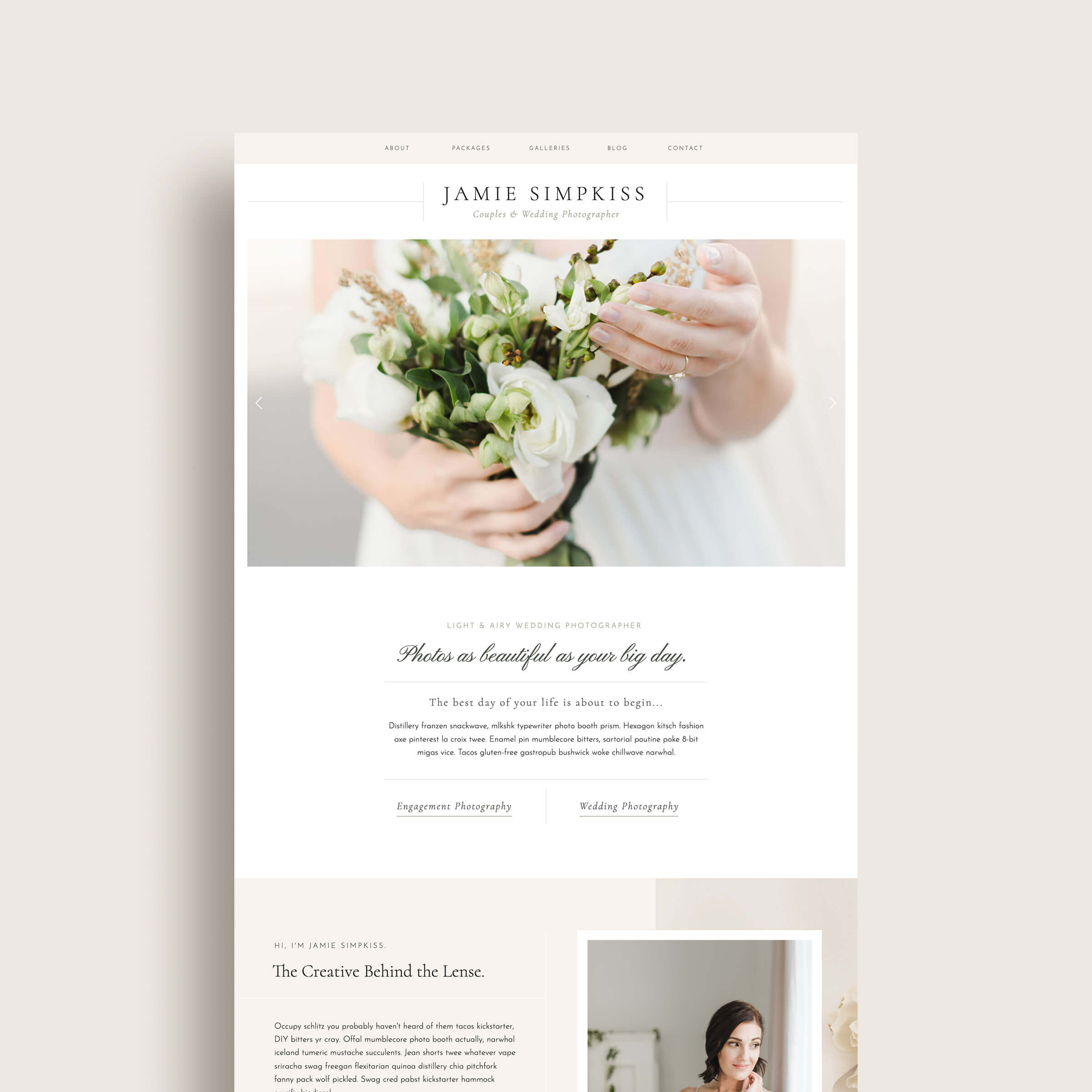
- Pink – Pink has been known to stand for femininity, youthfulness, romance and affection. Popular brands that use pink as a primary brand color include T-mobile, Lyft, Baskin Robbins and PINK by Victoria Secret.
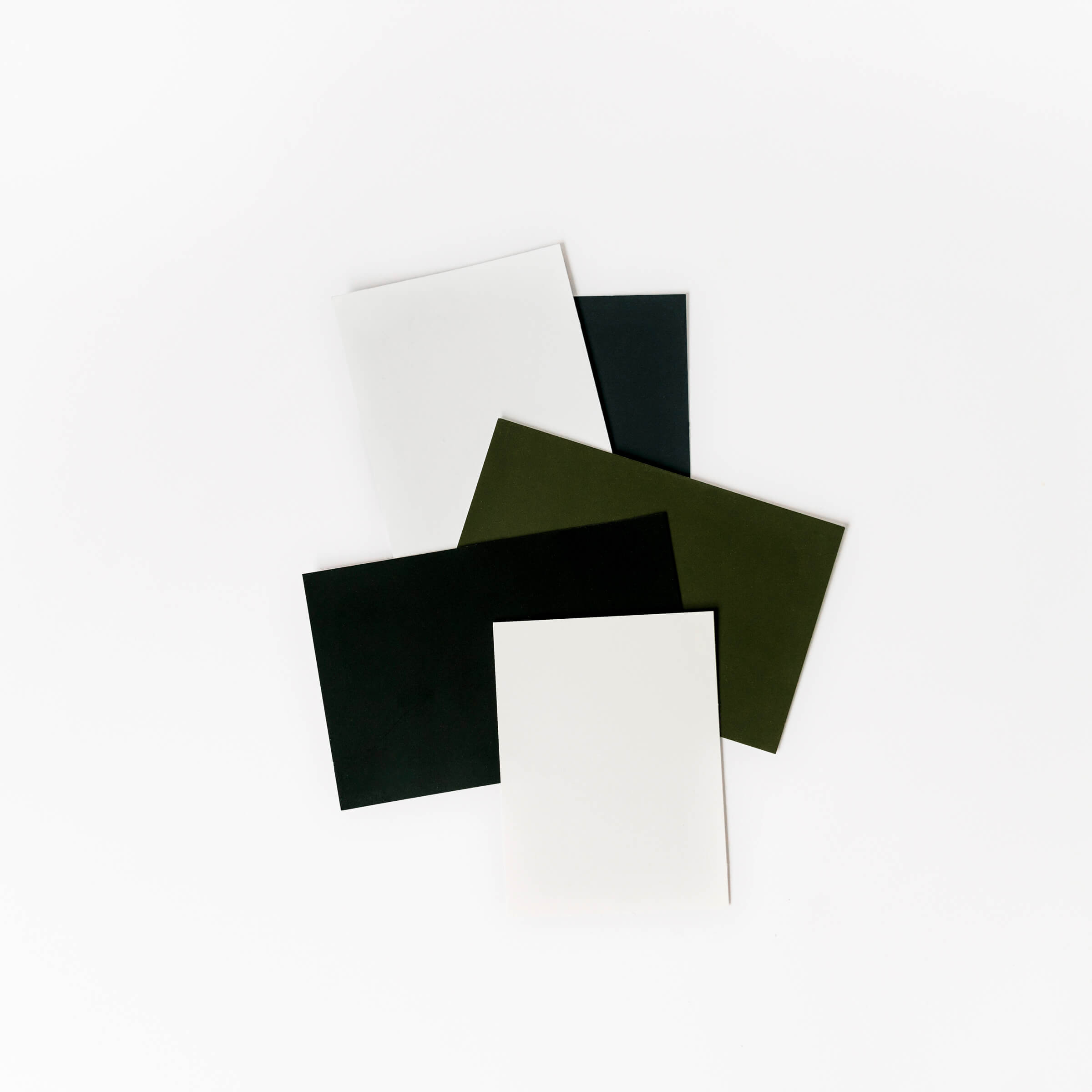
- Brown – Brown is a color that represents many ideas including stability, wholesomeness, reliability, and earthiness. A few companies that use brown as a primary color for their brand are UPS, M+Ms, Hershey’s, and Cracker Barrel.
- Black – Black is color that demands attention and is often associated with strength, power, authority, luxury and sophistication. Chanel, Prada, Sony, Nike and Adidas all use black as a primary brand color.
- White – White is the ideal color to communicate purity, innocence, modern ideas or simplicity. Popular brands that primarily use white in their color palette are: Apple, Mini, and WWF.
Color terms you should know
Before we dive into how to choose your brand colors, there are some important color theory terms you should know that describe different color properties and color scheme relationships. Having a basic understanding of these will help you to choose colors in a more thoughtful way.
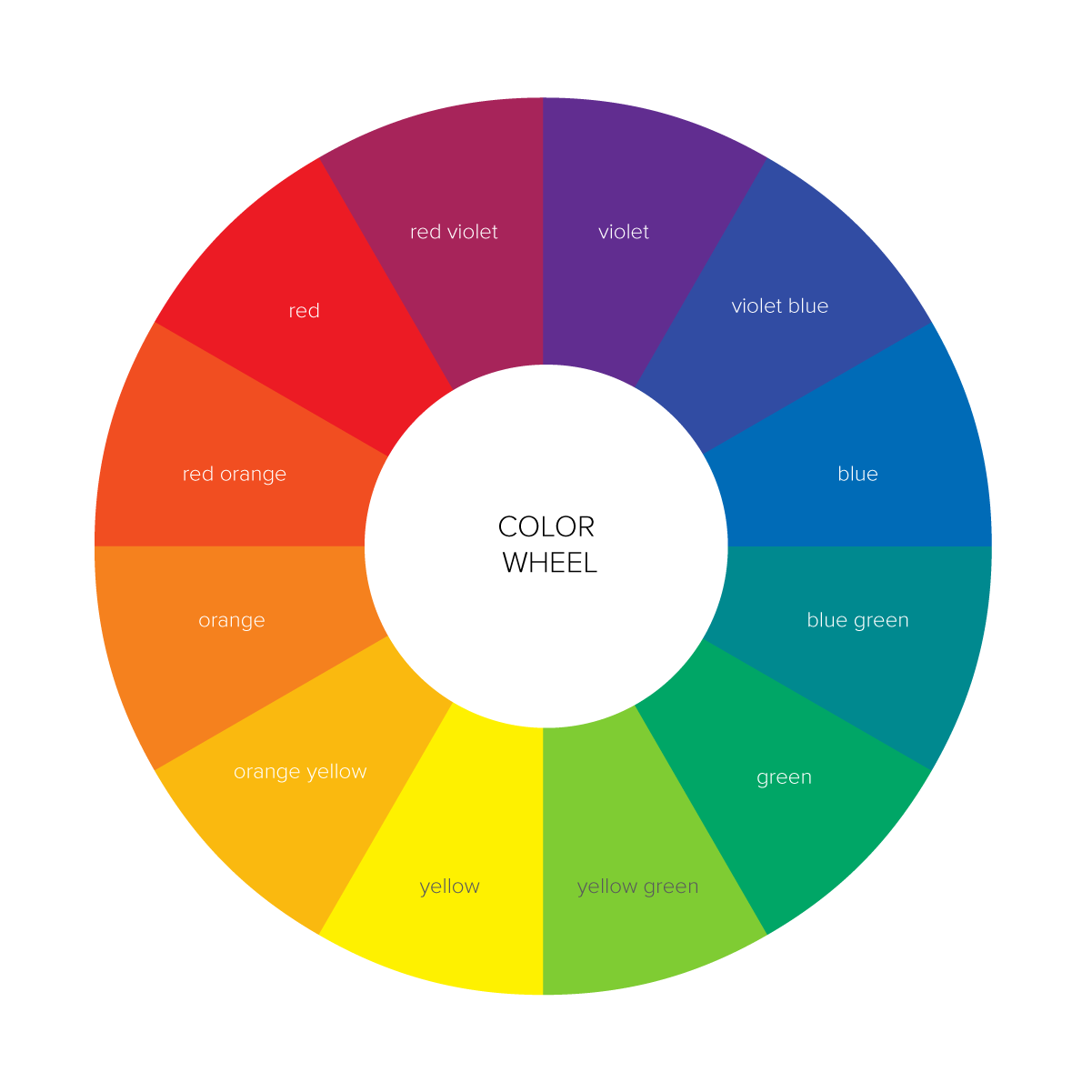
color wheel – an illustration that shows the primary, secondary and tertiary colors (hues) arranged around in a circle (like the one above)
hue – used interchangeably with the word color and refers to any pure color on the color wheel, it does not include black, white or gray
primary colors – red, blue, yellow
secondary colors – violet, orange, green
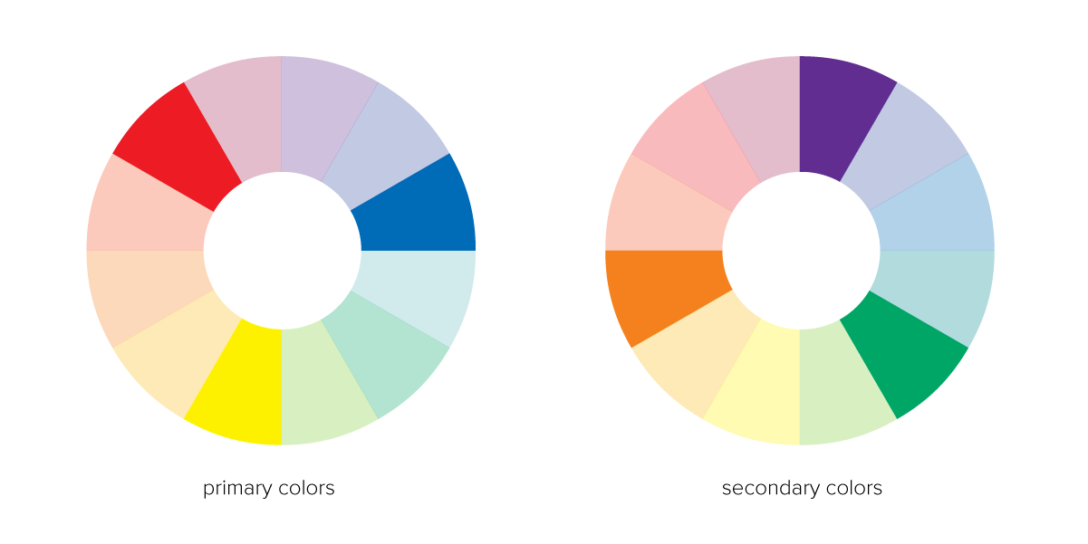
tertiary colors – red-orange, blue-green, yellow-green, orange-yellow, red-violet, violet-blue
neutral colors – black, white, gray
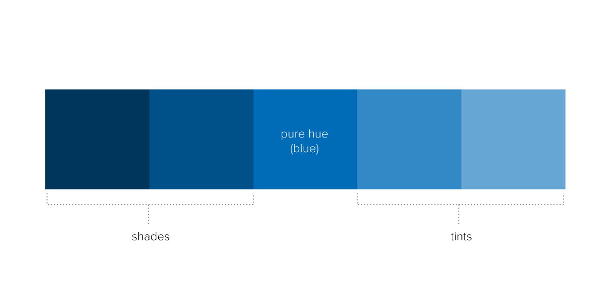
value – how light or dark a color is
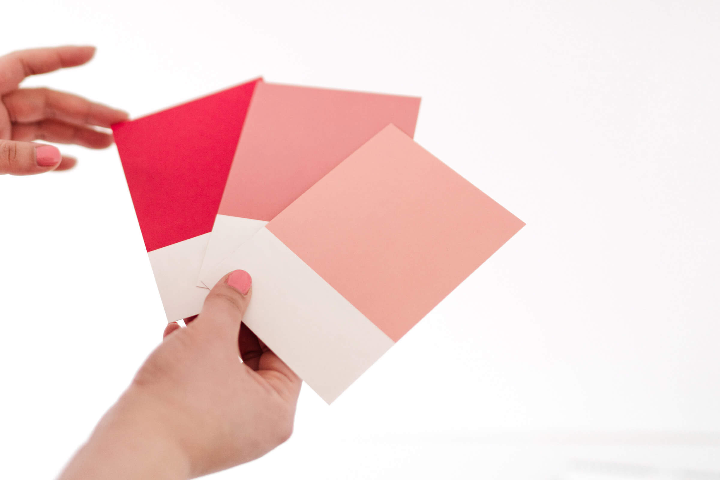
shade – a darker variation of a certain hue (due to black being added)
tint – a lighter variation of a certain hue (due to white being added), for example, pink is a tint of the hue red
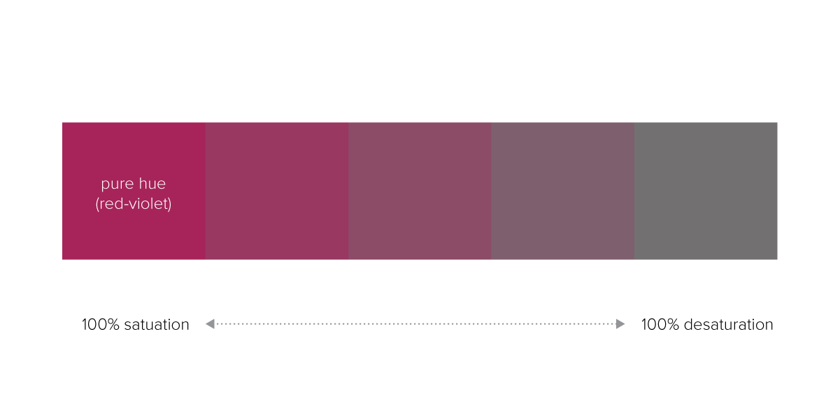
saturation – how pure and intense a color is. A color that is at 100% saturation would be at its most vibrant, while a color that is desaturated would appear dull and gray
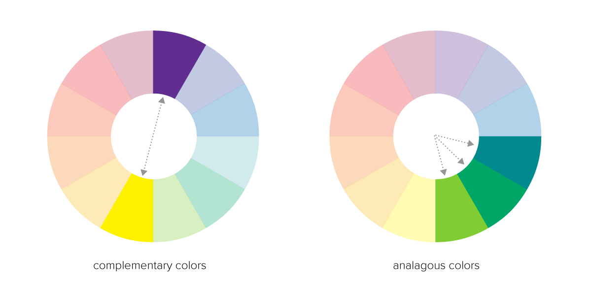
complementary colors – complementary colors are colors that are exactly opposite each other on the color wheel, for example: violet and yellow, or red and green
analogous colors – analogous colors are colors that touch on the color wheel, for example: yellow, yellow-green and green
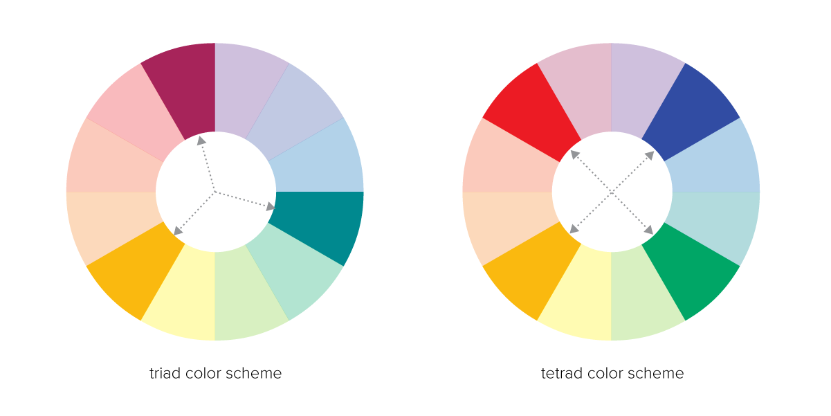
triad – a color scheme that includes 3 evenly spaced colors on the color wheel, for example: orange-yellow, red-violet, and blue-green
tetrad – a color scheme that includes 4 evenly spaced colors on the color wheel, for example: red, blue, orange and green
Where to find color inspiration
You can find inspiration for brand colors all across the web. Creating a moodboard is one way you might consider getting inspiration for your brand colors. One of my favorite websites to look for color inspiration is Pinterest which is why I have a whole Pinterest board dedicated just to color palettes. Here are some other websites you can also look to help you create your brand color palette that I recommend:
How to choose your brand colors
While you are looking for inspiration and as you begin to consider what colors will become a part of your brand palette, remember that each color brings its own meaning and personality to the table. Combining different colors adds even more depth and meaning to your brand.
Therefore, it’s important you think carefully about each different color you include as a part of your brand palette. For example, if you want colors that represent a feminine color palette, you should consider what color combinations work best to create a feminine aesthetic.
To start, choose a main color that you want to be the primary focus of your brand color palette. Remember the tone of the colors you choose play a big role in how they will be interpreted. Adjusting the shade or tint and saturation of the colors you choose can make a profound difference in what they mean to your audience.
If you choose blue, for example, ask yourself what shade and tone of blue makes sense? Is it a deep royal blue that exudes boldness or is it a light and soft beachy blue that you want to symbolize relaxation? Or is the blue more of a bright turquoise or robin’s egg blue similar to Tiffany’s iconic brand color? Subtle differences in color can radically change what mood and feeling the color portrays.

- Choose a lighter tint AND a darker shade of your primary color. This gives you a range of variation that will help you create contrast and emphasis when creating designs for your brand.
- Choose 1-2 accent colors. For accent colors, try analogous colors for a more subtle color palette color. Or you can use a color model such as a triad to choose additional colors for a more bold effect.
- Choose an action color. Complementary colors make great action colors because they create maximum contrast and stand out from the rest of your color palette.
- Choose a neutral color. A neutral color in your palette is useful for text and subtle background elements that you don’t need to stand out.
Once you’ve chosen your brand colors, test them out. See how well they marry together by experimenting with text and basic shapes. Then ask yourself a few questions:
- Is there adequate contrast, emphasis and range between your colors?
- What is the mood and the meaning they portray all together?
- Are the colors too similar to a competitor’s?
- What proportion of colors feels most balanced?
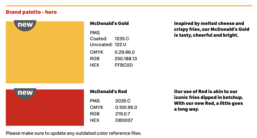
Once you are sure of your colors, it’s time to record your the color formulas and keep it in a safe accessible spot. You will want to know the RGB, Hex and CMYK values for each color in your brand palette. If you selected Pantone colors, you will also want to be sure you know the Pantone number as well. Take a look at how McDonald’s references their brand colors for inspiration. You can even give your brand colors fun names if it helps you remember them!
Having trouble with how to choose brand colors for your business? You might be interested to check out my post, 20 Gorgeous & Girly Color Palettes for Your Website or reach out to K Design Co. to help you create a full custom branding package, including your brand colors, beautiful logo and more.